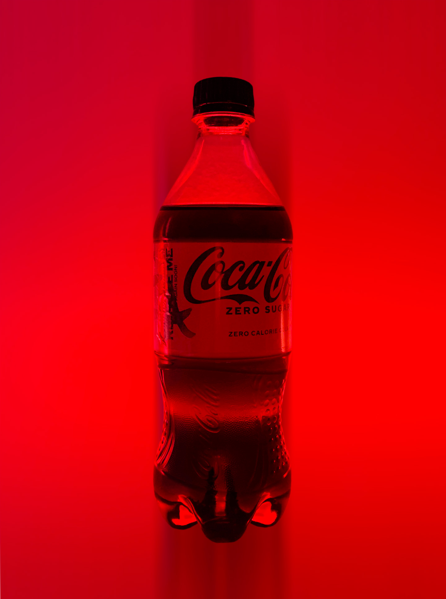
Coca-Cola Zero Sugar — Aaron Mebesius
A Personal Challenge
In 2014, while working on a contract with Wieden+Kennedy, I had the opportunity and privilege of seeing a “History of Coca-Cola Branding”, — a supercut of Coca-Cola ads and campaigns spanning Coca-Cola's life as a brand. After the Q&A session, I distinctly remember a conversation with a colleague about working on what is arguably the most iconic brand in the world. We both agreed it would be the ultimate thrill & challenge.
In the month of May 2022, I got the chance.
CREATED IN COLLABORATION AT AKQA
SENIOR DESIGNER•ART & LAYOUT DESIGN/EXPLORATION•DECK DESIGN
AARON MEBESIUS

THE CLAY WAS STILL WET
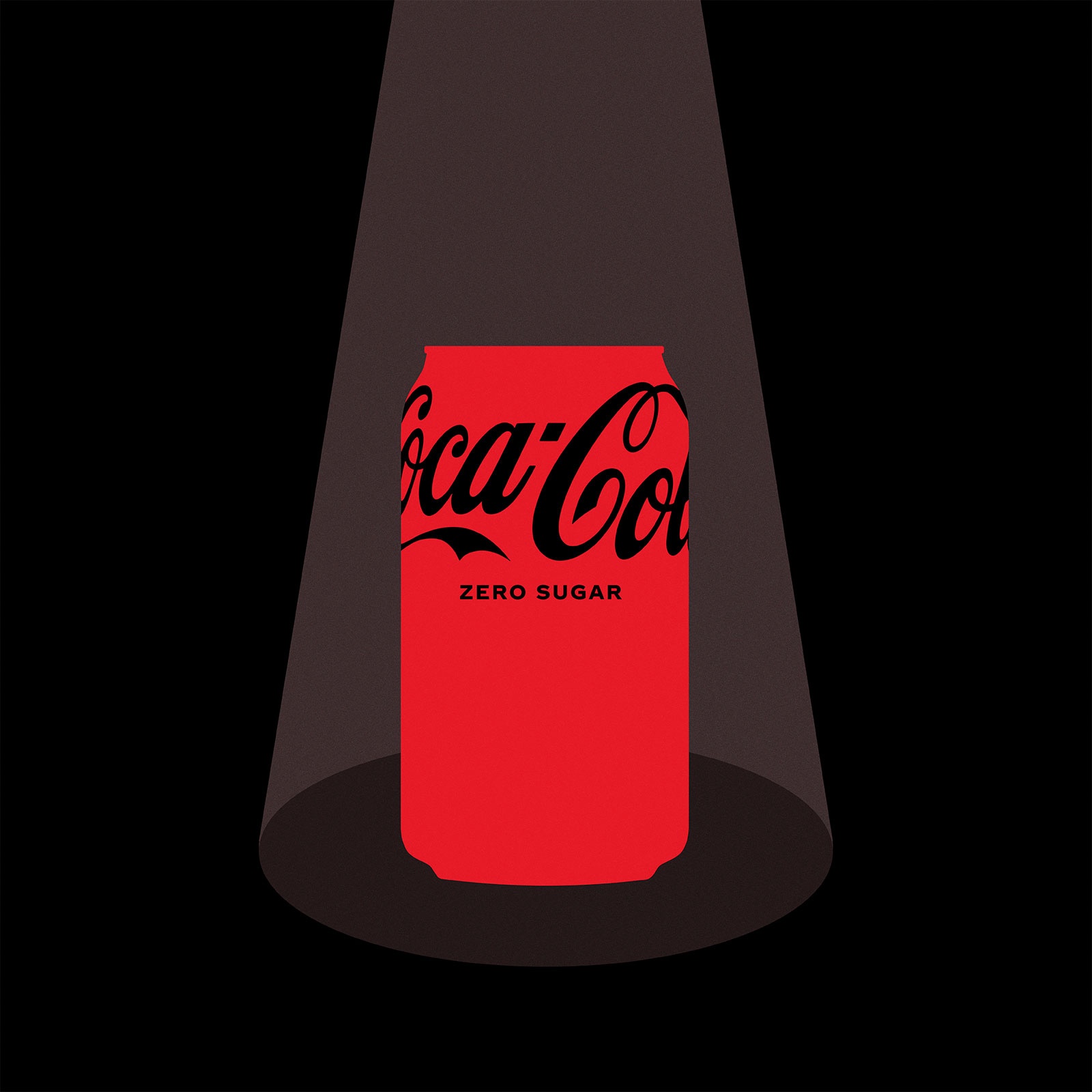
I began meeting my teammates (comprised of professionals from all over the world) and was excited to learn that while the idea/campaign was already well underway, much of the art design, tone, and storytelling surrounding this real-life moment was still in an exploratory phase. Our leaders were focusing on a user-driven, Coca-Cola-specific behavior: people stealing each other's Cokes at their home/workplace. In some instances, people left cheeky notes warning others to not steal their Cokes, or, in rare instances, thieves left gloating messages of their theft. Practical applications of these ideas surrounding this concept were being discussed. A “Security Can” of Coke Zero for instance, which recorded the inside of a fridge as a potential way of catching the taker/thief.
My role was clear: help design/manage the Coca-Cola pitch deck and help execute my team's vision (art design, tone, and storytelling).
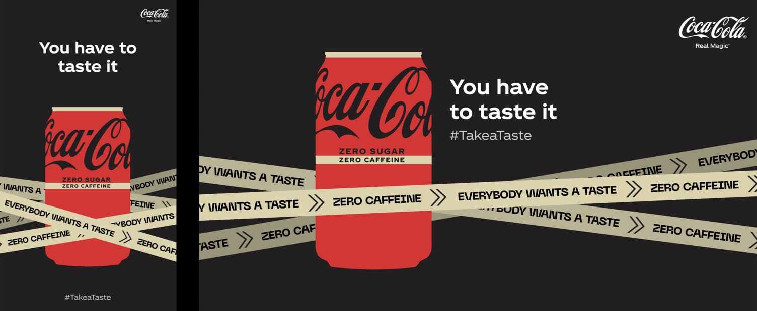
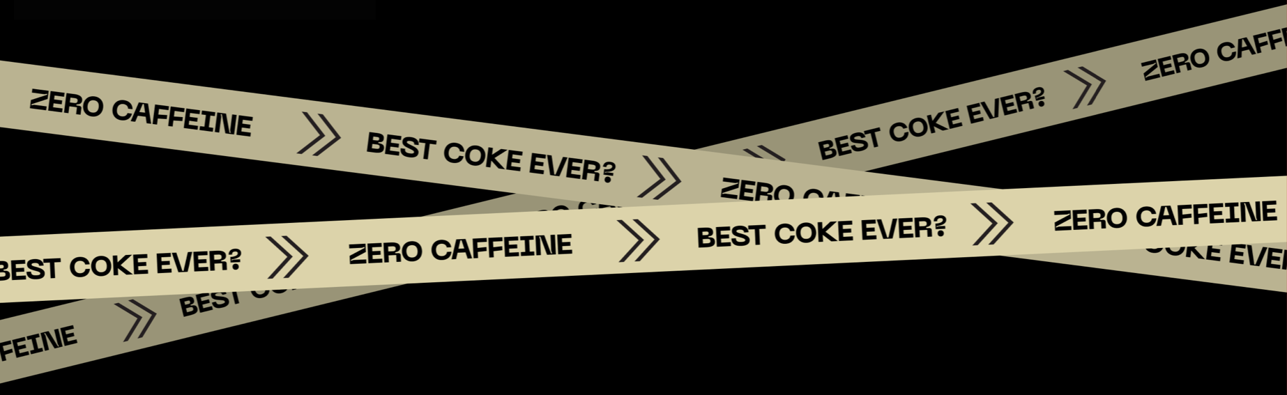
Early pieces of artwork had been established, though we were still exploring multiple headlines. We also were leaning into a flat, high-contrast, flat vector graphics aesthetic with various executions of crime tape (with Coca-Cola slogans and taglines incorporated into the artwork). There was still plenty of room for exploration.
On a personal note, I love and hate this moment of the design process, as the blank page is both scary (not knowing what the answer will be) and thrilling (trusting the process, your teammates, and yourself to find an innovative solution).
Daily International Collaboration
As the deck and ideas developed, we began a concentrated exploration phase — presenting numerous examples of artistic elements that would ultimately become the aesthetic pillars of this campaign.
Working collaboratively on an international level was like nothing I'd ever experienced. We had daily e-meetings in multiple time zones, constant conversations around the tone and art style, and discussions about what the campaign's story should ultimately become.

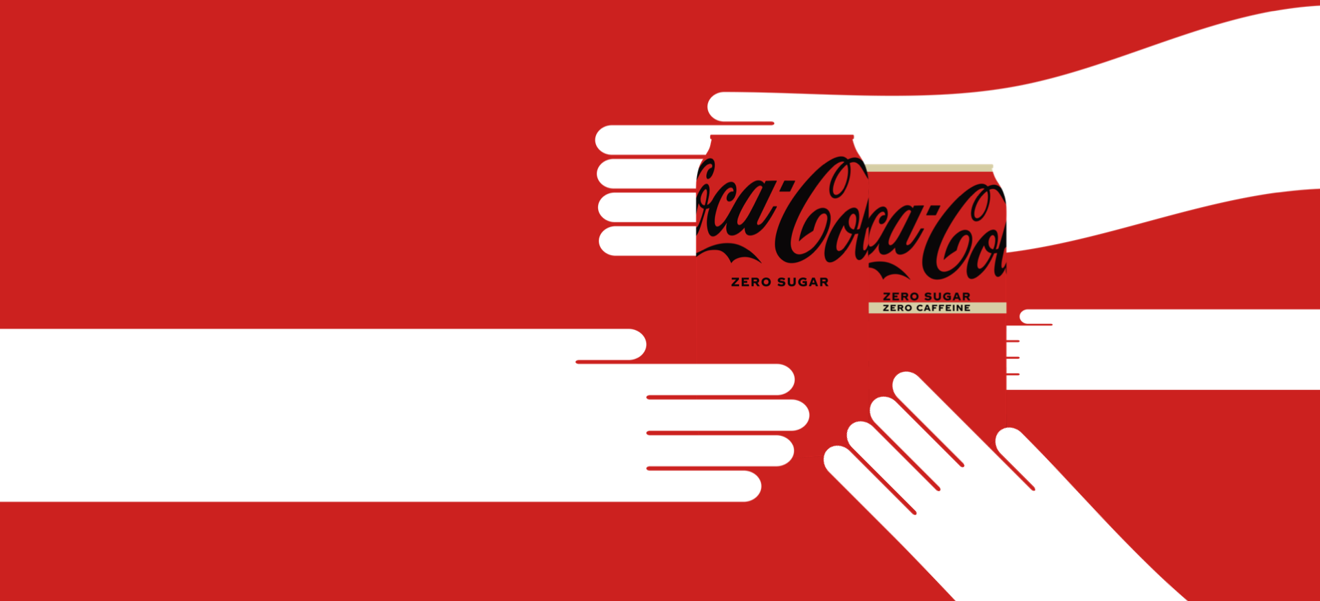
We explored multiple options of hands emerging from out-of-frame, typically spanning large distances of negative space and color.
TONAL INFLUENCE & EXPLORATION: • Coincidentally, as we began our research into what a potential story could be, I had recently watched “Catch Me if You Can”, and recalled that its title sequence felt adjacent to our desired tone/direction. I presented a few stills from the sequence and was delighted when the team agreed with the similarities in tone and storytelling. A lighthearted cat-and-mouse game, spy vs spy feel, something fun, mischievous, and heist-like.
The Thrill of the Breakthrough, Professional & Personal
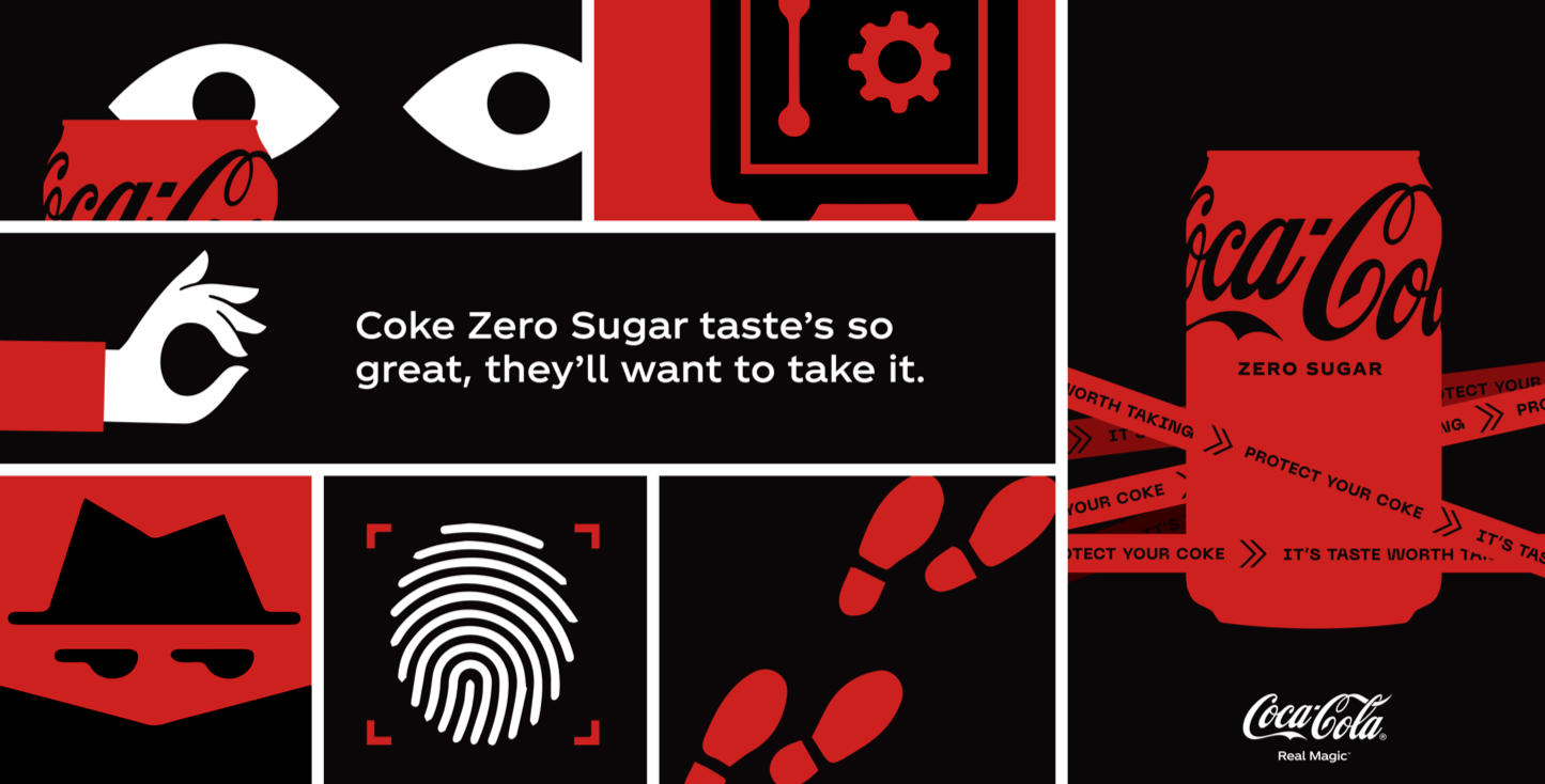
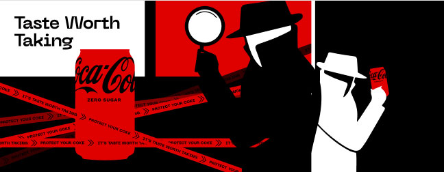
After presenting Coca-Cola with numerous artistic directions, this board emerged as the concept they responded to the most positively. The implied storytelling of the multi-panels and the elements within complimented the real-world Coca-Cola-based behavior. A fedora-clad spy, fingerprints, footsteps, eyes in the dark, branded crime tape — seeing all of these elements together began to resemble a re-creation of a fun cat-and-mouse Coca-Cola-style adventure.
Of all of my contributions in this process, this board holds a special significance. The thrill of collaboration and discovery with my teammates is something I'll never forget. This board helped shift us out of our initial divergent exploration and converge on what the final art pieces of this campaign would become.
Monsters, Heists, and Fun
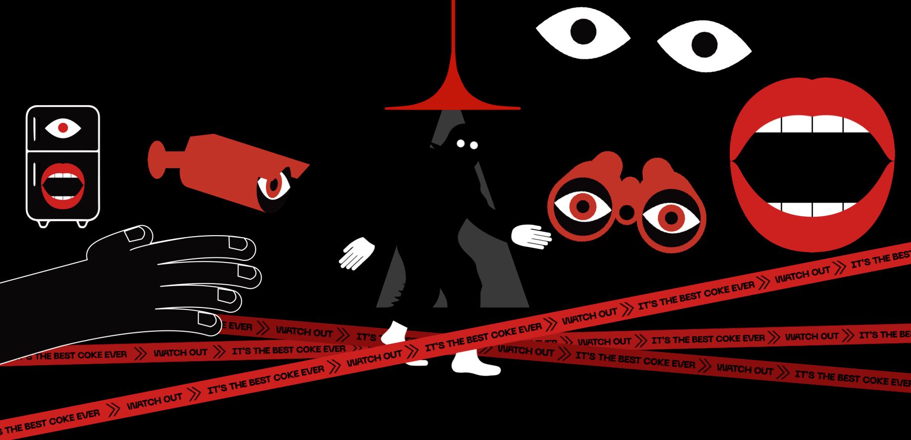
We began focusing on different elements and objects that would reinforce the concept of a Coca-Cola-branded “heist”. We looked at dozens of explorations of eyes, binoculars, mouths, hands, lights, characters, and other heist-like elements — all the while, embracing a playful, aesthetic tone.
We always presented these concepts in an ad-space, because, after all, this is Coca-Cola. The final story/campaign was destined to populate numerous digital and retail experiences including influencer-focused content, banner ads, retail experiences, and potentially even a branded video game.

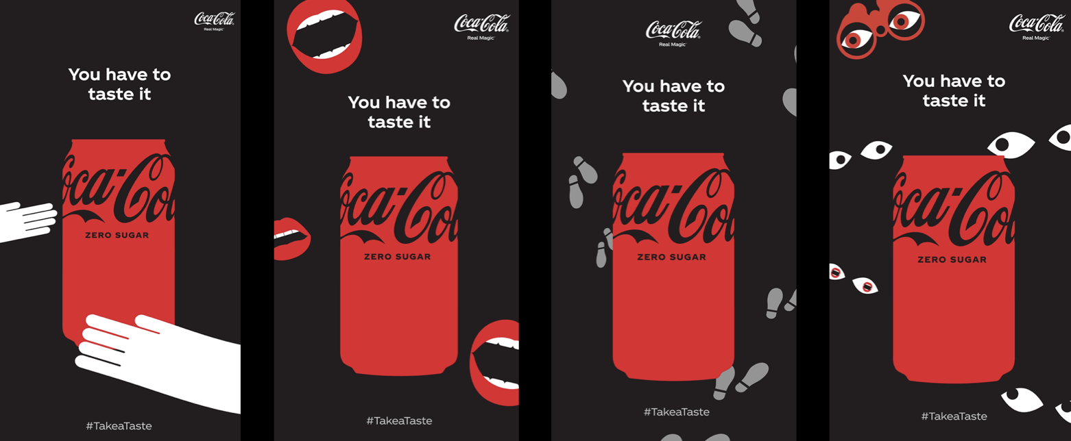
ELEMENT EXPLORATIONS

EYE EXPLORATIONS
CONTINUED
EXPLORATION
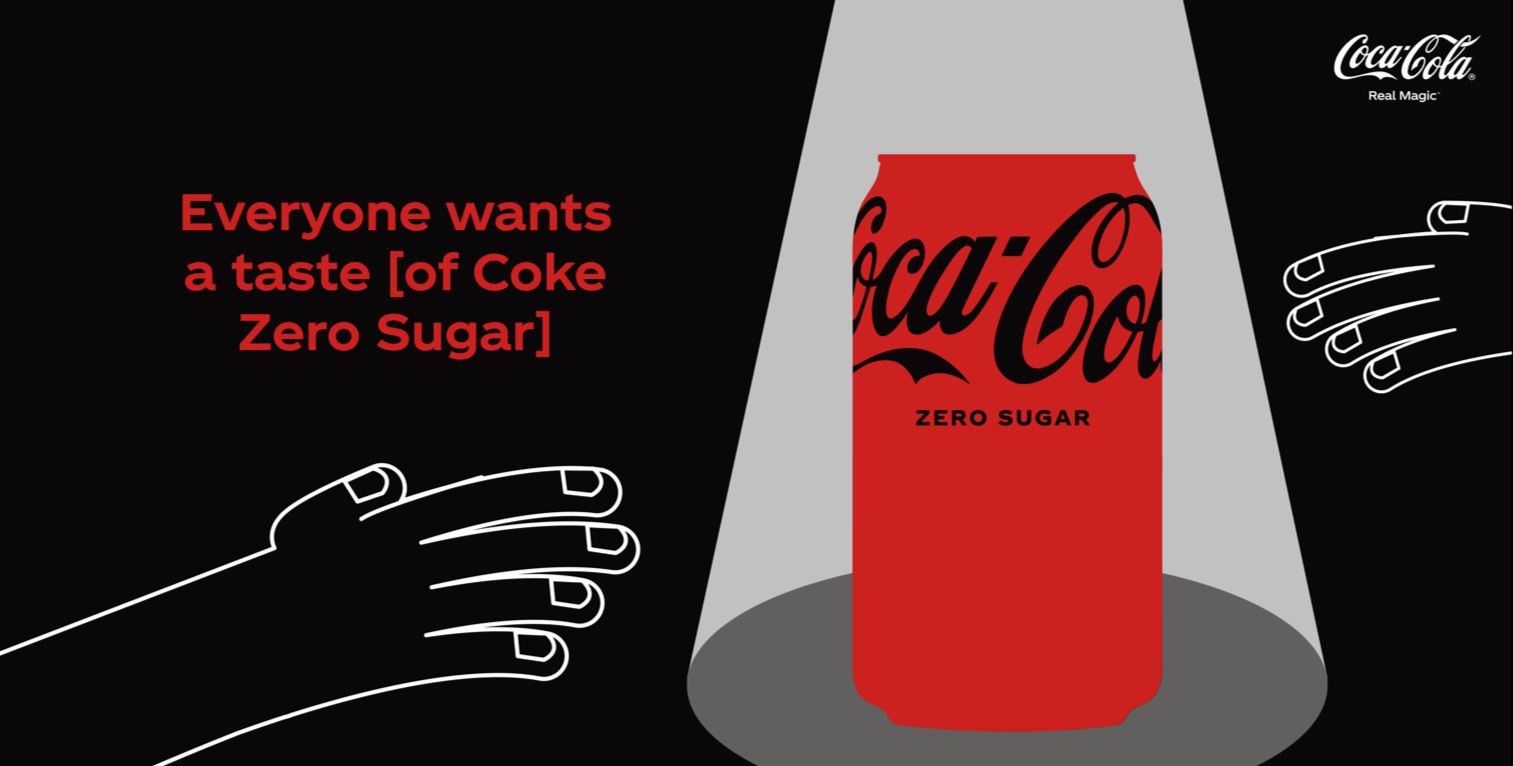
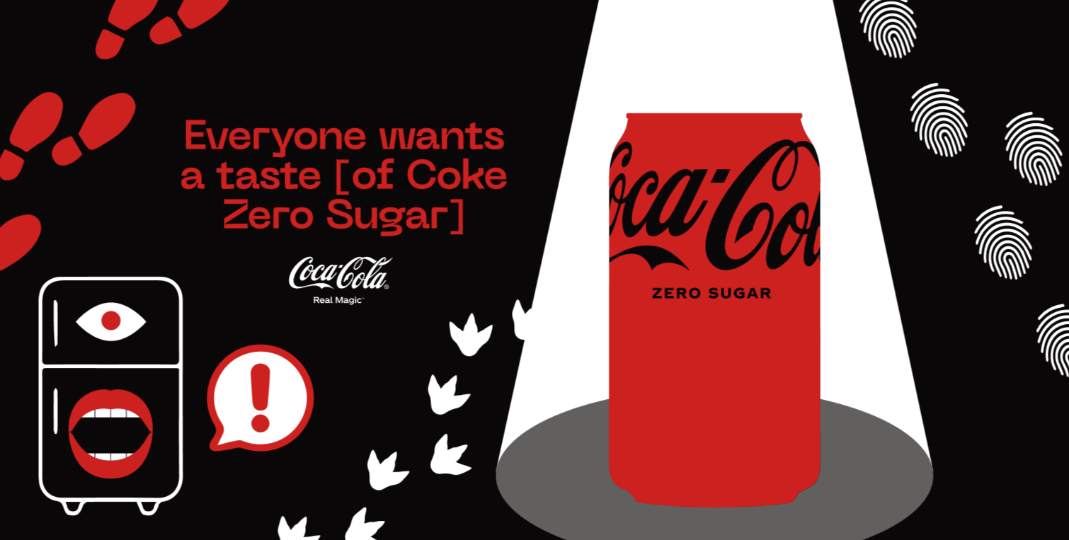
This espionage board was a little too aggressive and serious. The tone we were looking for needed to be lighter, friendlier, and more playful.
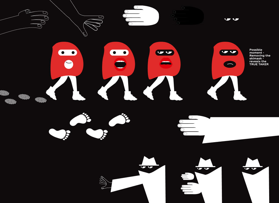
Our exploration lead to more abstract elements — not having the characters of the “Taker” and “Takee” being literal people. I especially like the iteration of a ski mask, walking in bigfoot boots, and leaving a trail of fingerprints as footprints rather than actual footprints themselves. This exploration was a precursor of what was to come...
A Final Headline Emerges

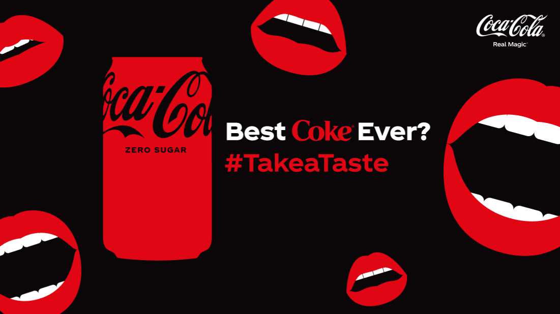
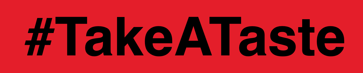
When “Best Coke Ever” is paired with #TakeATaste, the messaging is effective, simple, and clean — allowing the artwork and tone of the campaign to shine through.
We Converged on a Direction
As the exploration of aesthetics continued, a breakthrough moment occurred. What if the characters were not people or abstract elements, but rather, playful monsters/creatures engaging in the light-hearted Coca-Cola heist?
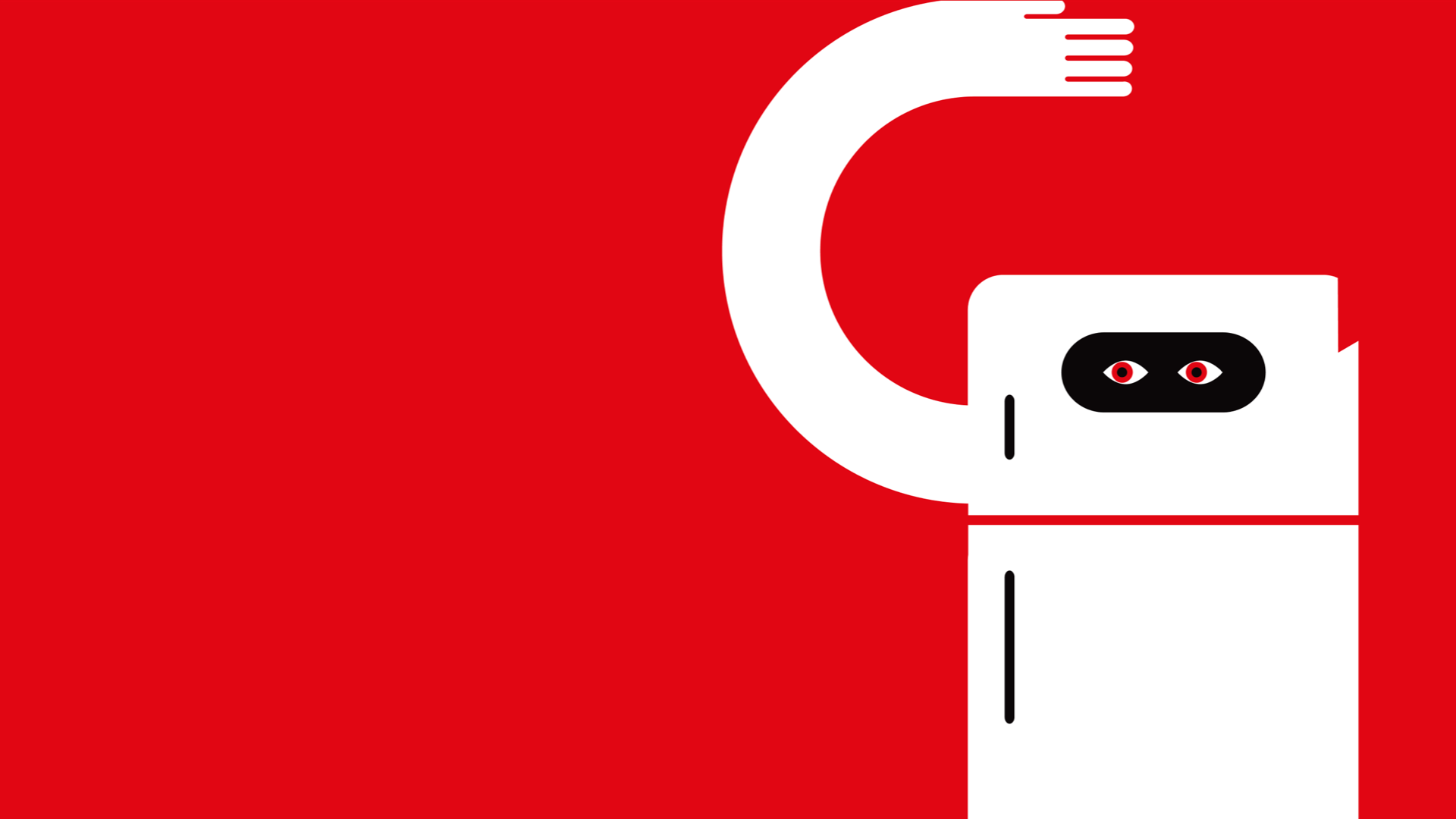
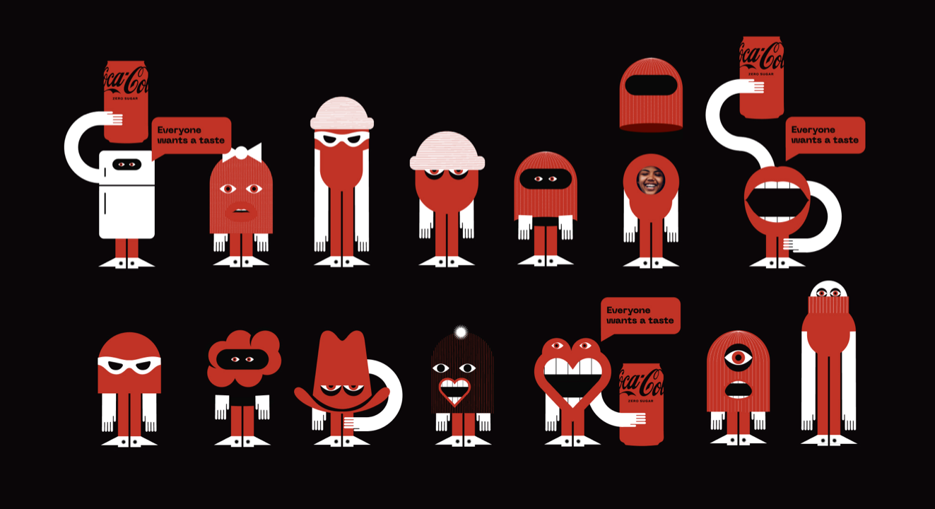
“Tastebuds” Full Character Roster — Early Explorations
Meet the “Taste Buds”, a group of branded, unique characters, that were constantly craving and mischievously stealing other people's Cokes. They allowed the expression of the tone we were seeking from previous iterations: a fun, heist-like, cat-and-mouse game, without being overly serious. It's interesting to see how these leverage the iterations of elements we'd been exploring earlier (hands, feet, eyes, mouths, etc.), and combined them into fun and quirky characters. Ultimately, their final illustrative style would emerge later, but their impact on the campaign was immediate with both our team and Coca-Cola.
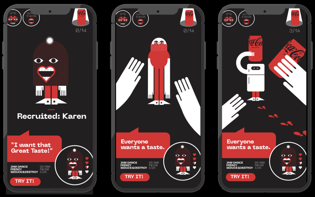
EARLY GAME PROTOTYPE • Before we knew it, they were interacting in all of our expressions — both print and digital.
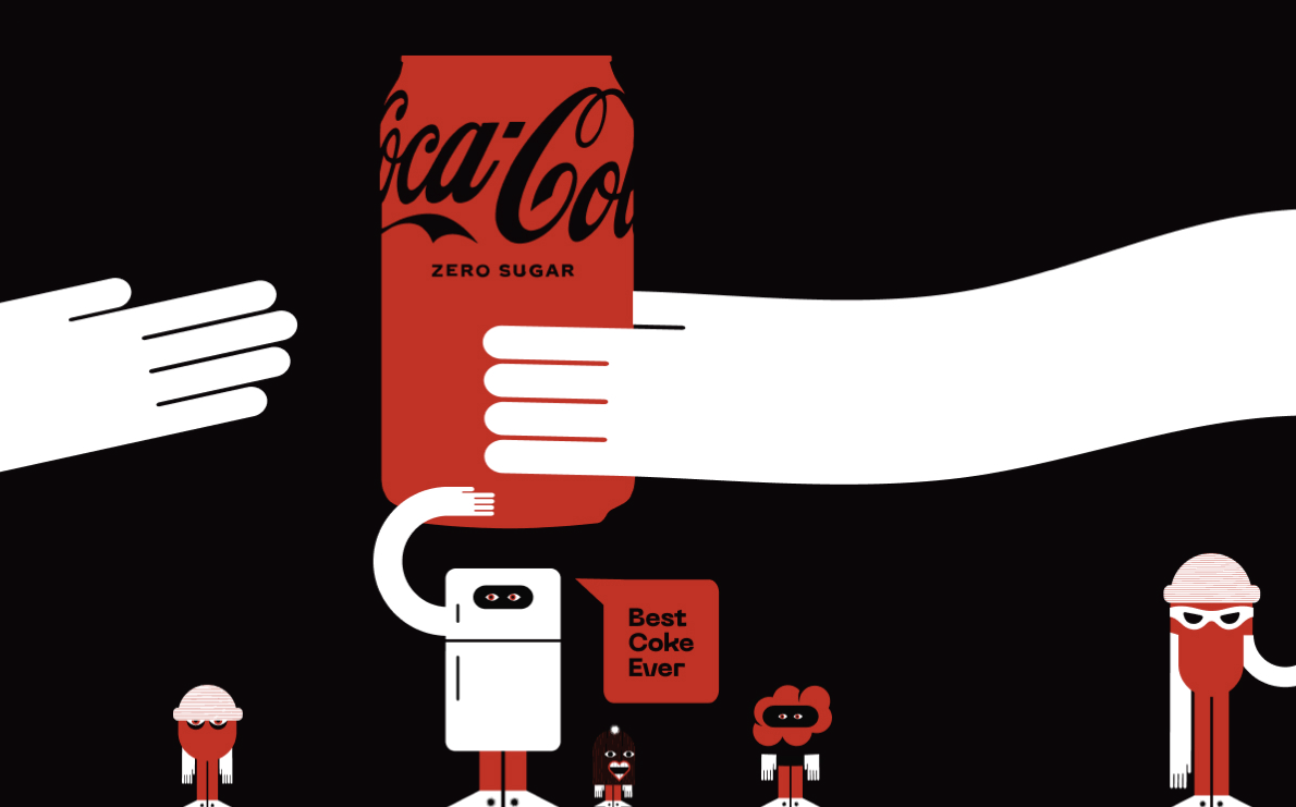

The final touch belongs to AKQA
My involvement in this campaign lasted for a single month, culminating in the delivery of the conceptual pitch deck, which Coca-Cola ultimately approved.
Below is the final campaign, executed by professionals at AKQA.
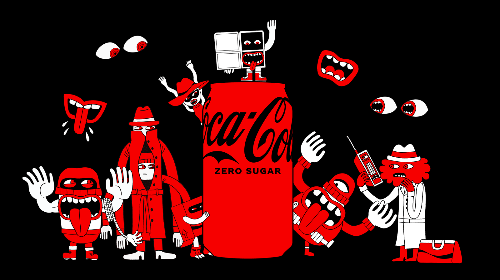
The final characters! Rambunctious, mischievous, and fun — their tone is perfect for what the campaign is ultimately trying to convey. I love the final rough-edged illustrative style they went with here.
Perfectly Executed from Industry Pros
If you want to see the full, perfectly executed campaign, look no further than the AKQA page, showcasing the full breadth of final executions and implementations.
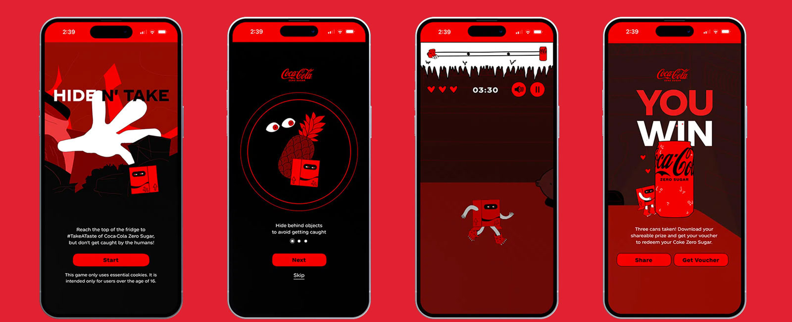
I was excited to see that the video game even made it to the end, ultimately becoming “Hide N' Take”.
The “Security Can” made its debut with influencers seeking to discover who had been stealing their Coke Zeros!
In the World
Coca-colacompany.com Coca-Cola Zero Sugar Invites Fans to #TakeATaste in Newest Phase of “Best Coke Ever?”
Adage COKE ENLISTS INFLUENCERS TO KEEP ZERO SUGAR CANS SAFE FROM THIEVES
The Drum Tasty enough to steal? Coca-Cola Zero Sugar taps influencers to tempt Gen Z to #TakeATaste
Little Black Book Coca-Cola Zero Sugar Encourages You to ‘Take a Taste’ with the Launch of Its Trial-Driving Initiative
EVERYTHING I'D IMAGINED
Every campaign is special, and every brand is unique, but there's something about Coca-Cola. Working on a Coca-Cola campaign was just as exciting and challenging as I had expected. But, beyond that, seeing some of my ideas and explorations contribute in a positive way filled me with such a sense of tremendous personal accomplishment, that upon the pitch deck's completion, I signed and dated a Coke Zero I had been drinking — a keepsake and sort of payoff to the conversation I'd had at Wieden+Kennedy in 2014.
Magic is real, friends. Cheers.