
Email Design System · 03–07 2026
Exact Sciences · Cancerguard & Cologuard Email Template System
This was one of the widest-scoped projects I've ever taken on, pushing my knowledge of design systems and branding to their very limit. This is a deep dive into how a single, comprehensive Figma email template system came together for Exact Sciences, Cancerguard, and Cologuard, setting the digital team up to move faster than ever.
MY ROLE:
Associate Creative Director • Email Template System Designer
TEAM:
The Exact Sciences, Cologuard & Cancerguard team
The Mission
Build a responsive, comprehensive Figma email template system that incorporates the brand theming for Exact Sciences corporate, the Cancerguard brand, and the Cologuard brand.
Section One · Defining the Problem
Preliminary Challenges
The template system is the final deliverable, but a system isn't as simple as an elegantly designed single-use template. Before designing anything, I had to stay objective about how it'd be built in Figma from perfectly branded components: one that allows for fast production, swift art direction, and easy approval by legal teams, so finished emails can deploy quickly across multiple markets. Getting the target right, rather than rushing to make something that merely looked finished, was the first real work of the project.
The original brief was, in truth, very limited. It amounted to little more than a request to "design a Figma email template system." To their credit, the Exact Sciences team trusted the preliminary knowledge and expertise I had brought from other brands like Apple, Nike, and Grön, and they gave me the room to use my best judgment to provide them with an effective solution. I outlined the following challenges that the template system needed to solve, and used them throughout the project to measure whether the final deliverable was genuinely everything the team wanted.
1
Applying an evolving brand
Cancerguard was moving into a refreshed, more cinematically grounded aesthetic that was still rolling out across other collateral as I was building the templates. The system had to apply an identity that was still a moving target.
2
Designing with legacy & new assets
I worked from the brand guidelines and partnered closely with the brand's art and creative directors to keep the system true to the new identity. A clear example: the emails needed to mirror the brand's (Cancerguard) current website, so any email reads as one continuous experience.
3
Speed to a polished first draft
From brief to dev, getting the team to a polished first draft as quickly as possible is the optimal goal. At Exact Sciences, approval was especially time-consuming, as every word and claim understandably needed to be approved by their legal team. Given what they sell, cancer detection, their language is tightly controlled.
Speed, ultimately, is the maximizer: the key measure of whether the entire system was successful or not.
Section Two
Learning the Design System
I set up meetings with people across the entire Exact Sciences organization: Cologuard, Cancerguard, the design systems team, the writers, everyone. The early stretch of any project like this is always interesting. You are a fish out of water with a new brand and a new team, and everyone is moving a mile a minute. You have to drop in and learn the brand exactly as it stands today and then try to build where it's going.
In this case, that meant learning three brands at once: Exact Sciences, the mother brand; Cologuard, the key product and the breadwinner; and Cancerguard, the newer product the company was working hard to elevate, with its revitalized branding.

The new template system would replace their existing one, but they didn't want it to echo the old aesthetic. I met with their art directors and creative directors, using the emerging Cancerguard branding to answer a deceptively simple question. What brand is this template actually creating, and whose aesthetic will it ultimately encapsulate? The answer was a blend: it needed to reflect the new, modernized Cancerguard branding that was still being rolled out, and it had to deliver one universal, themeable content block that could inherit its look and options directly from Figma.
Designing the System, Not the Email
A design system isn't a single execution. Before you can build something comprehensive, you have to wrap your head around where the existing system actually stands. I spent real time getting up to speed on their Figma design system too. I met regularly with their lead design systems designer and we built an easy rapport. I was delighted to find their system was even more sophisticated than the one I had built at Grön, maintaining distinct, robust systems for color, iconography, and typography, all of it living natively in Figma. Even better, it was a published component library, which meant email components could be made accessible to any designer working on these pieces. If built correctly, first drafts would come quickly and be perfectly branded, with a consistent result across all three brands, especially once paired with Figma theming.
Section Three · One System, Three Brands
Atomic Components & Theming
An email is made up of so many different little pieces; the Lego block analogy is a good one, and I keep coming back to it. You build a lot of small pieces, and then, when a brief comes down from leadership, the designer assembles an email from those building blocks.
Building the Blocks
I explored what those building blocks should be: the typography, the imagery, the spacing and the spacing tokens, all perfectly branded and consistent. Their Figma system allowed for a healthy amount of grounded exploration. The complication, again, was Cancerguard. The pieces that were live in the system still belonged to the old branding, so I had to build my own iterations of the new-branding Figma components from scratch. We explored for a few weeks and ultimately landed on a solution I'd call a happy middle ground between Cancerguard and Cologuard, with the understanding that the Exact Sciences branding might come later.
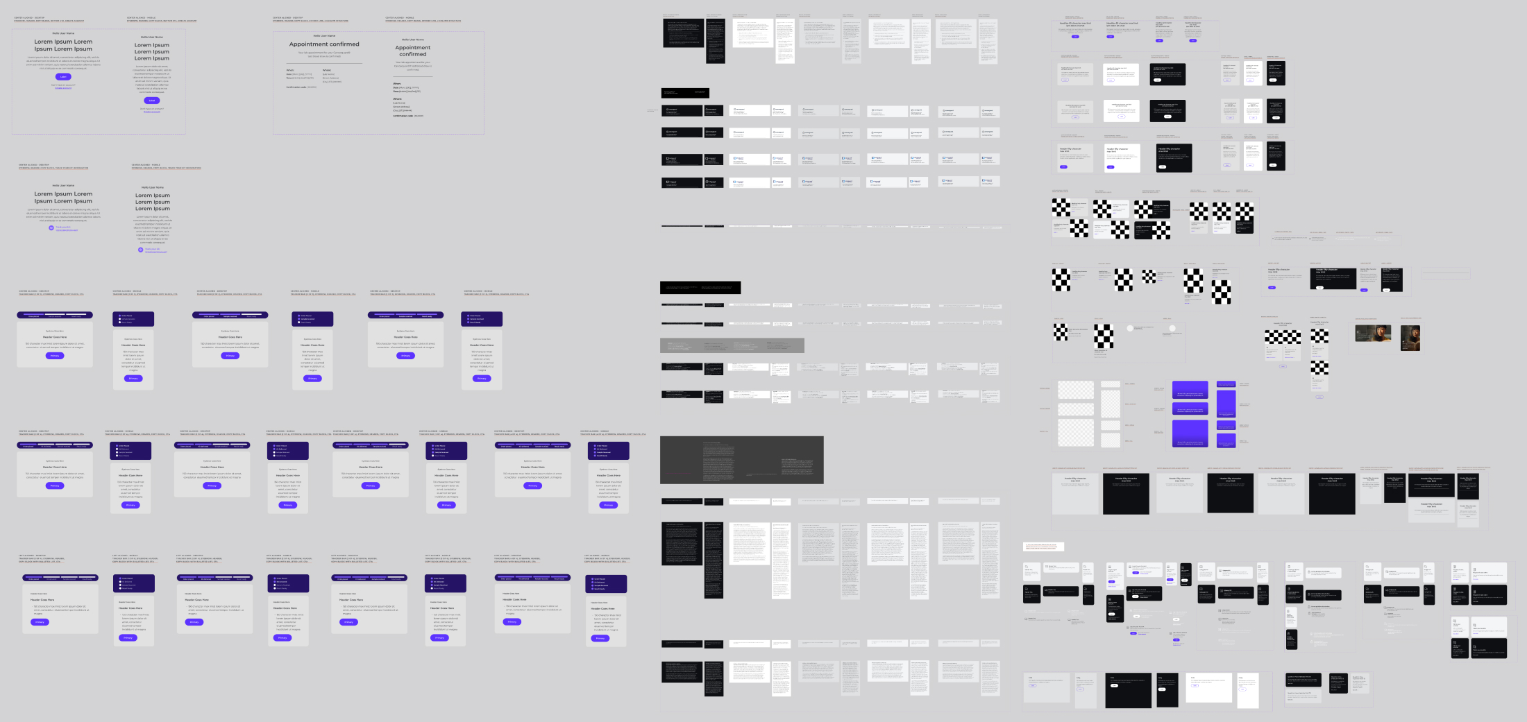
Email components, the building blocks, the atomic components, variables with spacing, text and graphic alignment.
One Set of Components, Many Themes
Ironically, the mother brand was the bedrock, yet it was the last to be fully resolved. I built the components from the Exact Sciences brand library at the base, and then applied Figma themes (containing predetermined typography, colors, etc.) for Cologuard and Cancerguard over the top of the individual layouts. This effectively tripled the efficacy of the templates, as instead of designing a single instance for Cancerguard, it could now (with theming) be used for Exact Sciences and Cologuard seamlessly.
A Unifying Force
Each batch of components carried multiple variables for light mode, dark mode, and different colors. Cologuard and Cancerguard ended up sharing the same tiers of spacing and padding, so when you look at an email across the three brands, what you see is a single unifying force of UI and brand design running through all of them. It is very similar to what I did at Grön, and to what any house of brands like Apple does. With the updated components complete, and built specifically to fit the new branding across Exact Sciences, Cologuard, and Cancerguard, the theming could finally be applied cleanly to all of them from a single source.
Section Four · Speed to First Draft
The Figma Curve Ball: Figma Slots
In the middle of all of this, Figma released a new feature called Slots. At the risk of getting overly granular, a slot is a designated instance that can be pre-loaded with components from a published library. It makes loading pre-designed, ready-to-use template elements incredibly fast. Once those elements are dropped in, a designer, or really anyone on the team, can edit the copy and the attributes directly, shortening the distance to the all-important polished first draft.
It was a serendipitous breakthrough. Built effectively, it'd let me arrive at a rough draft I could put in front of art directors, creative directors, and copywriters within a day, instead of a week or longer.
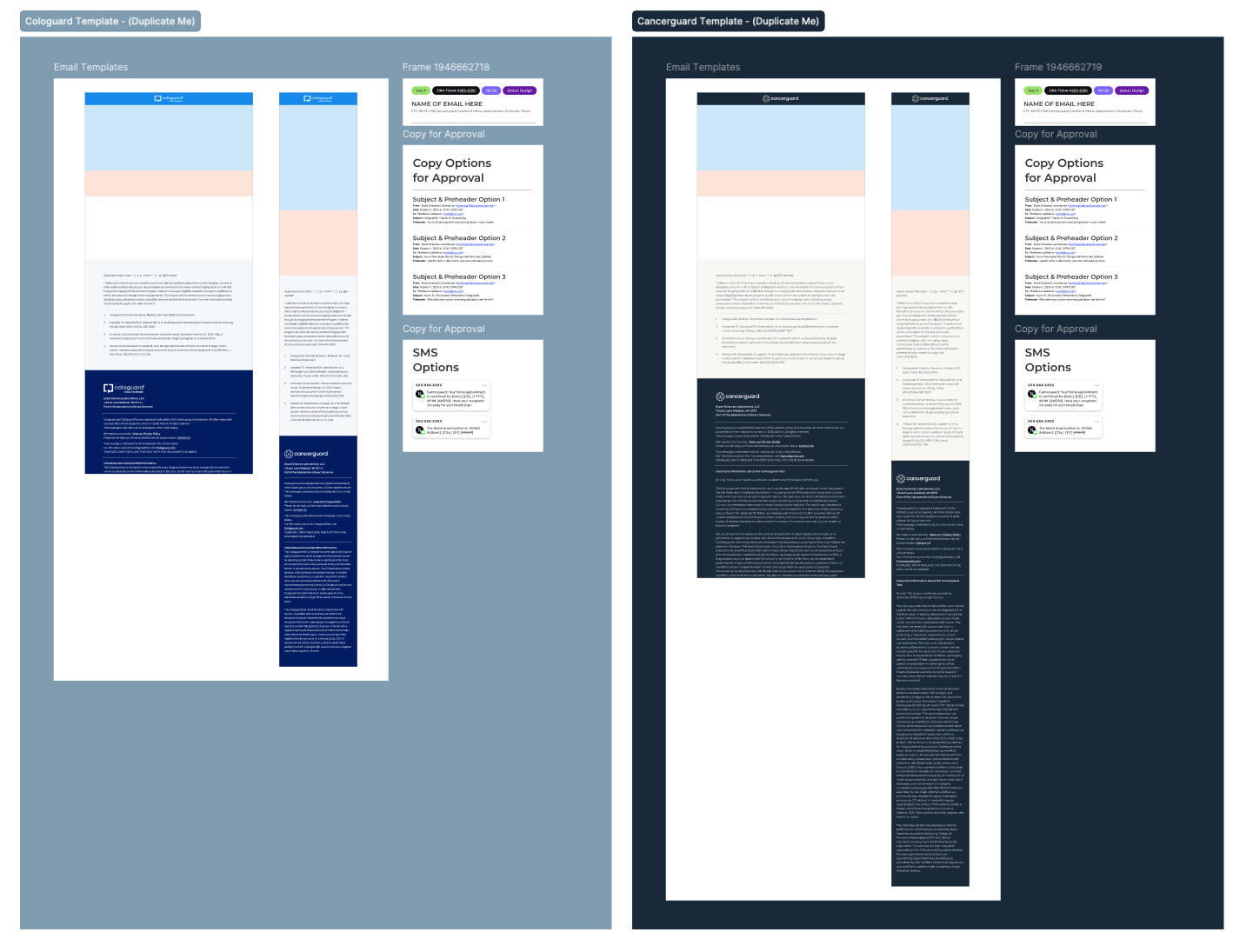
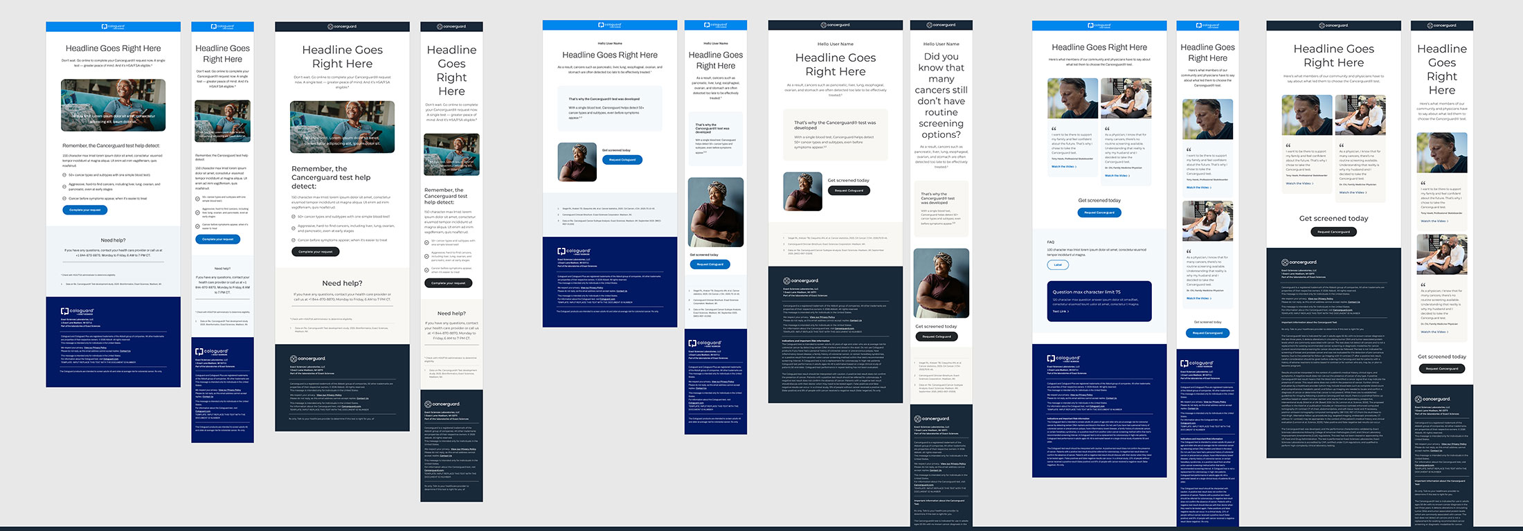
The full templates for Cologuard and Cancerguard. These included desktop, mobile, Jira ticket statuses, SMS options, and headline and subject line renderings, making it easy to get a draft of not just the email art, but an entire campaign.
The Four Slots
In practice, the email broke down into four primary slots:
1. The logo banner. The very top slot loads the logos, with prepared instances of white on color and color on white.
2. The primary message. This slot encapsulates the principal message and always keeps the text above the fold. That's something I learned at Apple: the messaging should load before the imagery, so the words land first. The system inherits that behavior by position.
3. The body. The second position is the guts of the email, holding the copy blocks, the grids of layout elements, the pull quotes, and everything in between.
4. Callouts, references, and the footer. The next section handles the callouts and footer references that recur again and again across email templates, accounted for in an elegant, reusable way. Legal reviews every email from head to toe. If the footer language is already approved for the three general types of emails the team sends, the lawyers can confidently skip re-reviewing it. That alone can shorten the process by a few days, and a few days can make all the difference in final delivery.
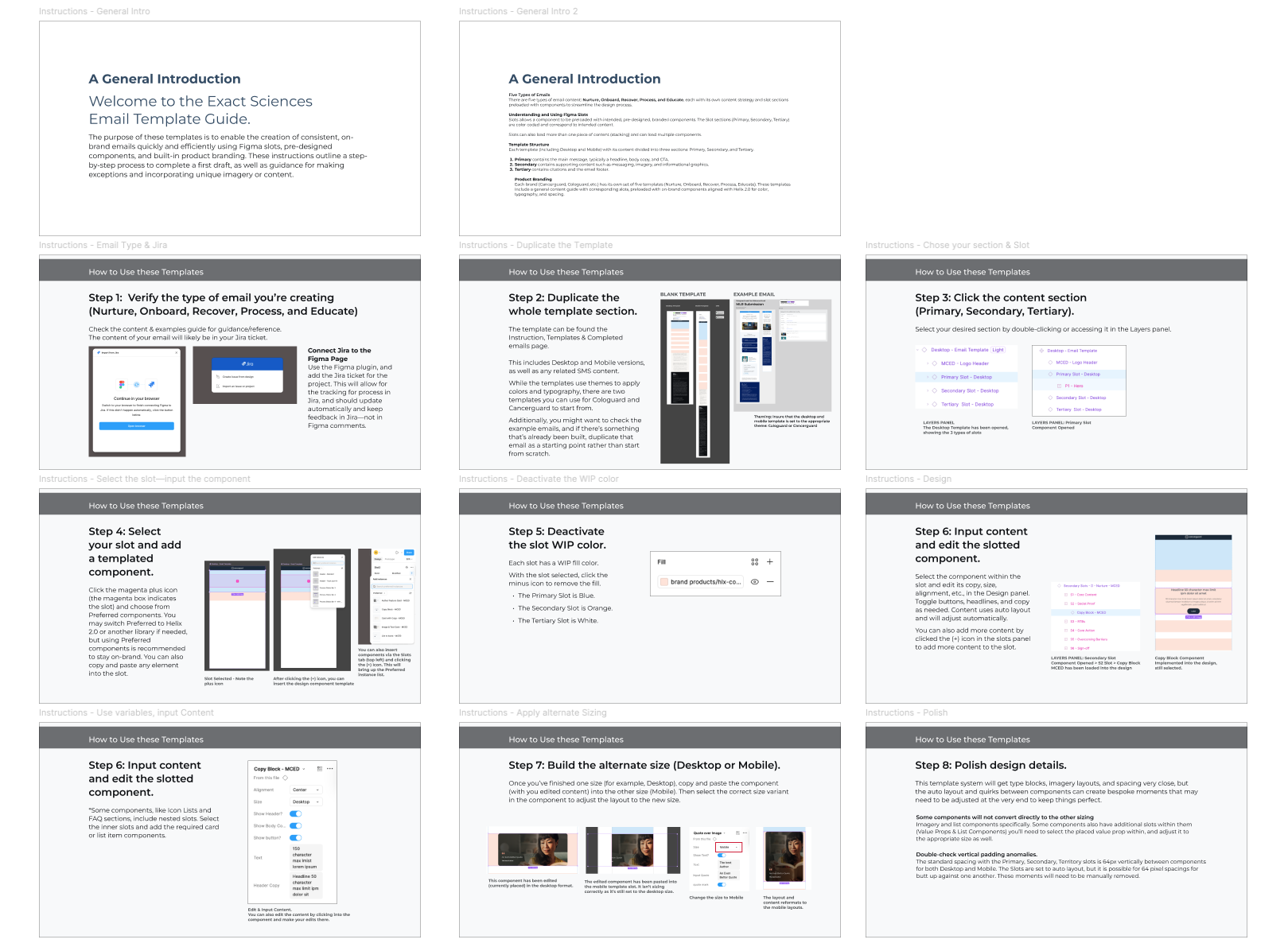
Instructions detailing how the designers and team would utilize and produce emails with the systems.
Section Five · Mission Accomplished
Pushing the Button on Standardization
In the end, we accomplished everything and more, as the scope grew well beyond the initial ask. It became a system of perfectly branded components, themed through Figma, paired with a set of specific instructions. I even recommended and built a Jira plugin in Figma, which is how the team processes briefs. That set Exact Sciences up to assign work and produce templated emails faster than ever before.
A Cologuard email I designed myself became the guinea pig for the system as a whole, allowing me to playtest and squash any bugs. Using the template system, I pulled a rough draft together in a matter of hours rather than days. This allowed us to focus more on polish rather than sprinting to the finish, with no risk of breaking the whole email just to make a small change.
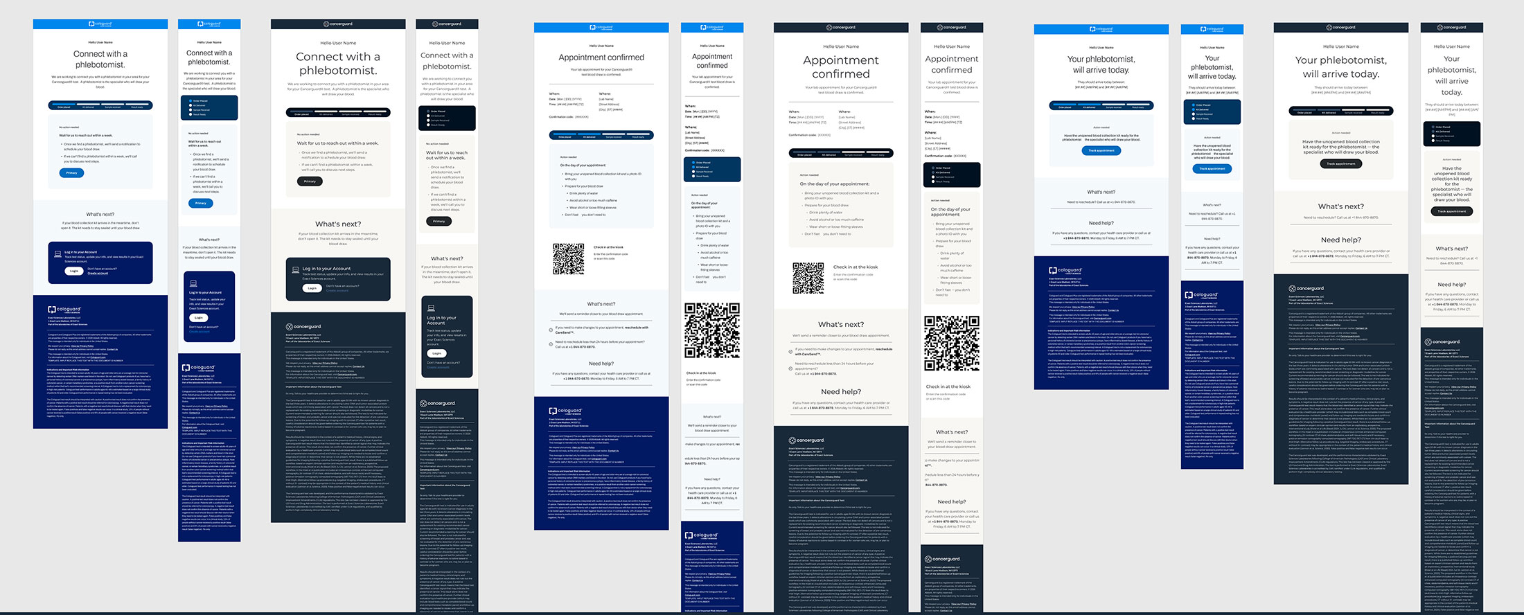
Process emails, assembled with the atomic components. Note the unification of the UI, but that the colors and typography inherit the theming of the Cologuard and Cancerguard branding.
Nurturing content email examples, created for reference by designers when assembling the new content.
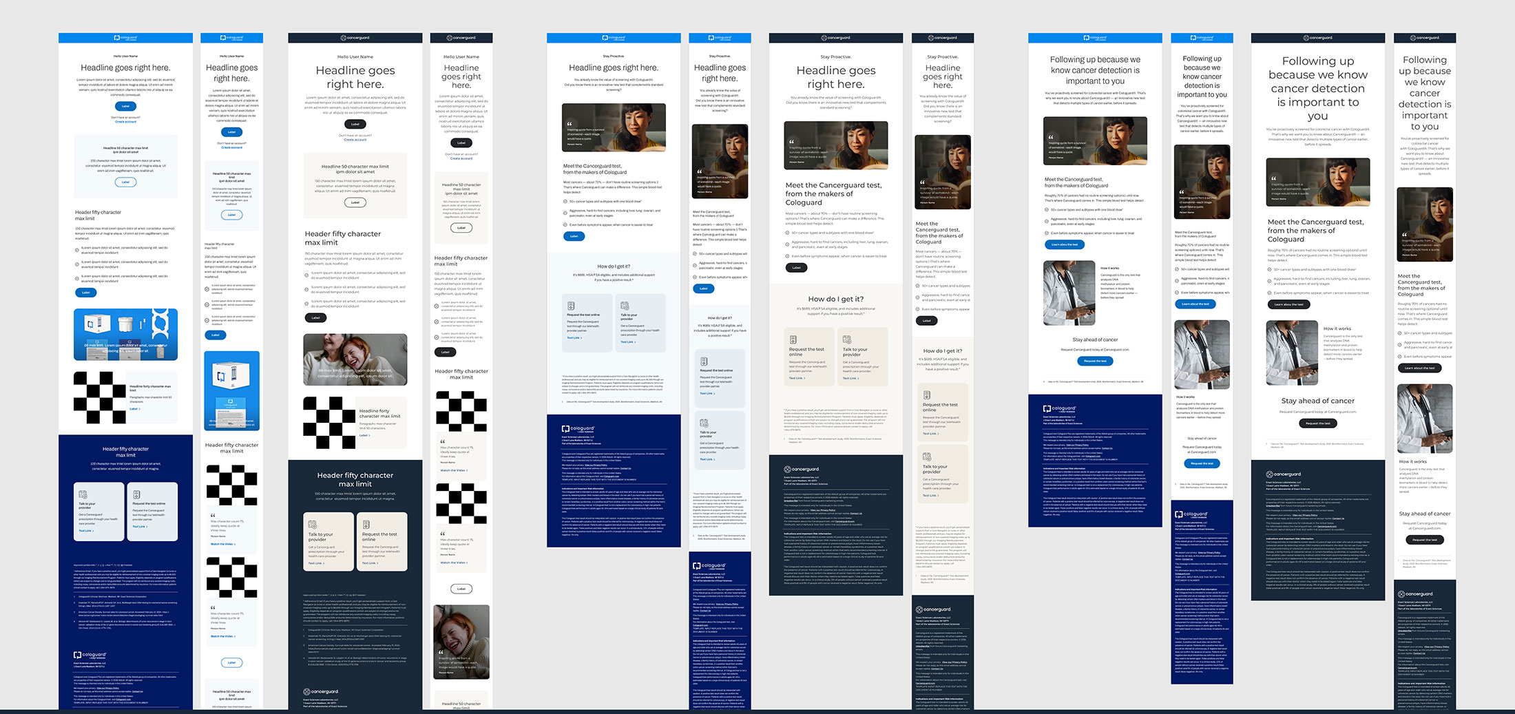
Marketing email examples, all built with the branded pieces, allowing for easy reference.
Deliverables Accomplished
-
A responsive, comprehensive Figma email template system
Delivered as a published library of atomic components pre-loaded into templated Figma Slots that assemble into complete, responsive emails.
-
Built on existing Figma design system elements
Rebuilt from the Exact Sciences brand library at the base, inheriting their established color, iconography, and typography systems rather than starting from scratch.
-
Figma Slots and theming resolved for consistency
Used Figma Slots to drop in pre-published components fast, and a single themed component set with light, dark, and color variables to keep every execution consistent.
-
A faster path from brief to approval
Documented instructions built into the team's Jira ticket workflow, plus a cloud-based single source of truth and standardized footer language that speeds legal review by days.
What I delivered set the organization up to design emails and gather feedback faster, reaching that all-important first draft sooner with more time to make the work shine. I'm proud to have left the team something that makes their work better as they bring life-changing products to the people who need them.