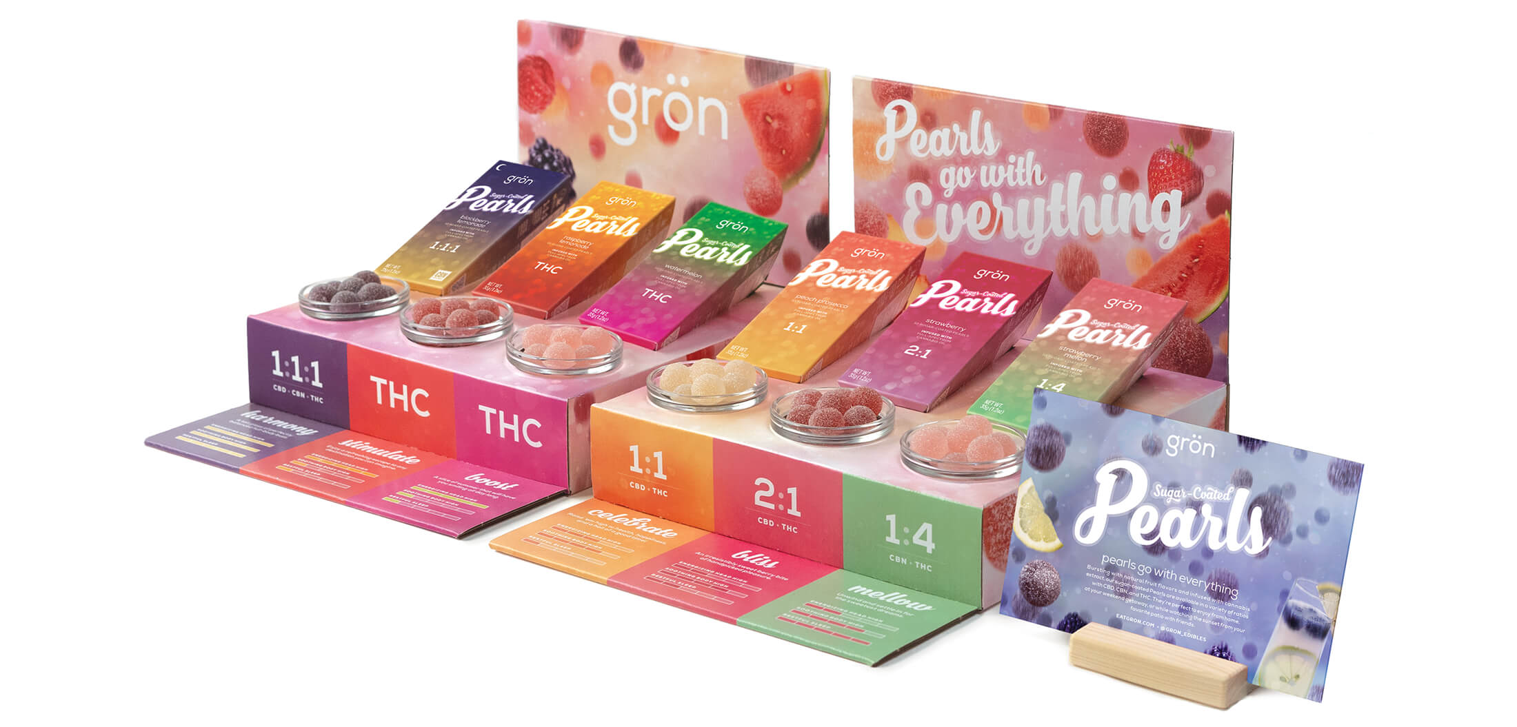


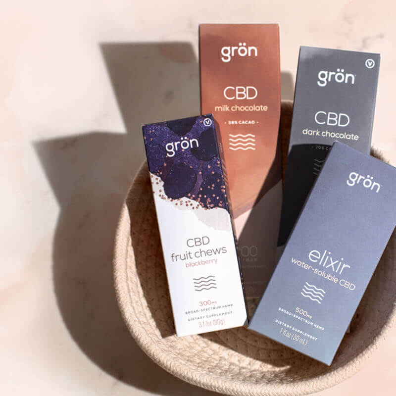
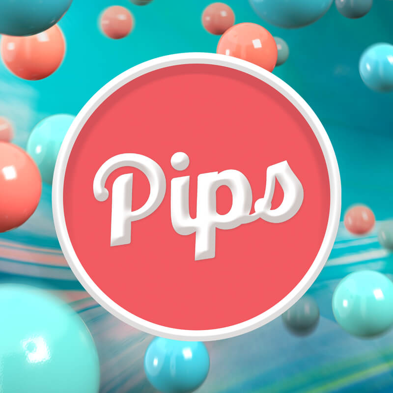
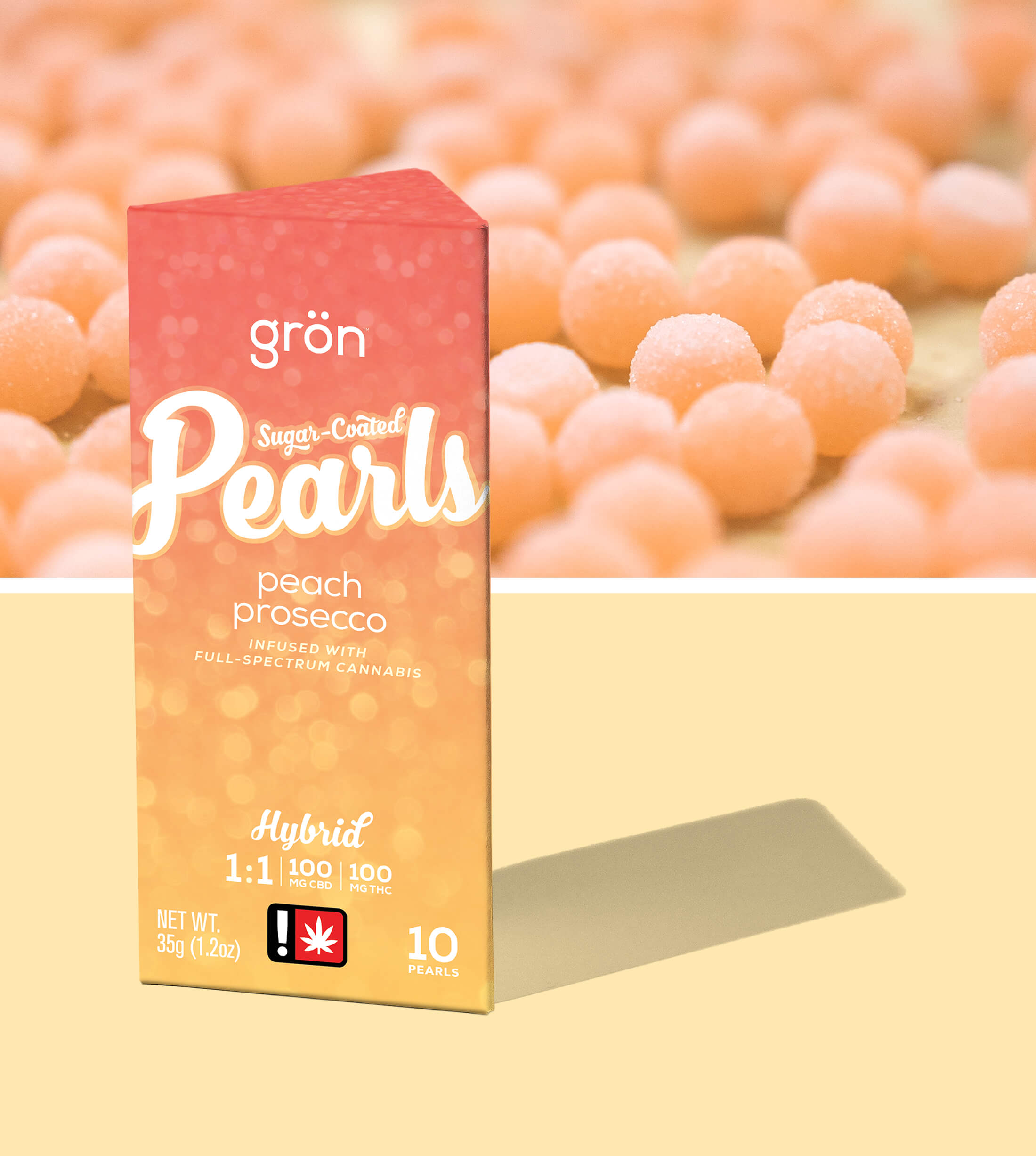
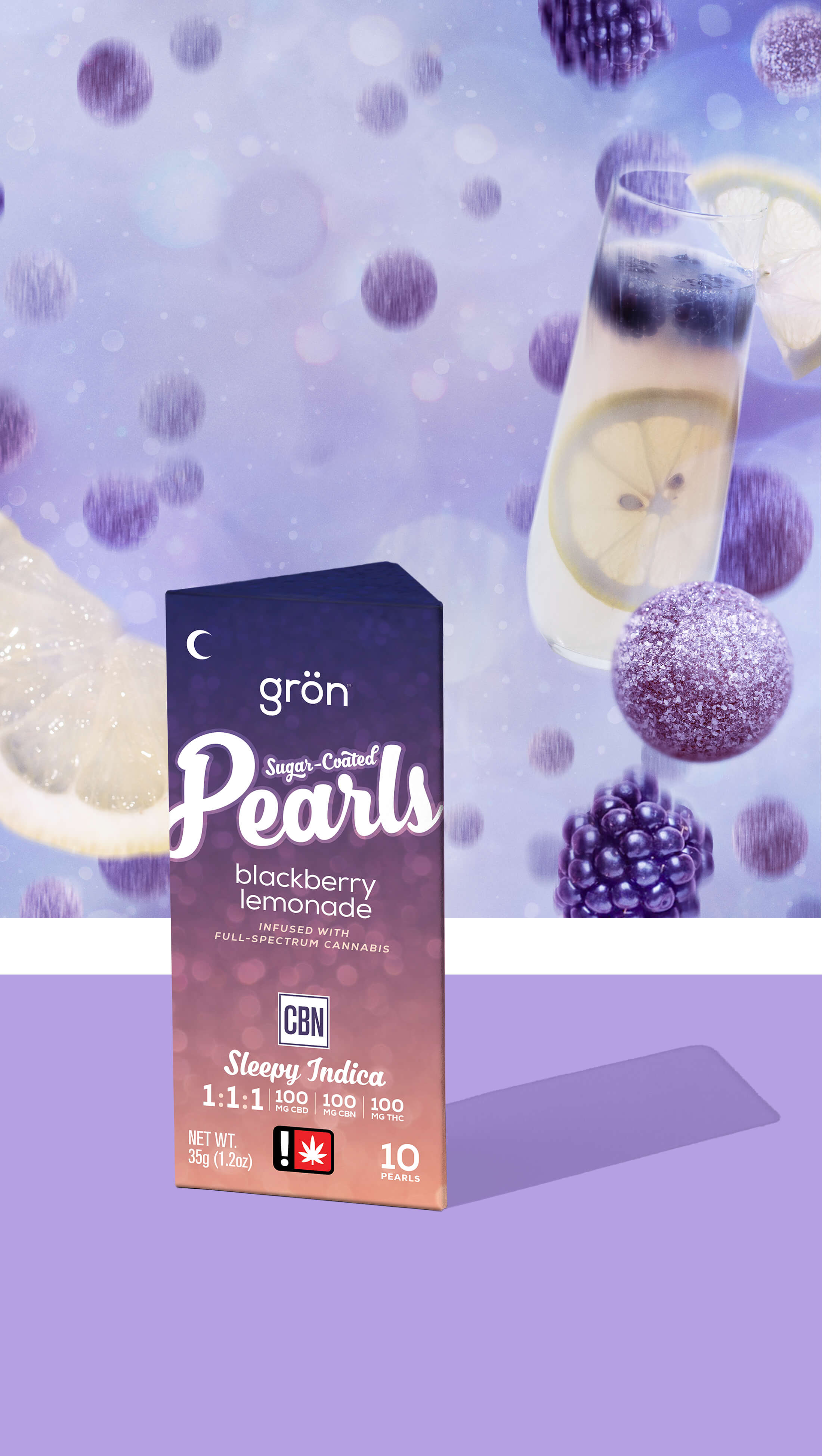
Grön • Sugar-Coated Pearls
Of all the product lines I worked on, the Sugar-Coated Pearls probably went through the most dramatic evolutions in both packaging and support imagery before finally finding its voice.
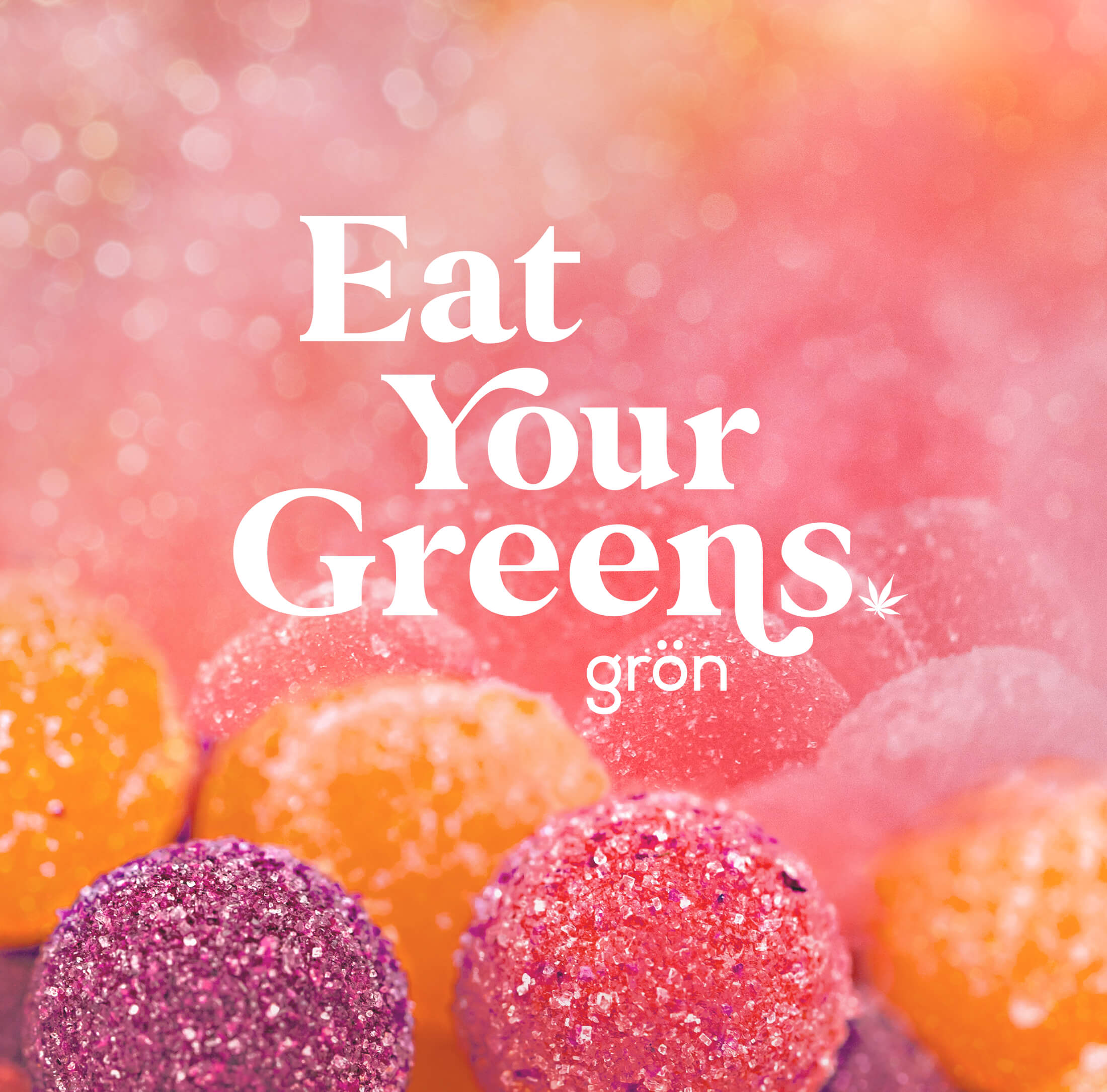
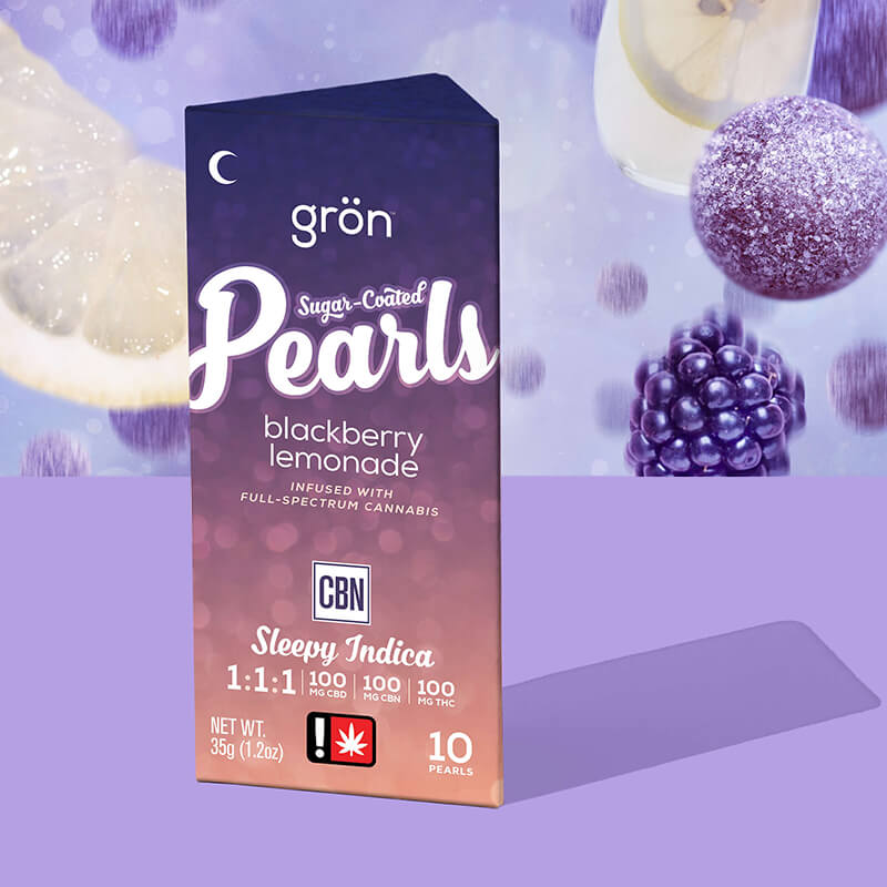
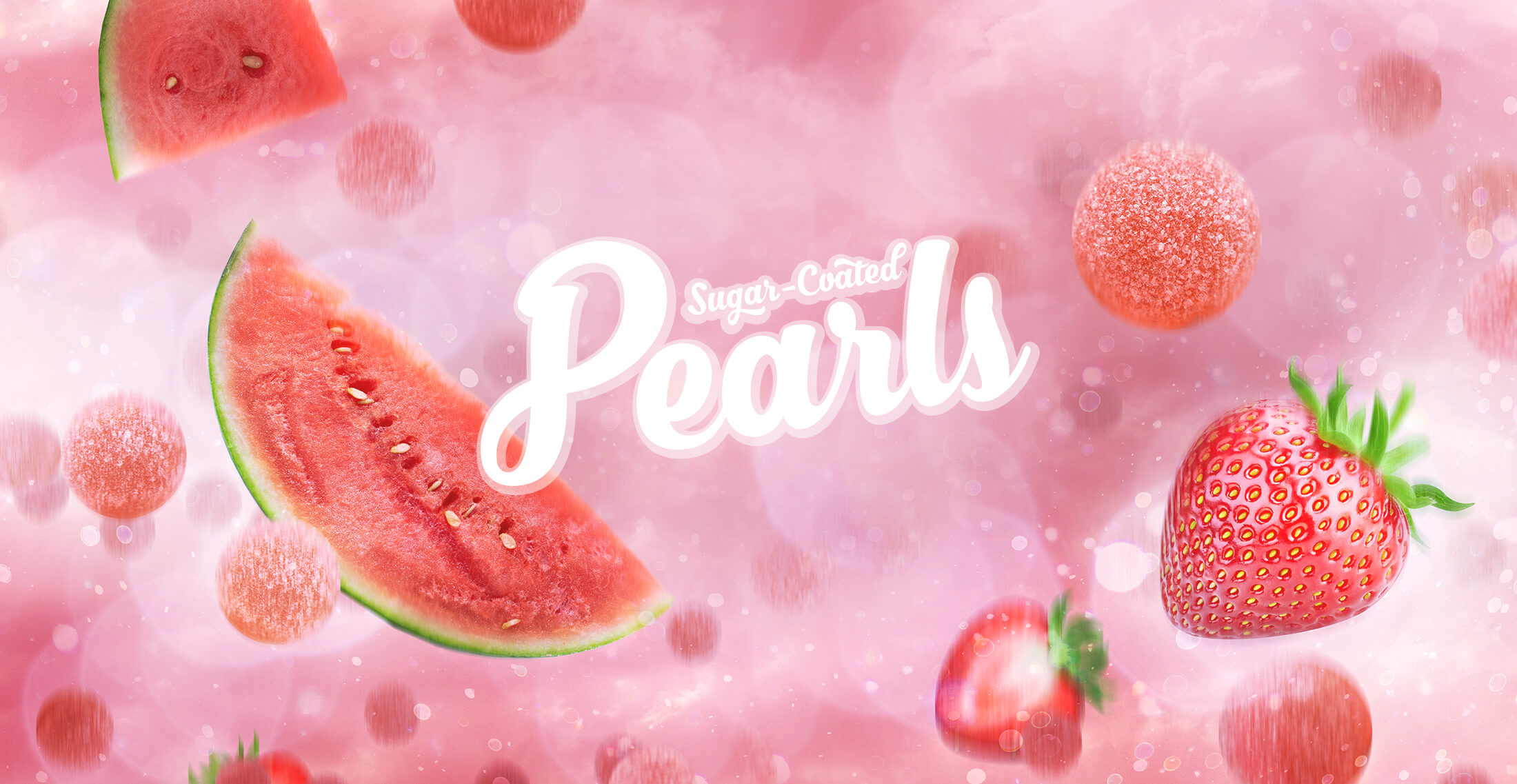
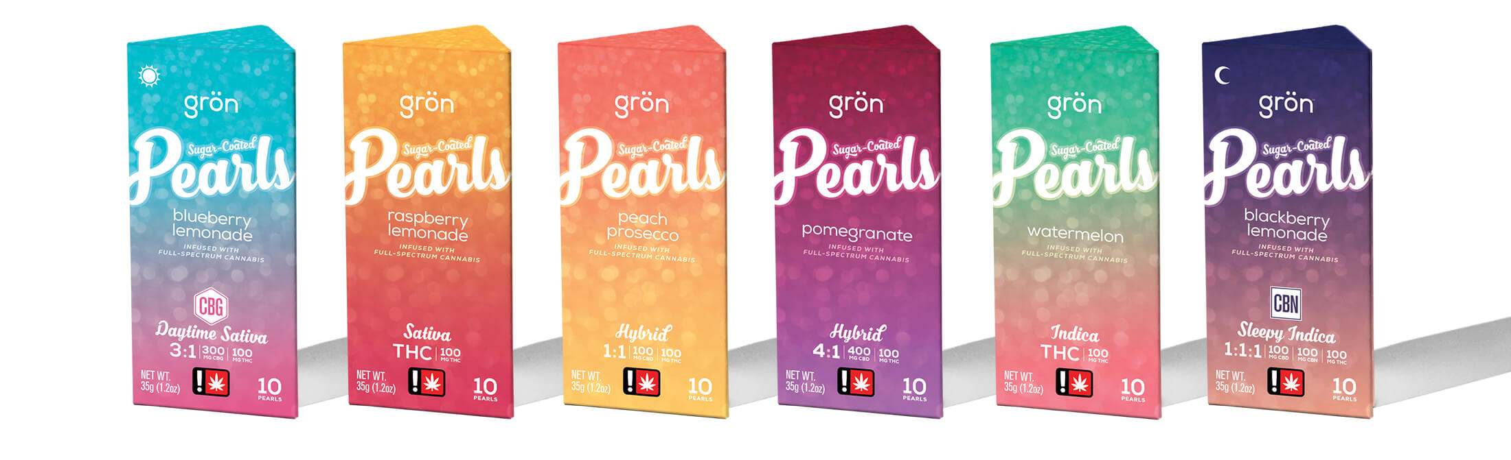
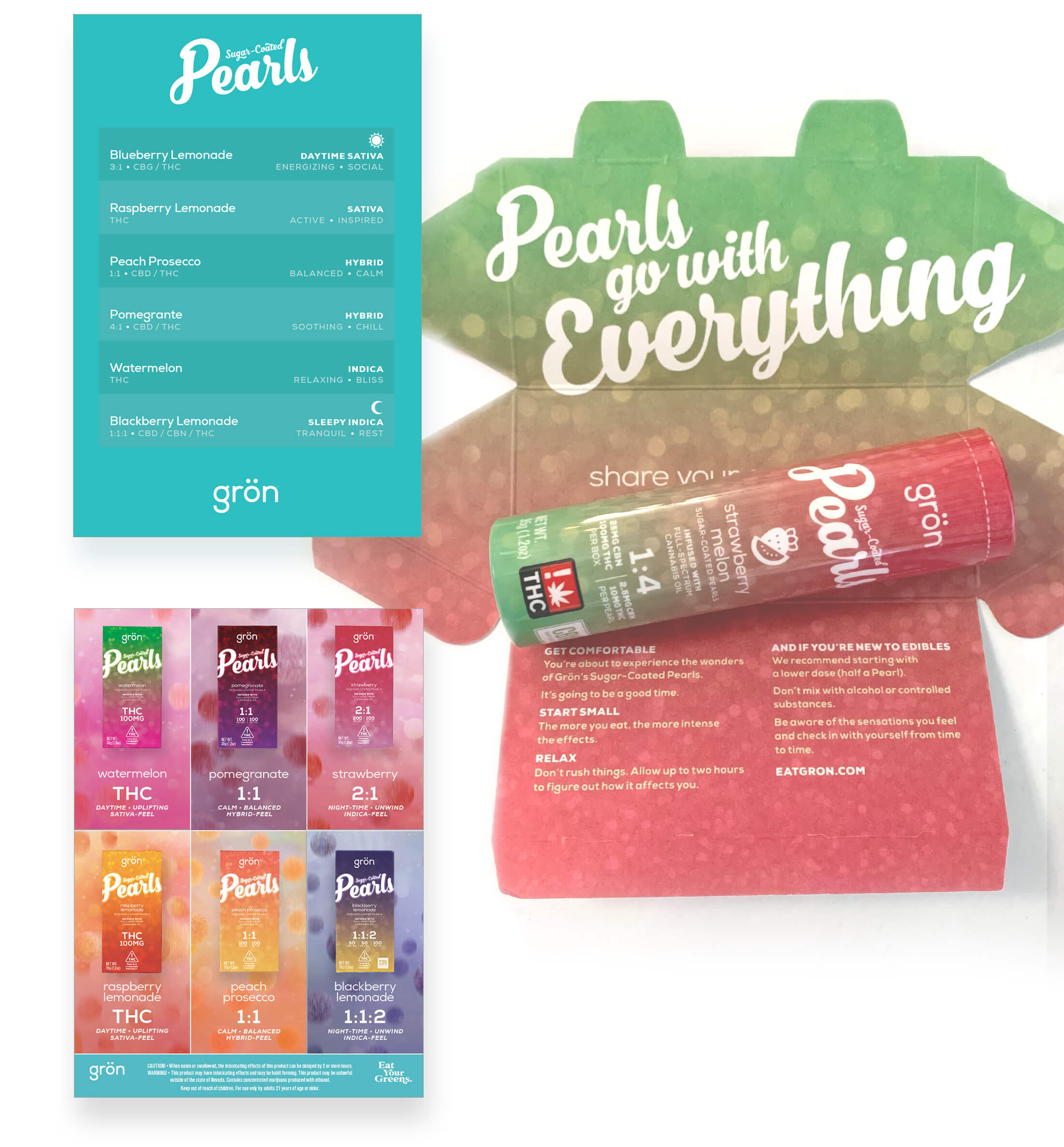
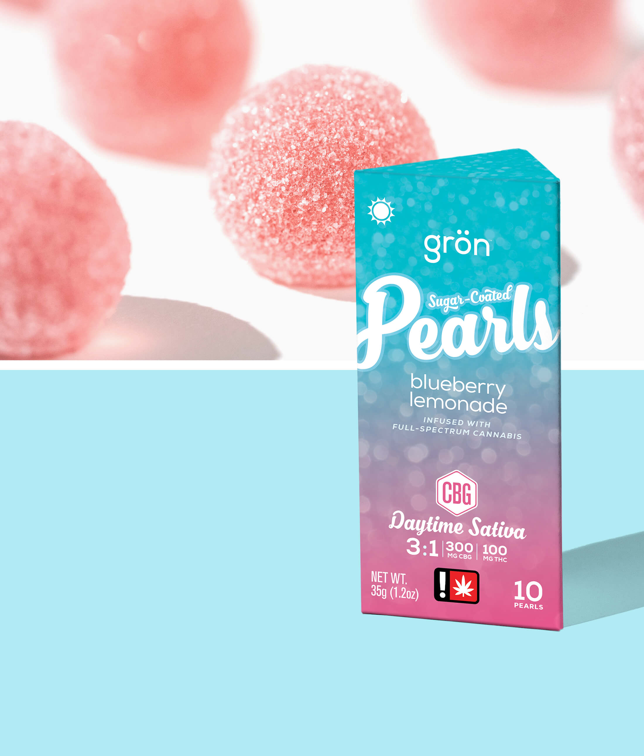
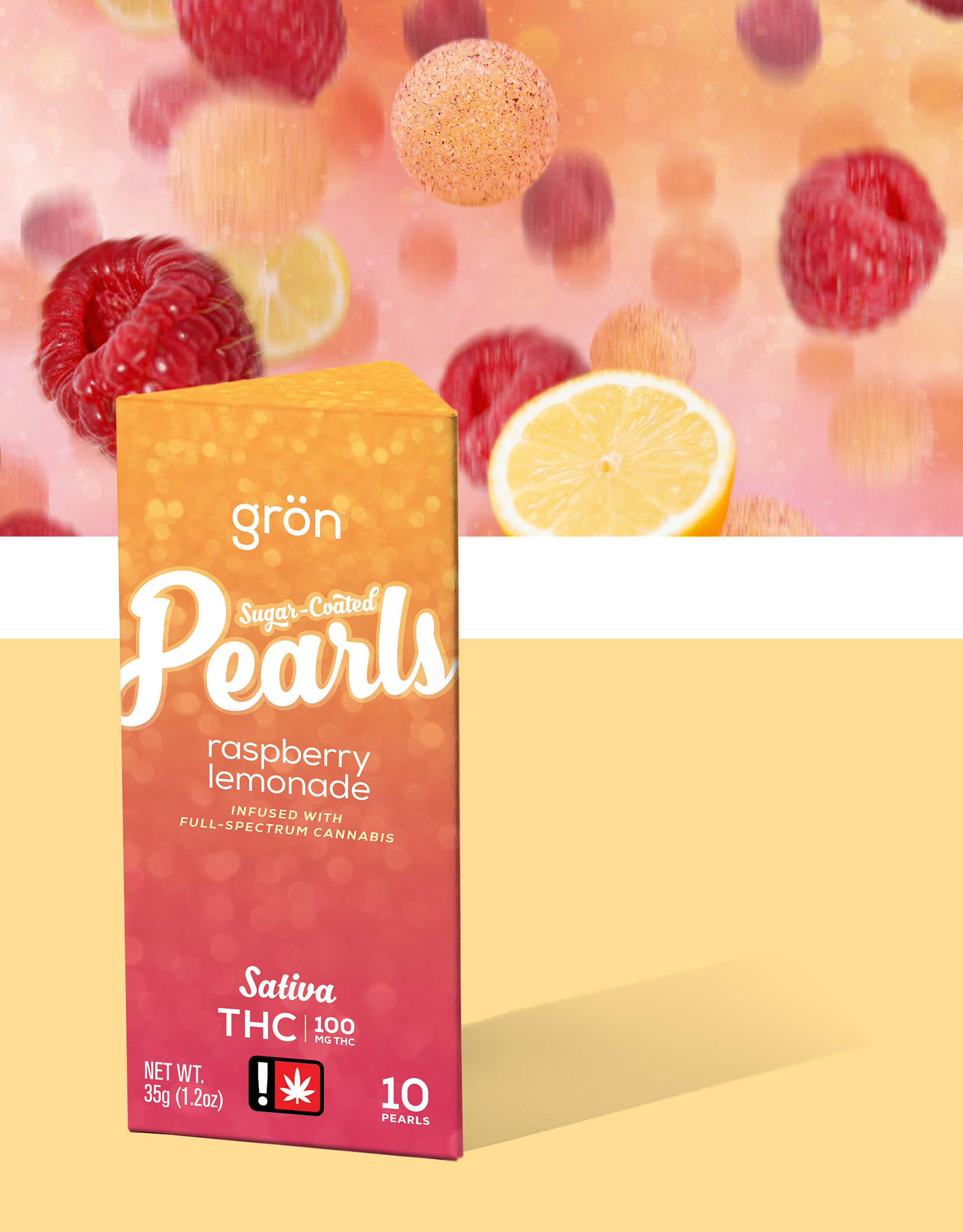
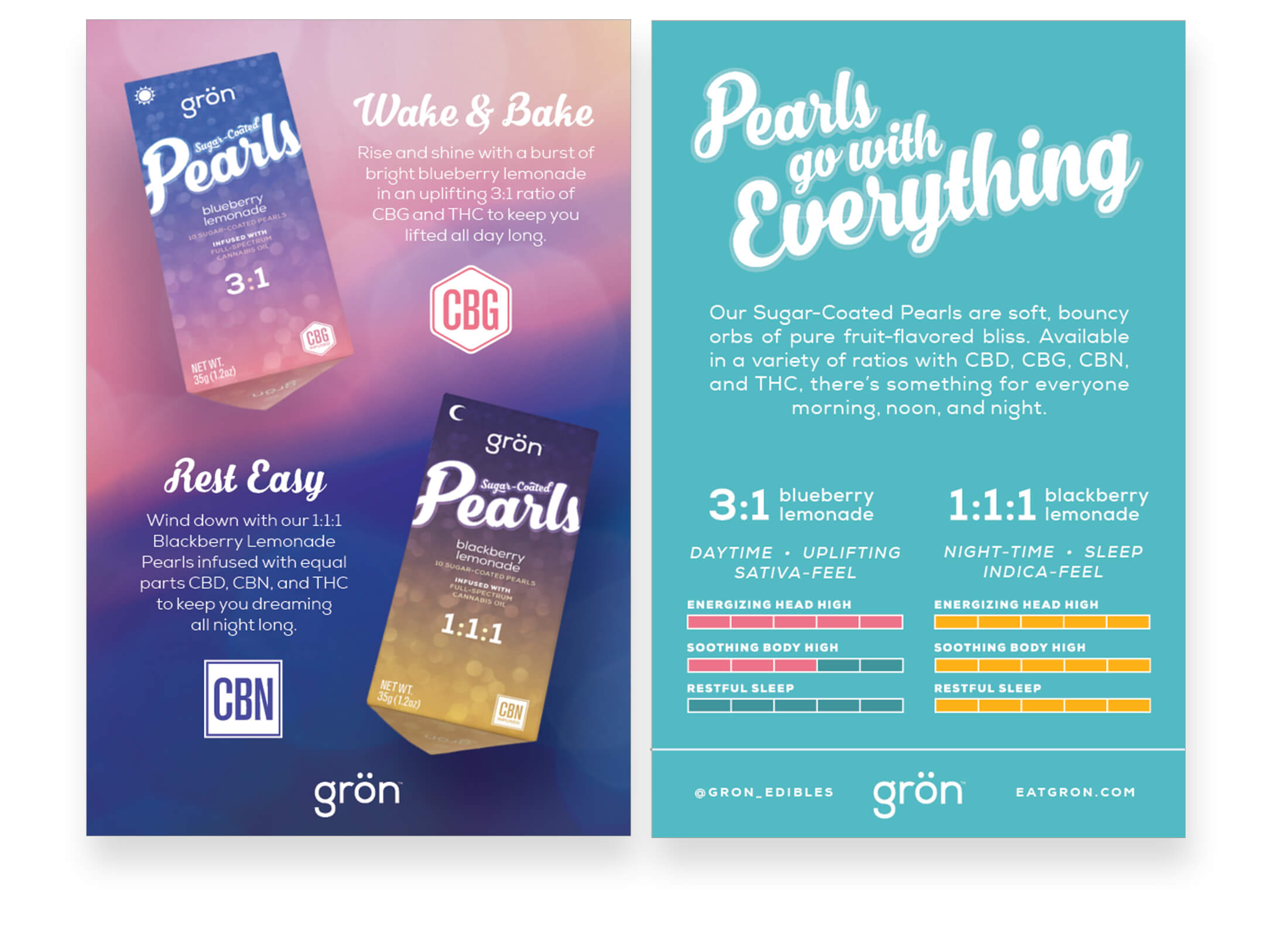
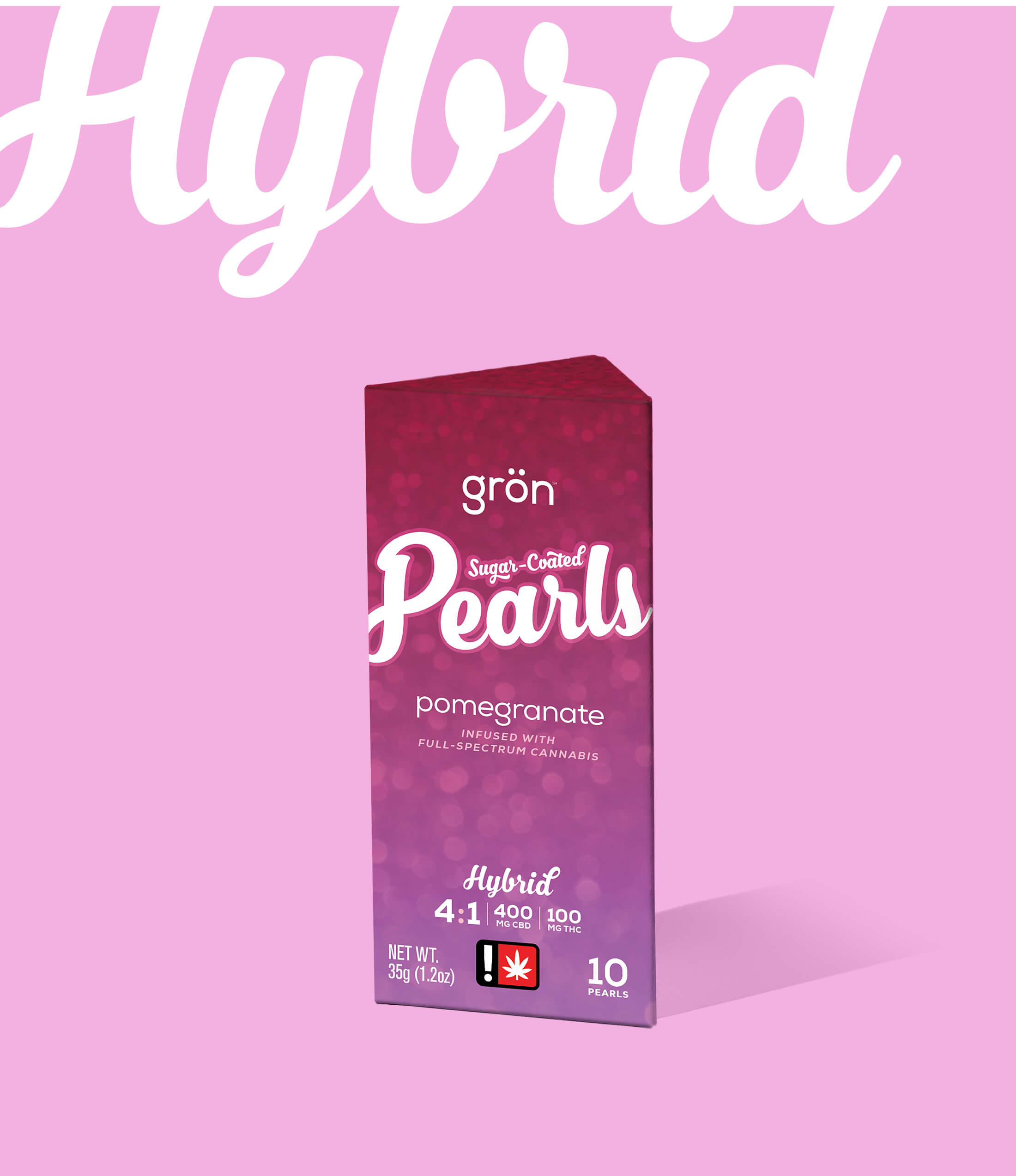
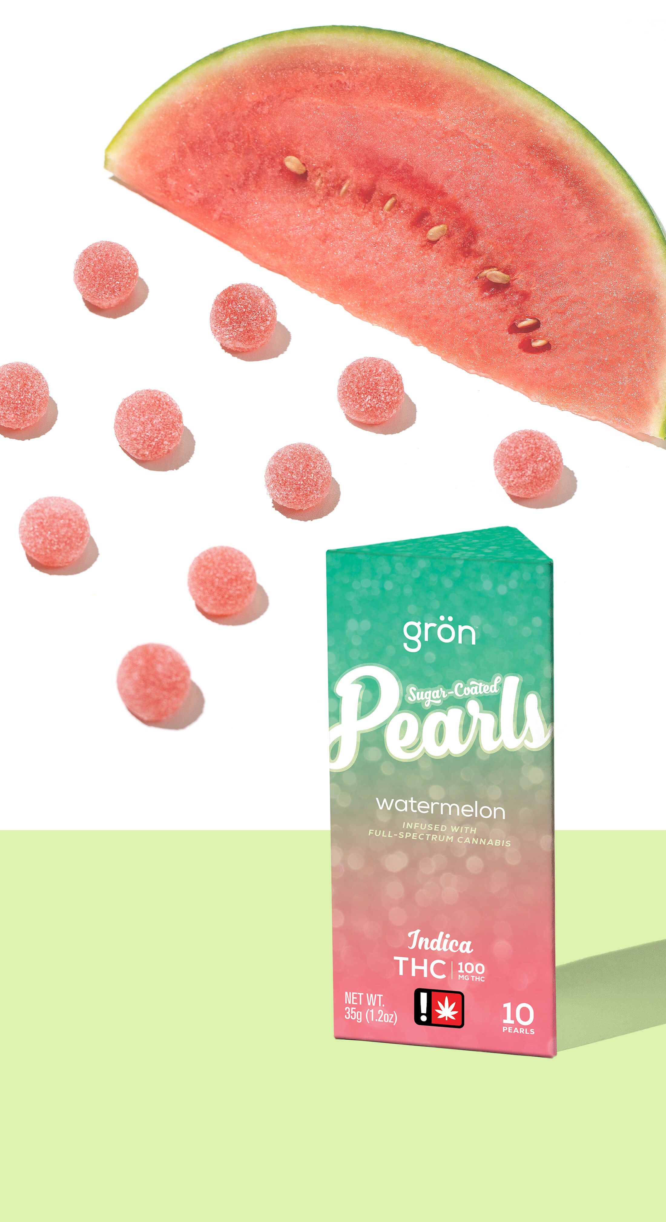
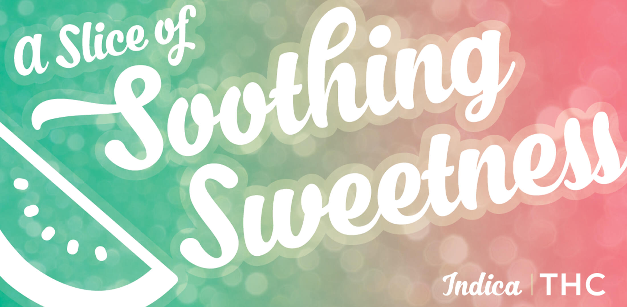
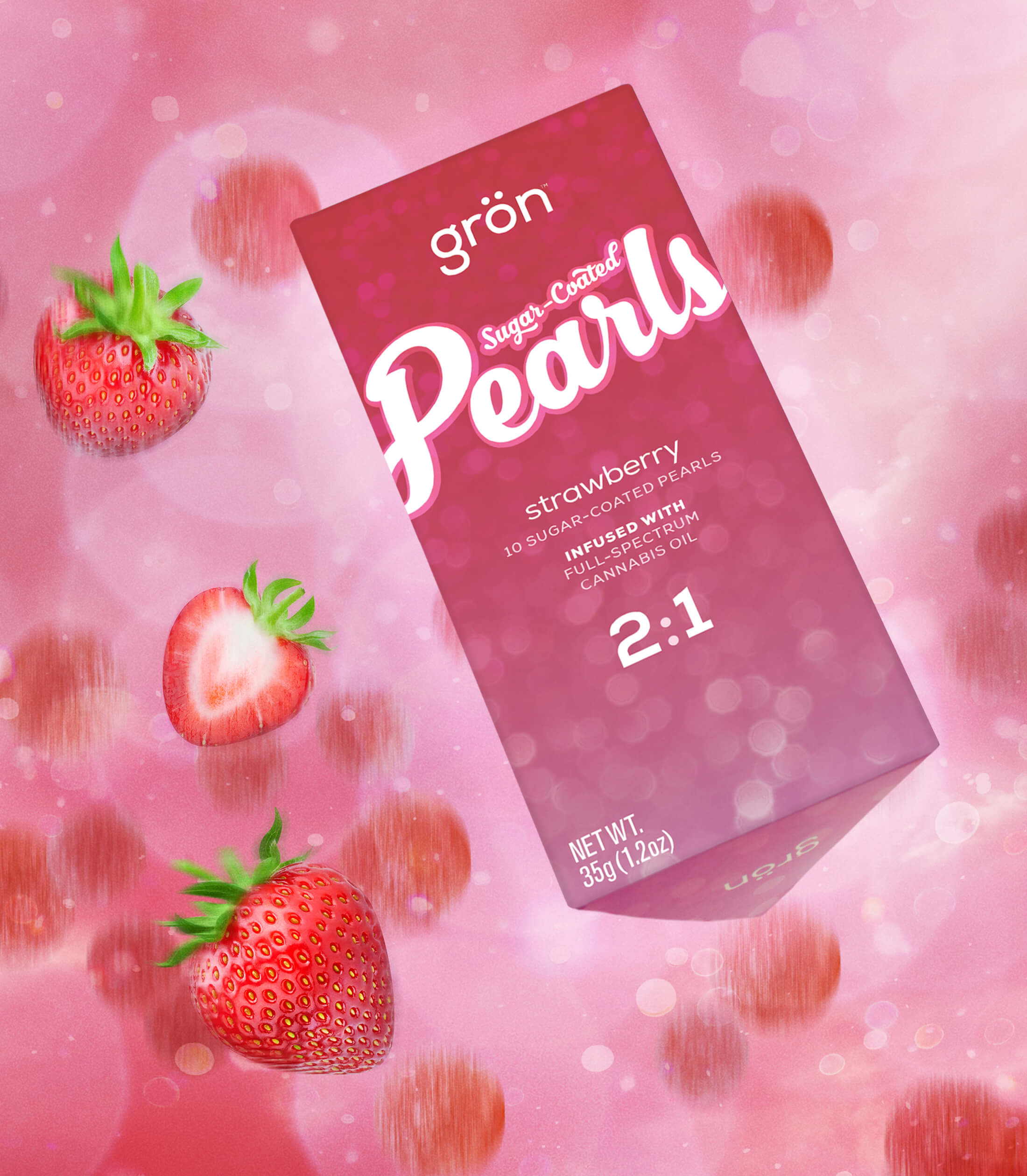
On the box, the bokeh effect is the throughline for all Pearls packaging and branding. Its shimmering, sparkling appearance invokes the quality of the pearls themselves while also implying the feeling of the product's potential effects. When paired with fun, vibrant, flavor-inspired colors, the Pearls packaging becomes a product and brand difficult to ignore.
AARON MEBESIUS
CREATIVE DIRECTOR & PACKAGE DESIGNER
CREATED IN COLLABORATION WITH:
THE GRÖN BRAND TEAM & THE GRÖN KITCHEN

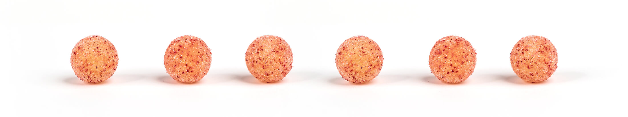
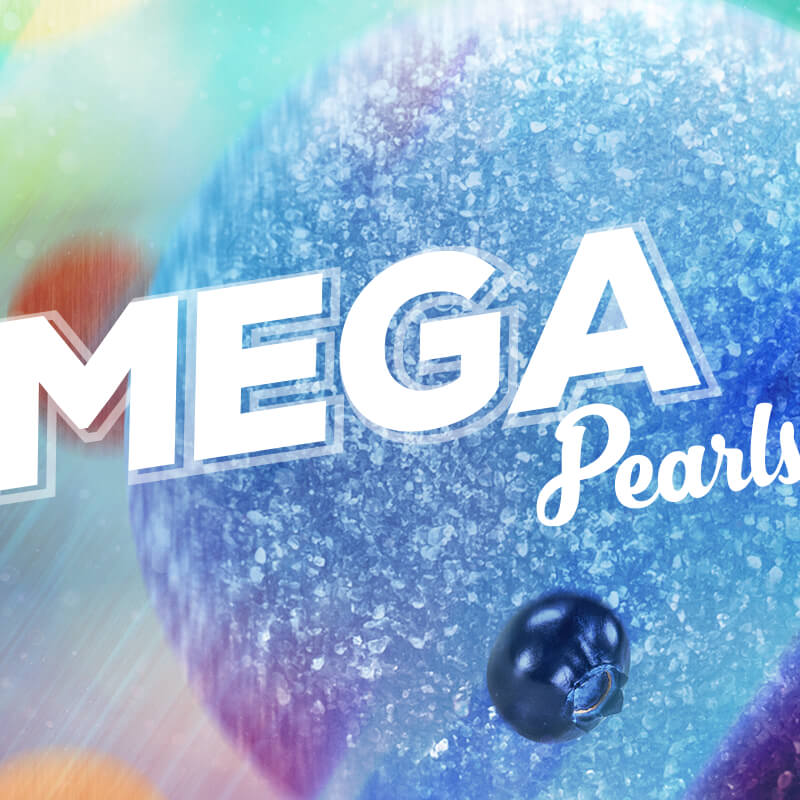
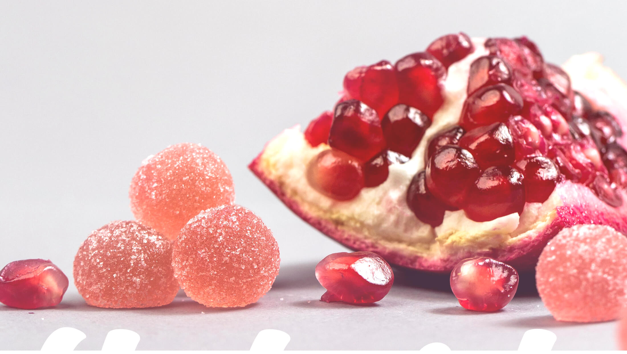
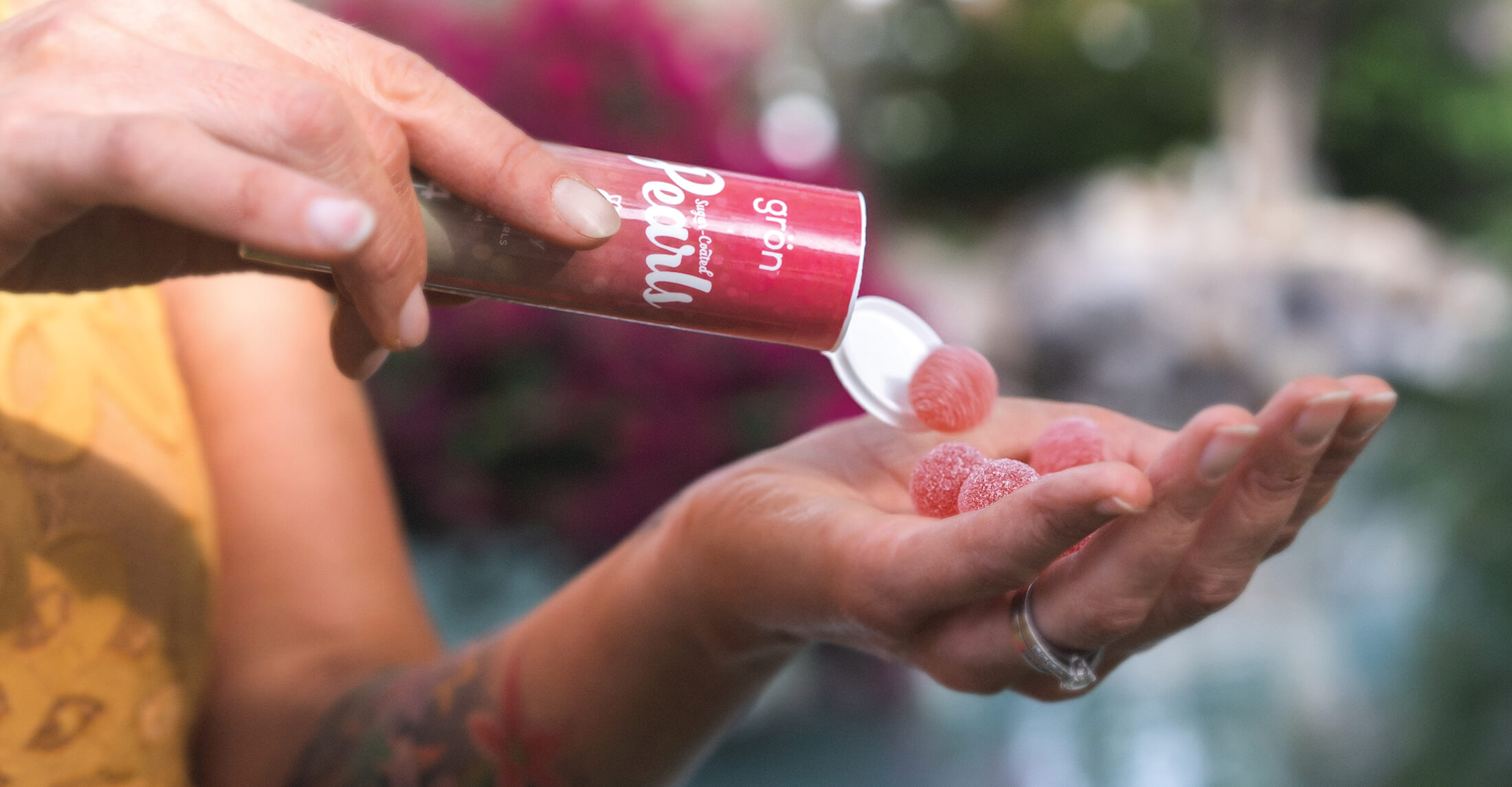
A Photographer's Delight
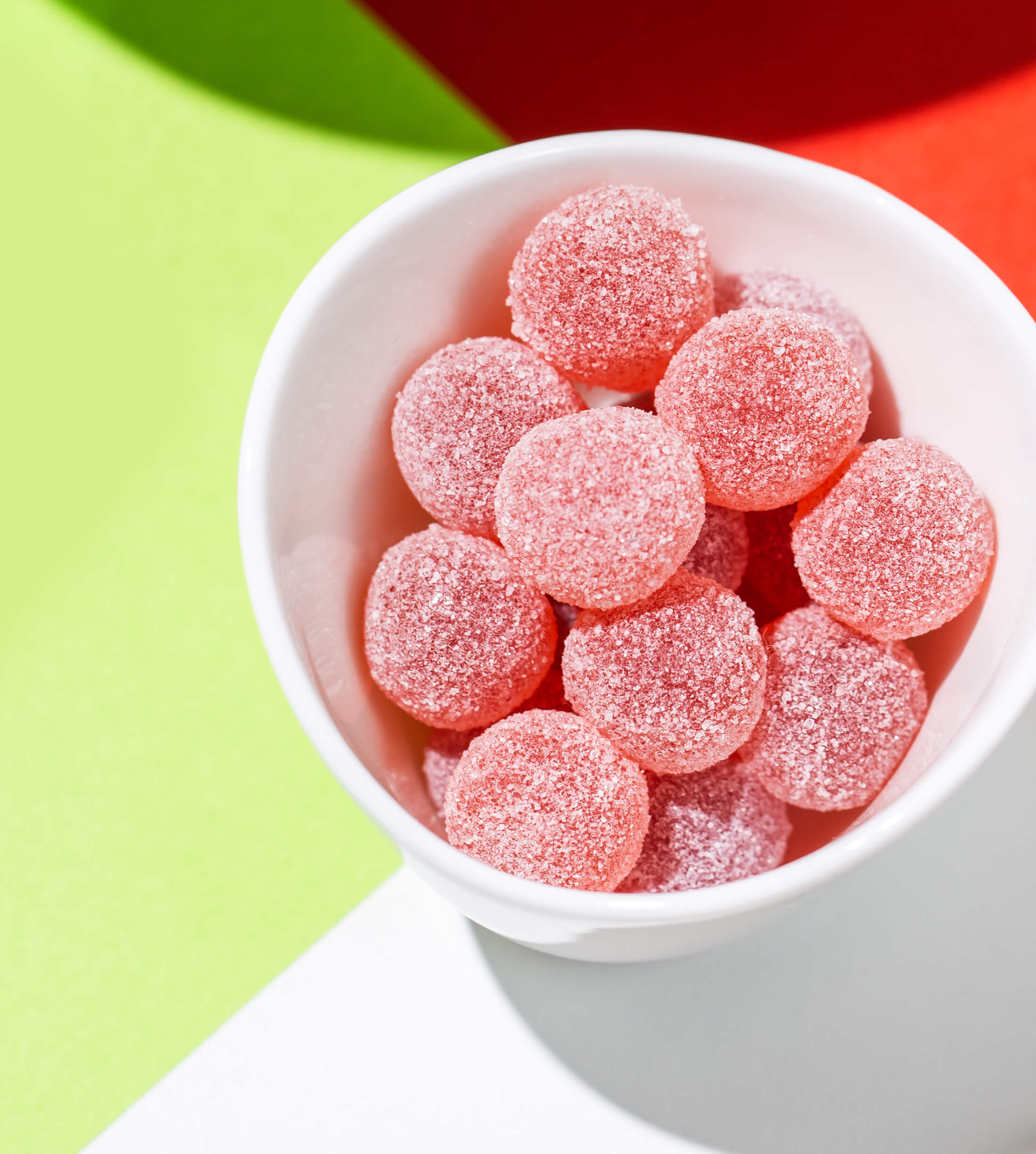
My compliments to Grön's photographers for capturing the personality of the pearls in both lifestyle and product photography. This is some of the best work I've ever been a part of.
PHOTOGRAPHERS
CHARLOTTE ROEHM & NICK WICHMAN
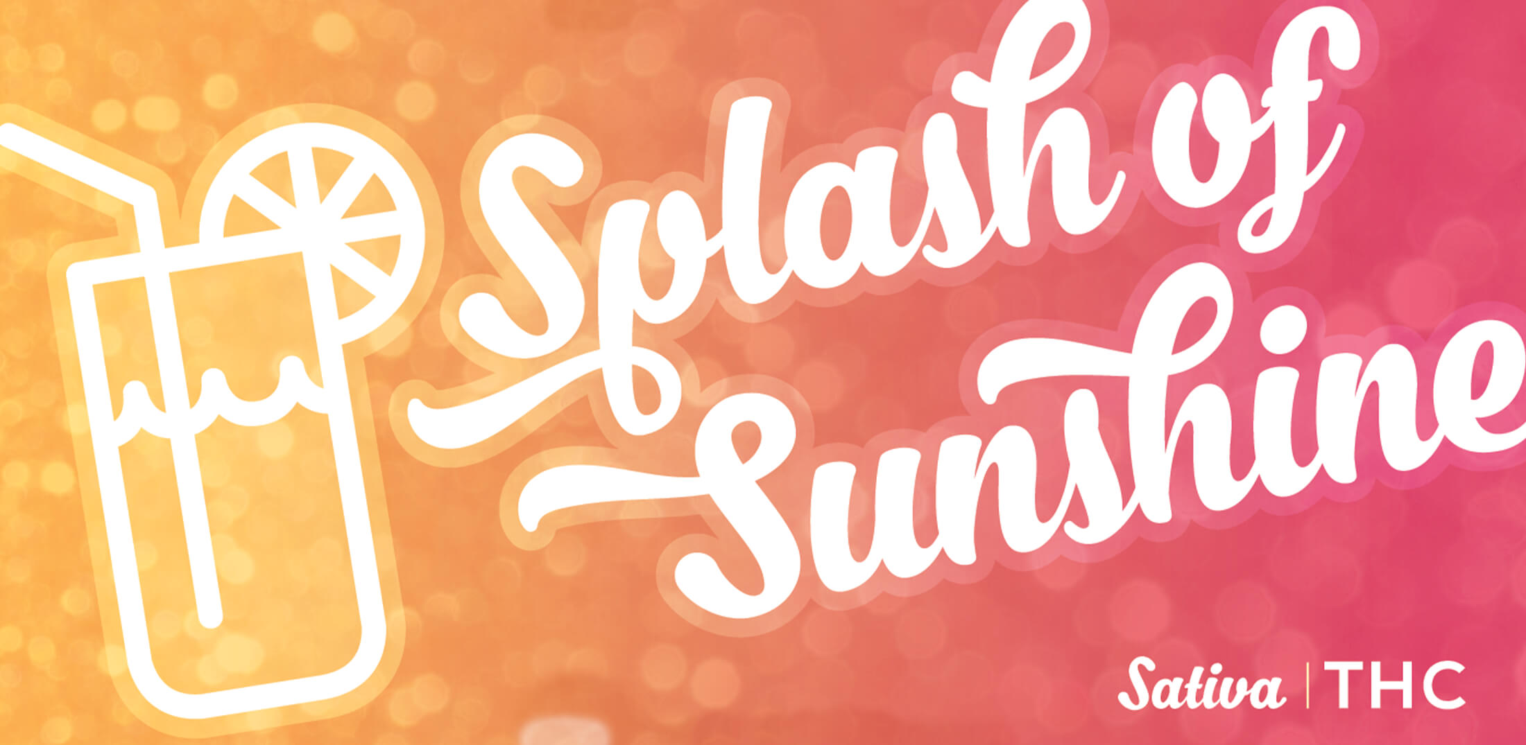
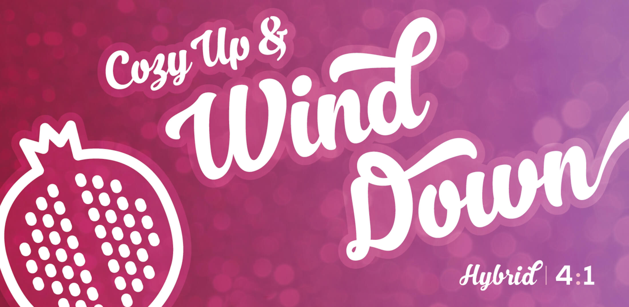
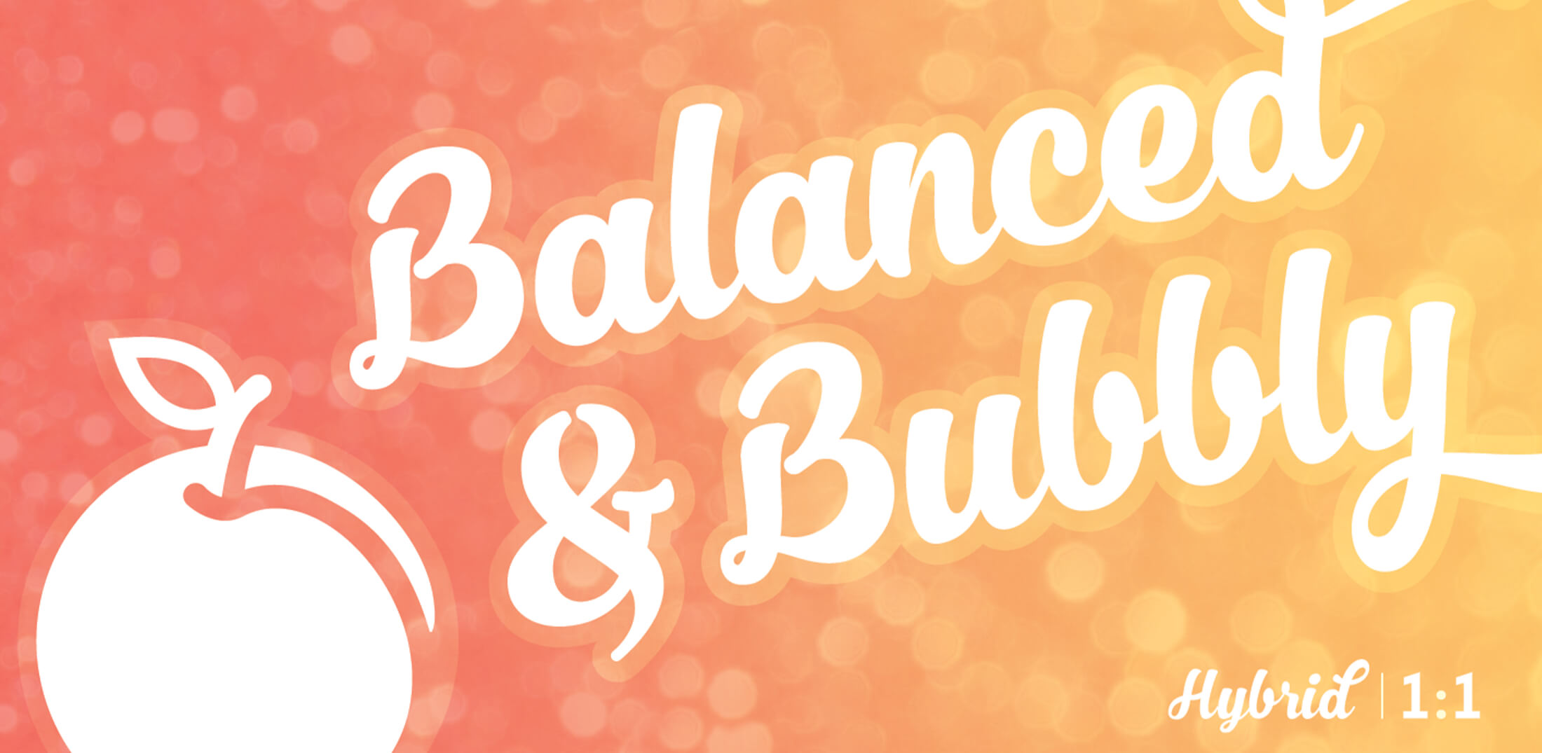
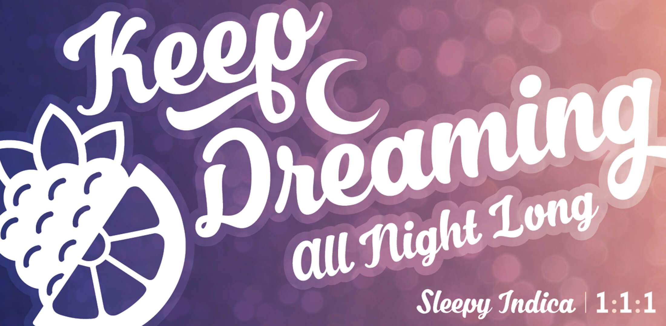
DISPENSARY DIGITAL DISPLAY
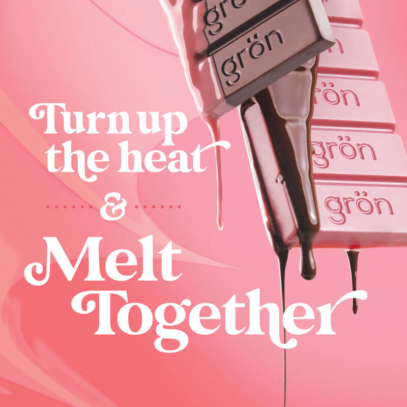
Grön Pearls were always a fun product line to work on; as the pearls themselves were beautiful, colorful, and a bit magical. I always felt the packaging and branding should simply echo that feeling & tone.
Their success in multiple THC markets is a point of accomplishment – not just for me, but for the entire Grön team.