
The Grön Logo
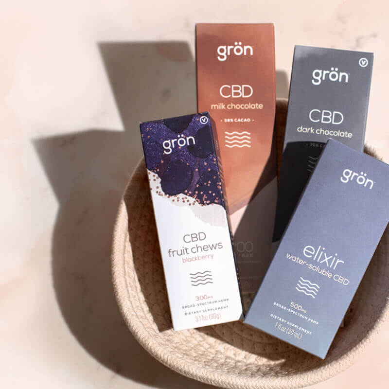
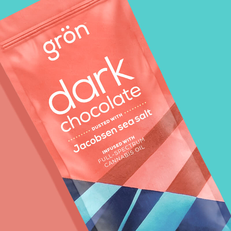
The primary mark for the Grön brand (shown in its customary white on Grön teal), this wordmark is a modern evolution from the original Grön logo created by CEO and founder Christine Smith.
It's modern, friendly, and validates everything the Grön brand does and stands for. It's a stamp of excellence, craft, and a guarantee of a quality cannabis experience.
I'll never look at umlauts the same way ever again.
CREATIVE DIRECTOR
AARON MEBESIUS
CREATED IN COLLABORATION WITH
CHRISTINE SMITH & FACTURA

Sugar-Coated Pearls Logo
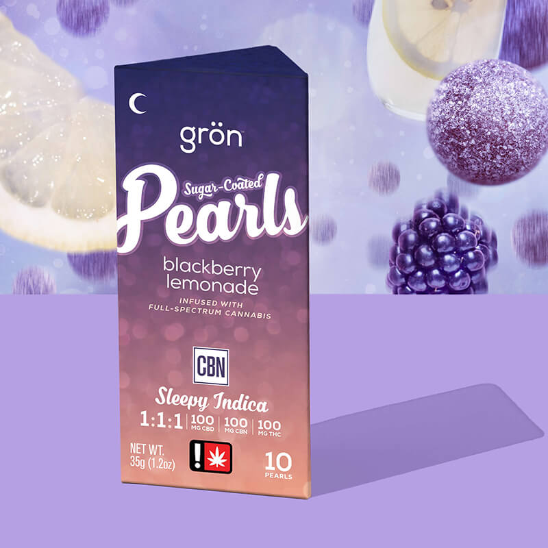
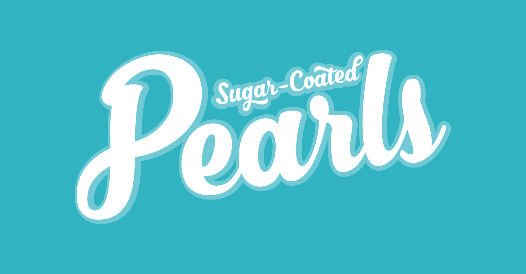
Grön recognized early on that people were buying its products and not just the brand itself. People were asking for Grön pearls at dispensaries – not just gummies. Creating the Sugar-Coated Pearls logo made it easier for people to connect with the products they were searching for.
The introduction of this logo also set a new standard for all future Grön products: the Grön logo would always be secondary in the packaging hierarchy, allowing the product itself to become the primary focus.
I also love how flourishy and expressive this mark is – especially in contrast to the neutrality of the primary mark. As soon as we incorporated this mark's derived typeface into the Pearls' collateral the entire Grön brand benefited.
CREATIVE DIRECTOR • LOGO DESIGNER
AARON MEBESIUS
CREATED IN COLLABORATION WITH THE GRÖN BRAND TEAM
CHARLOTTE ROHEM, HENRY KING, & NICK WICHMAN

Mega Pearls Logo
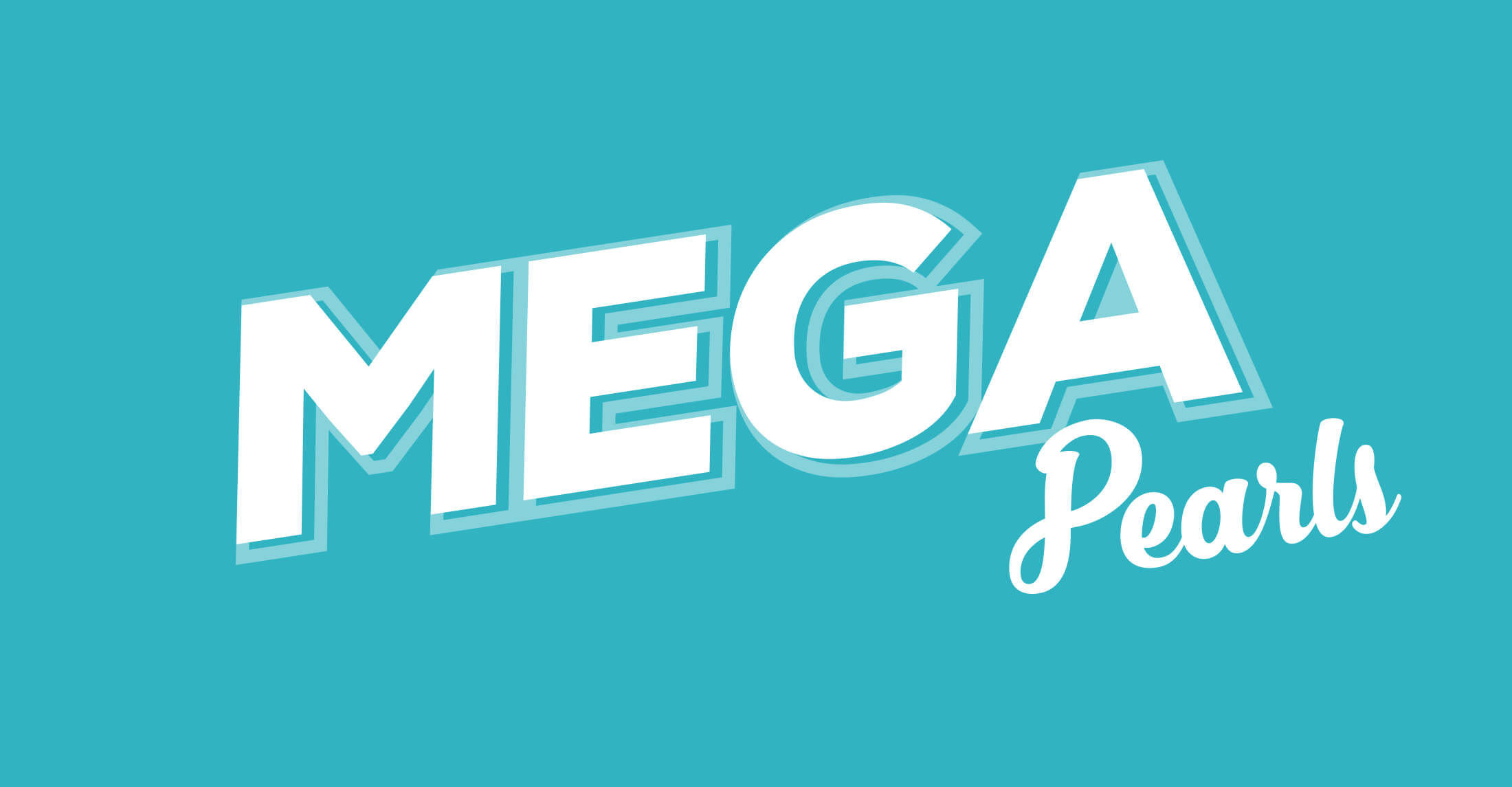
An experience with a Mega Pearl is one you'll never forget.
An all-caps derivation seemed appropriate.
CREATIVE DIRECTOR • LOGO DESIGNER
AARON MEBESIUS
CREATED IN COLLABORATION WITH THE GRÖN BRAND TEAM
CHARLOTTE ROHEM, HENRY KING, & NICK WICHMAN

Pips Logo
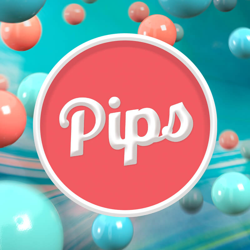
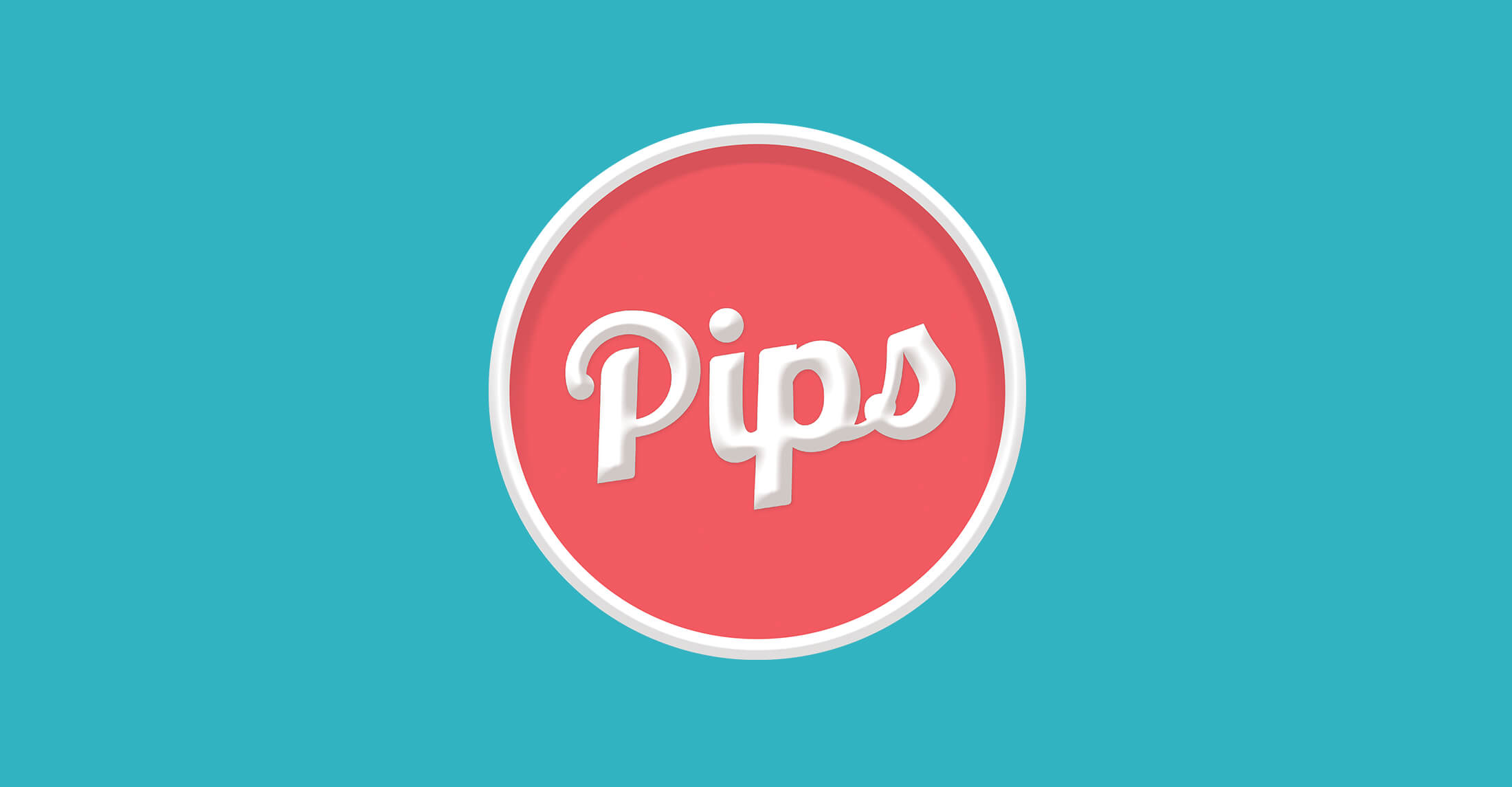
Of all the logos I worked on during my time at Grön, this was by far the most collaborative in its construction. We developed the tone of the Pips packaging and its logo in tandem, and while normally I don't support beveled logo treatments, in this case, it greatly adds to the future-classic look of the Pips branding.
The Pips "shield" is actually its secondary state serving as an invaluable brand asset for pins, merch, and the primary panel of the Pips candy dispenser.
CREATIVE DIRECTOR • LOGO DESIGNER
AARON MEBESIUS
CREATED IN COLLABORATION WITH THE GRÖN BRAND TEAM
CHARLOTTE ROHEM, HENRY KING, & NICK WICHMAN
MORE GRÖN & CANNABIS BRANDING


