


THE GRÖN MODERN PORTFOLIO
6 years in the making, explore the strategies and executions that defines the Modern Grön Brand.

THE PREAMBLE
& CHALLENGES

BRAND VOICE,
LOGOS & COLORS
CATEGORY
BRANDING

PHOTOGRAPHY
& VIDEOGRAPHY
THE FIGMA
BRAND MACHINE
EATGRON.COM
THE GRÖN MODERN PORTFOLIO
PHOTOGRAPHY & VIDEOGRAPHY

Three Grön Photography Styles
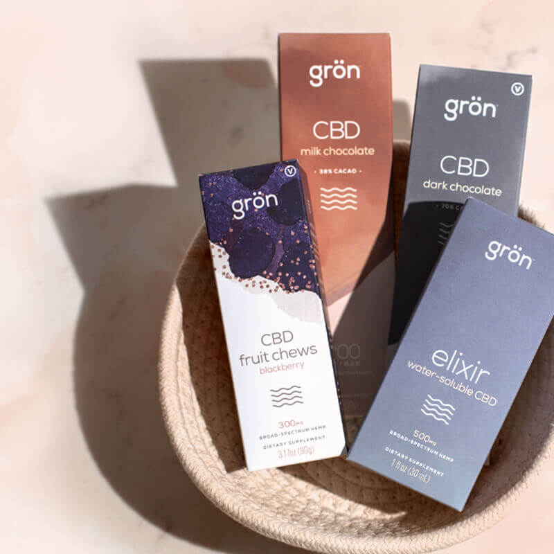
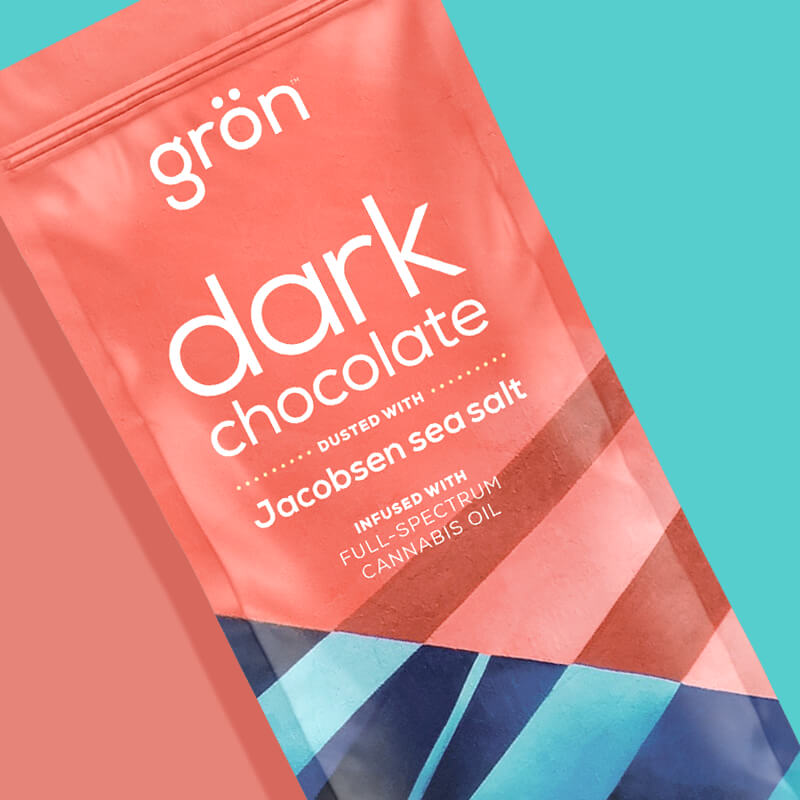
EDIBLES ON WHITE
This photography and videography became vital for presenting products in a polished and clean manner. This style grounds the edibles in reality (No more Gröniverse), showcasing their vibrant colors and delicious details without distractions. It creates a sense of professionalism and quality, which is essential for gaining consumer trust and enhancing brand perception in the cannabis space.
CRAFT
Taken directly from the mission statement, this type of footage offers a behind-the-scenes look at the people and processes involved in making the products. This approach humanizes the brand, allowing customers to connect with the artisans and the care that goes into crafting each edible. At it's best, this footage is incredibly passionate and even romantic.
LIFESTYLE
This photography aims to capture the fun and vibrant essence of cannabis edibles through stylized models in bright, engaging settings — the "edible experiences." This type of imagery evokes emotion and inspires potential customers by illustrating how the products can be enjoyed in everyday life, making them more relatable and desirable.

I mentioned earlier that white was Grön's primary accent color, and our photography of edibles benefited the most from this rule, keeping things clean and minimal. This type of photography lets our confections shine on their own. Our products are stunning, and we ensure they are captured beautifully against a clean, uncluttered white background that emphasizes their deliciousness and playful nature. Each shot is like a still life or a haiku, where only the essential elements are present, allowing their beauty to take center stage.
The best analogy would be that of an art gallery — walls painted white to allow the art to come forward and be the only thing you're focused on.
We shot the vast majority of these photos internally. For the rest of this section, I'm going to let the images speak for themselves.


This is the passion — the romance that goes into the craft of each Grön confection.
We have nothing to conceal; in fact, we have much to celebrate. Craftsmanship is a fundamental value of Grön's brand. We caringly craft the world’s finest cannabis edibles, and our behind-the-scenes footage highlights our roles as artisans, confectioners, and cannabis enthusiasts. We love to showcase our production process because it not only reveals the handcrafted quality of our products but also the people behind them.
These images capture the effort that goes into each creation, and although they may be less polished than edibles on white, they still exude deliciousness while showcasing the love and meticulous attention to detail that our people brings to the table. Here we focus on the skilled hands, quality ingredients, and tools that contribute to our delicious offerings. At its heart, Grön is a community of artisans, and these videos invite the audience to witness these masters crafting the world’s best cannabis edibles.
If you're only going to watch one video, watch this one. Craft highlight reels immerse viewers in our craft, expertise, and community spirit.

I wanted to do more in-depth stories of the confectioners, but we always seemed to run out of time. I hope Grön pursues this avenue further in the future — its a compelling story.
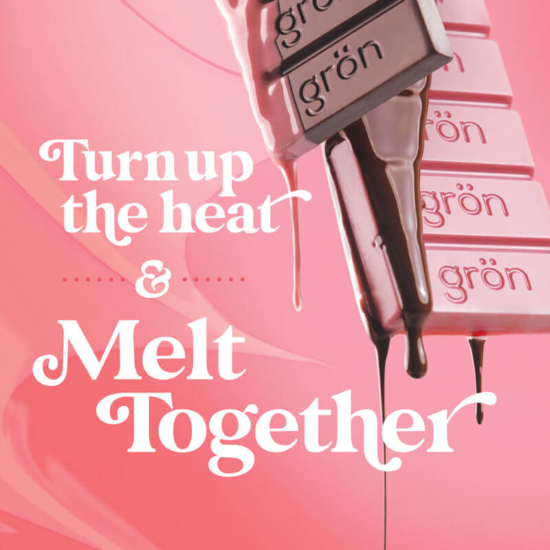
Chocolate: Grön's First Love
What sets chocolate apart is its stunning beauty in both liquid and solid forms, and this footage beautifully highlights that duality. Whether it's flowing decadently in a molten state or elegantly molded into exquisite shapes, chocolate captivates the senses.
Chocolate offers a unique feature: it is the only product we create that bears our logo imprinted directly onto the edible itself.
This imprinted logo serves as a testament to the craftsmanship and pride in our products. It signifies that every bite is not just a treat, but also a piece of our brand’s story. The combination of the luxurious appearance and the personalized branding creates a memorable experience for our customers, making our chocolate not just a confection, but a statement of quality and artistry.

Diverse range of shots allow for ease of execution in future collateral.
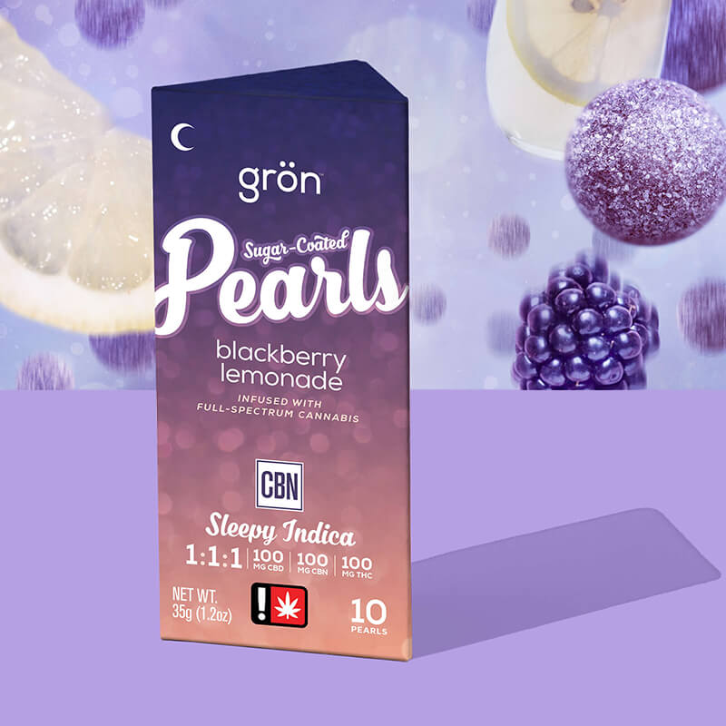
Pearls in Their Natural Form
Here we see the enchanting process of our Pearls coming to life. As they roll, tumble, and bounce in a shower of sugar, they sparkle and exude an irresistible appeal. Unlike the pristine simplicity of edibles on white, these images showcase the vibrant reality of creation, emphasizing the journey from raw ingredients to finished product.
In addition to the captivating luminescence of the Pearls, our footage reveals the skilled hands of the artisans who create them, as well as the trays and equipment used in the process. The sugar coating that gives the Pearls their final touch is also prominently featured, showing the attention to detail that goes into each batch — celebrating both the craftsmanship and the joy of creating something uniquely Grön.

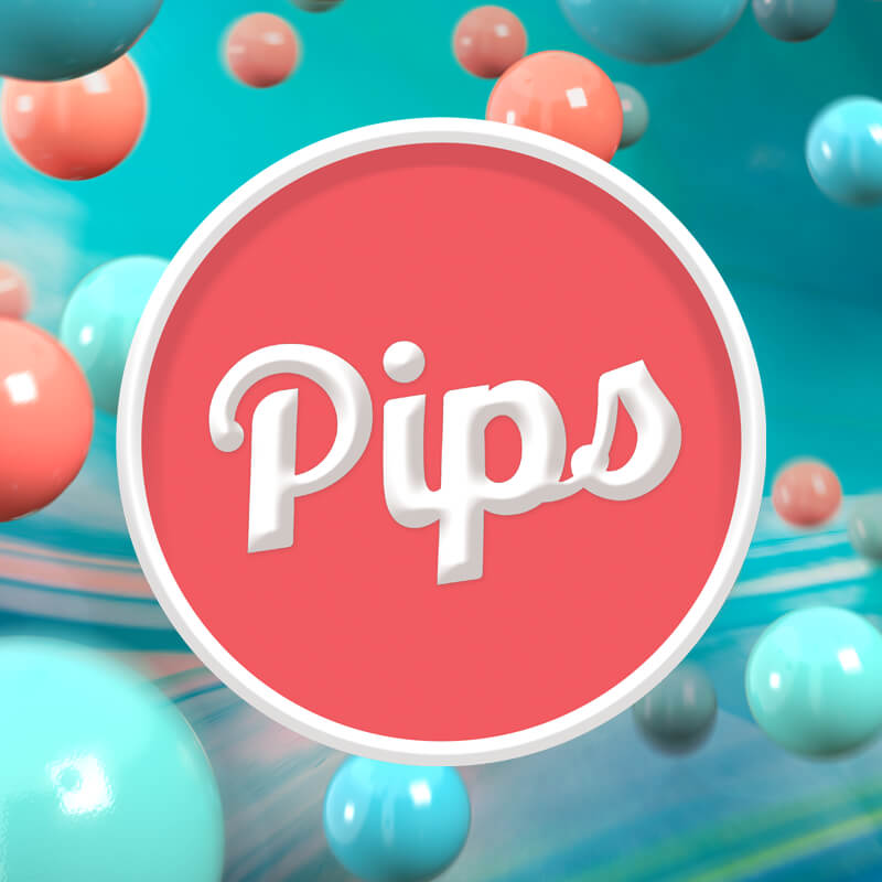
Pips in Abundance
We observe the enchanting evolution of Pips as they take shape, rolling and bouncing while receiving their eye-catching candy coating that sets them apart. Each phase of the process is a feast for the eyes, not only highlighting the vibrant spectrum of colors but also the people meticulously crafting these delightful confections.
The creation of a Pip is dramatic, from their initial "centers" to their final colorful presentation, every moment in the manufacturing process showcases the artistry behind Pips. This behind-the-scenes glimpse not only honors the product but also fosters a connection between consumers and the passionate artisans who bring these scrumptious edibles to life.

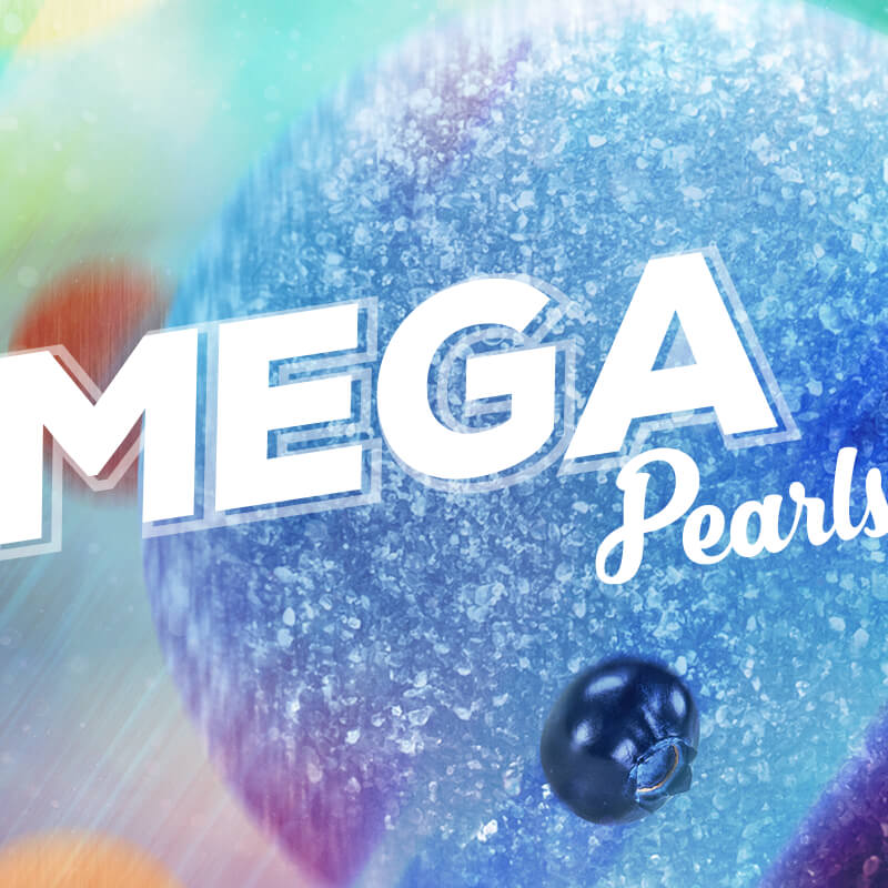
Big into Craft
Megas are not just delicious; they are impressively large, and that size is central to their identity. Here we placed a strong emphasis on the true scale of these confections with greater emphasis on "hand shots" for scale than any other category.
Despite their potent cannabis content, they still look irresistibly delicious, reinforcing the idea that these are not just ordinary edibles. This captivating imagery invites viewers not only to admire the product but also to anticipate the extraordinary experience of enjoying a Mega, true to their name and reputation.


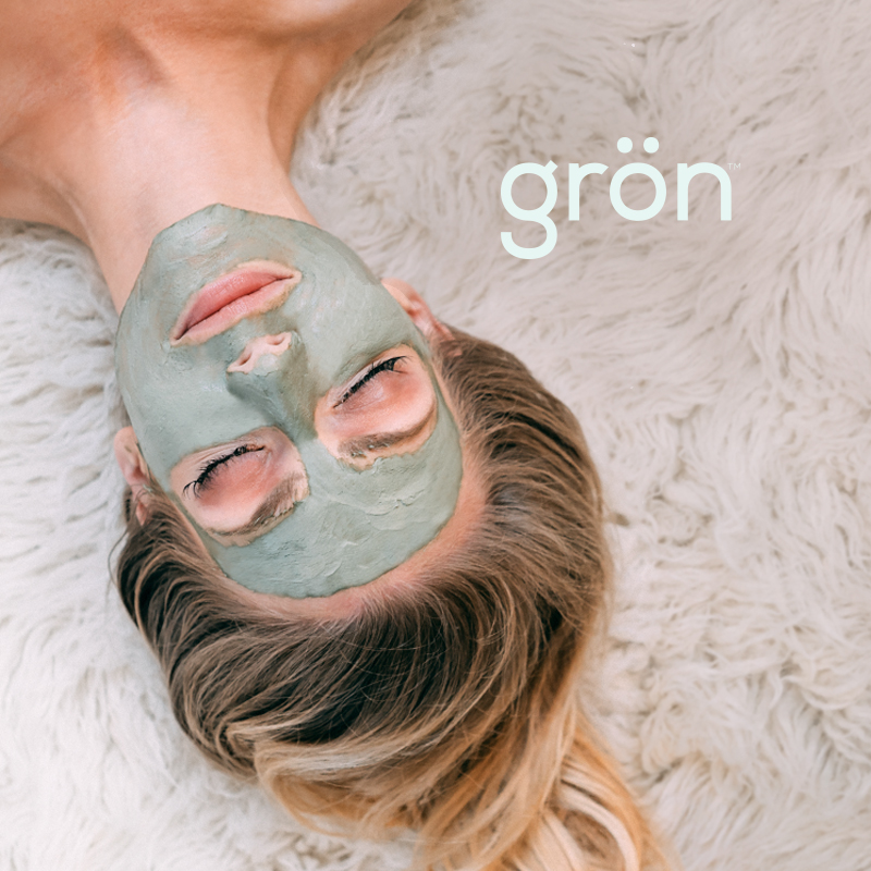
The lifestyle photography was the final piece in the "Grön Modern" puzzle, and it needed to align perfectly with the standards we had established throughout our branding refresh journey.
In the world of cannabis edibles, lifestyle photography was crucial for shaping a Grön's identity and connecting with consumers on a personal level. Now, with a unified style, tone, and color palette set by the brand standards, lifestyle photography could truly elevate our narrative, creating a cohesive visual experience that would resonate with our audiences.
While we've conducted photoshoots in the past, those sessions lacked consistency. However, by embracing lifestyle photography with a clear vision, we could better showcase how our edibles fit into everyday life, highlighting their appeal and inviting customers to be part of the experience in a Grön Modern way.
These moments too, just as with edibles on white, are one part of Grön's branding, often needing typography, messaging, and an applied layout to truly bring them to life. We'll see more of those in the Marketing Chapter of this Series.

Showcasing a variety of colorful and enticing edibles on the table emphasizes product diversity and encourages viewers to explore different options. First and foremost, it creates a vibrant and inviting atmosphere that captures the essence of sharing and enjoyment, which is central to the experience of consuming edibles. This type of imagery illustrates the social aspect of cannabis consumption (an area we're trying to encourage), showing how it can enhance gatherings and create memorable moments among friends and loved ones.

Here, we're not afraid of showing the products on plates of different colors because they're grounded in real world (if not staged) settings.

Note the elevated and intentional colors of the wardrobe that fit within the newly refreshed color palettes. I also love the inclusion of traditional cannabis items like ash trays and lighters. Anytime we could show cross culture items it strengthened Grön's ties to the cannabis community.

Intentional use of color, paired intentionally with key packaging.
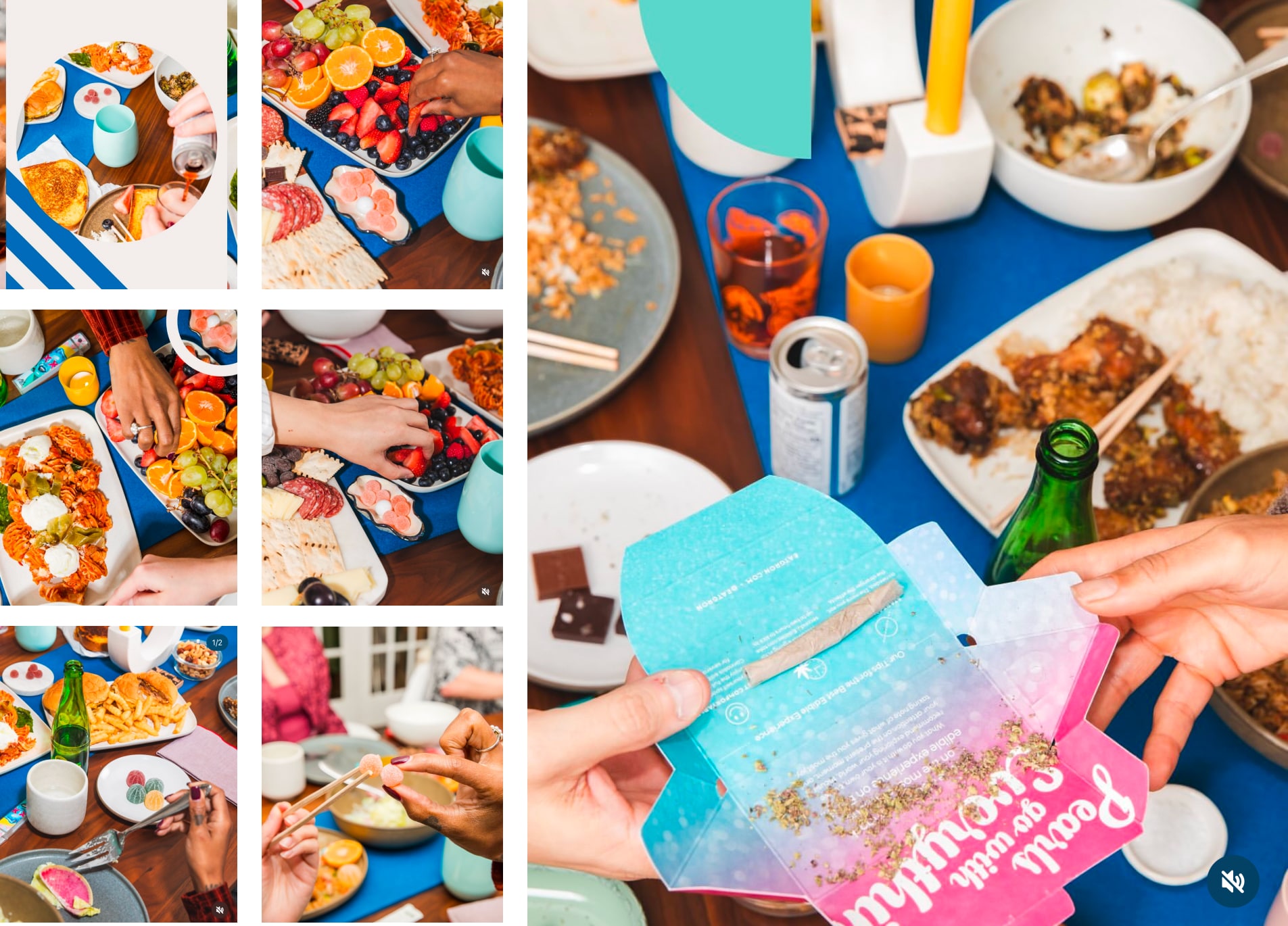
It had become a kind of inside secret that people would use the Pearls external box as a rolling tray. Showing this process allowed Grön to acknowledge that edibles are just one part of cannabis consumption, and that eating and smoking didn't have to be mutually exclusive.

The presence of people having fun adds authenticity and relatability, making the brand more approachable to potential customers. It communicates that cannabis edibles are not just products; they are part of joyful experiences that bring people together — another goal of Grön's mission (elevating lives).
A True, Branded Foundation of Grön Modern Standards
Chapters 2–4 have focused on the elements of Grön's branding, beginning with its Mission Statement and now finishing with its three styles of Photography and Videography. All of these elements were placed into a comprehensive deck totaling an impressive 400 pages!
The comprehensive nature of this guide left no room for misinterpretation regarding what was “on brand,” as we had effectively refreshed every major piece of Grön's branding.
Internally, it significantly streamlined the art direction process, while externally, it enabled us to produce beautifully branded briefs for our vendors with ease. I can't emphasize enough the importance of this when collaborating with third parties who might attempt to introduce their own interpretation of your brand.
The pieces were built, and our vision was clear, but the next step was even more critical: making the branding accessible and actionable for everyone—a brand machine. There was only one program I wanted to use for this, and nobody on my team had ever used it before.

OTHER INTERESTS
Fleets & Fortunes
Screenplays & Treatments
FishingPDX

MEET THE DESIGNER
Explore the career of artist, designer, & creative problem solver Aaron Mebesius.
-
Meet the Designer
Majin Planet: Origin of a Designer
Find Me on Linkedin