


THE GRÖN MODERN PORTFOLIO
6 years in the making, explore the strategies and executions that defines the Modern Grön Brand.

THE PREAMBLE
& CHALLENGES

BRAND VOICE,
LOGOS & COLORS
CATEGORY
BRANDING

PHOTOGRAPHY
& VIDEOGRAPHY
THE FIGMA
BRAND MACHINE
EATGRON.COM
THE GRÖN MODERN PORTFOLIO
CATEGORY BRANDING
This is some of my favorite work: the packaging and patterns.
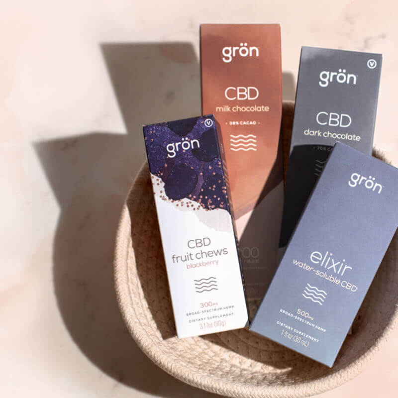
There is no greater example of the power of branding than package design, the number one deliverable of any brand in the cannabis space. If you're lucky, a customer has heard about you, seen an ad, or maybe even been recommended your product by a budtender. If not, a brand only has one way of communicating with a consumer, your box. It should embody everything you want to stand for and promise; and all, at a glance.
The First Pillar of Grön Modern:
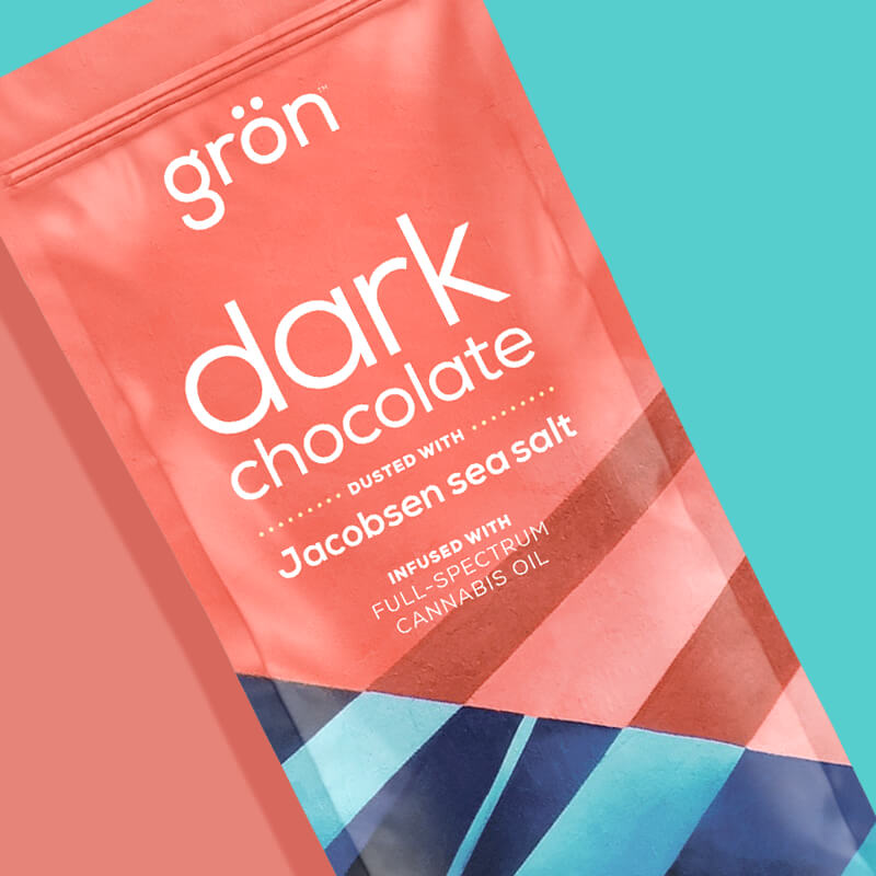
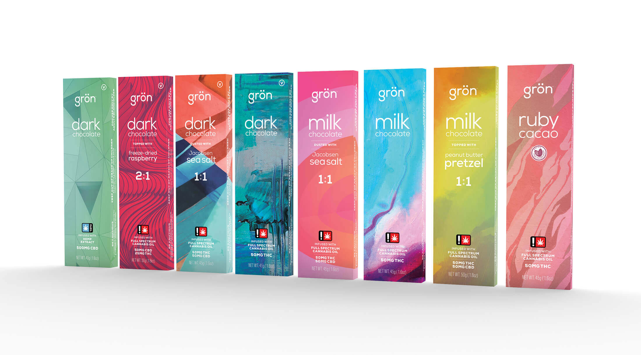
Grön Chocolate
This was the brand's breakout moment, the bedrock of Grön's packaging and color identity; these 8 chocolate bar boxes. These boxes brought into reality the design standards of typography (mandating that all Grön packaging type be white) and set new foundational pillars for all future package design. It established the tone for all colors, and while we make tweaks along the way, all of the flavors for Pearls, Megas, and Pips drew directly from these products.
The Designer's Favorite
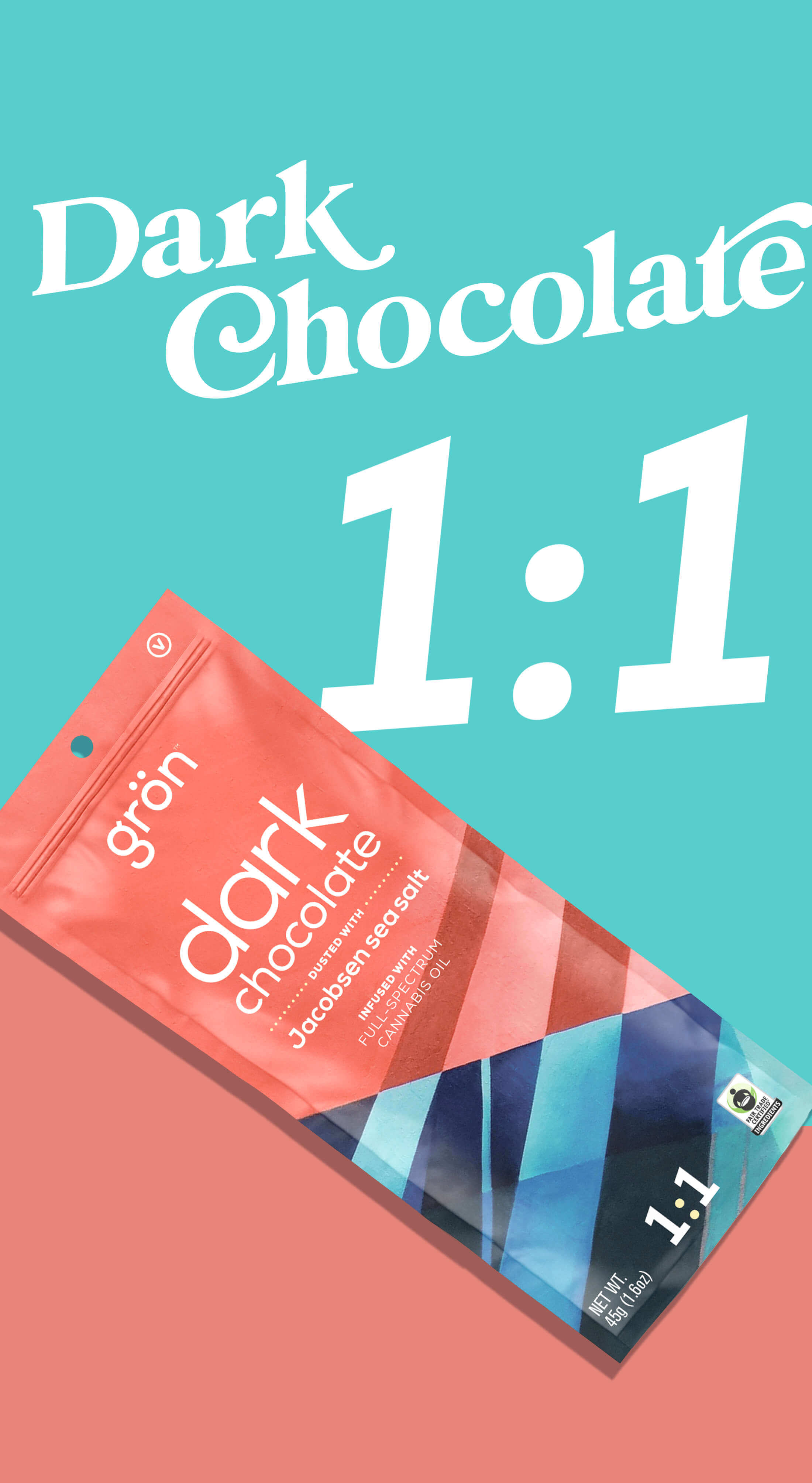
Of all of Grön's products, the Dark Chocolate 1:1 (CBD & THC) is my pick for "Best in Show". Its playful use of contrast & color is wonderfully unique (even among Grön chocolates) and the fact that it became a best-seller further cemented it as my personal favorite.


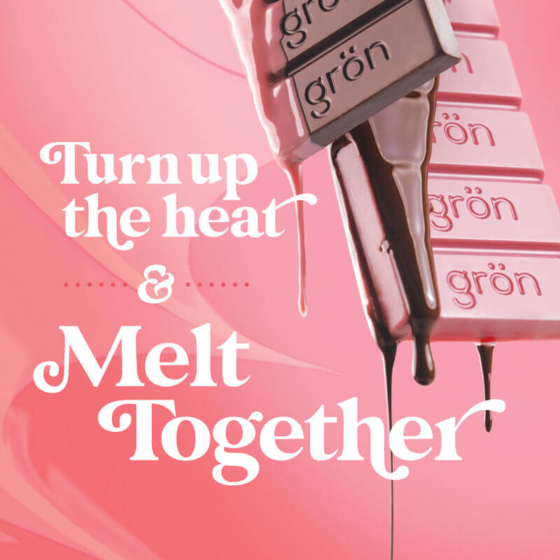
Chocolate's four-color packaging is quintessentially Grön: fun, vibrant, refined, and diverse. The use of color, texture, and typography defined by this series of packaging became the brand's first truly defined aesthetic pillar, setting the tone for Grön’s brand and heavily influencing nearly every form of Grön's digital and print collateral. In some cases, state regulations require us to use one single color. It’s a beautiful alternate that complements the minimalism of our product photography.
"Melt with us" for the chocolate category evokes warmth, indulgence, and a sense of community. It suggests a shared experience, inviting consumers to savor the rich, creamy textures of the chocolate while enjoying the uplifting effects of cannabis. This phrase not only highlights the melting quality of the chocolate but also implies a moment of relaxation and connection, encouraging people to unwind together and embrace the blissful experience that comes with it.

Follow the Leader
The Mini Bar packaging is, appropriately, aligned with the chocolate aesthetic. The background textures of the Minis echo the tones of their full-size counterparts, while also incorporating a Newly designed Mini Bar logo. Note that the colors of the effects are tied directly to the flavors and taxonomy — consistency & harmony are key.


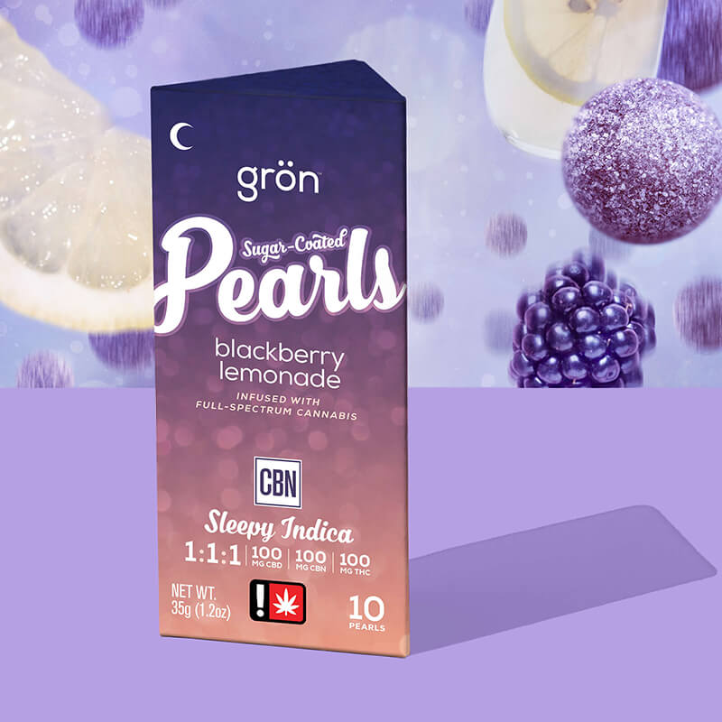
Sugar-Coated Pearls by Grön
Of all the product lines I worked on, the Sugar-Coated Pearls probably went through the most dramatic evolutions in both packaging and support imagery before finally finding its voice. On the box, the bokeh effect is the through line for all Pearls packaging and branding. Its shimmering, sparkling appearance invokes the quality of the pearls themselves while also implying the feeling of the product's potential effects. When paired with fun, vibrant, flavor-inspired colors, the Pearls packaging becomes a product and brand difficult to ignore speaking to both flavor and effect.
"Pearls go with everything" beautifully encapsulates the timeless elegance and versatility of this gummy line. Just like classic pearls, these gummies appeal to a wide audience, offering a delightful treat for any occasion—be it a leisurely morning, a midday pick-me-up, or a cozy evening indulgence.

The Designer's Favorite: Watermelon Pearls by Grön. Getting these colors perfect was a real challenge.
Grön Pearls were always a fun product line to work on; as the pearls themselves were beautiful, colorful, and a bit magical. I always felt the packaging and branding should simply echo that feeling & tone. Their success in multiple THC markets is a point of accomplishment – not just for me, but for the entire Grön team.


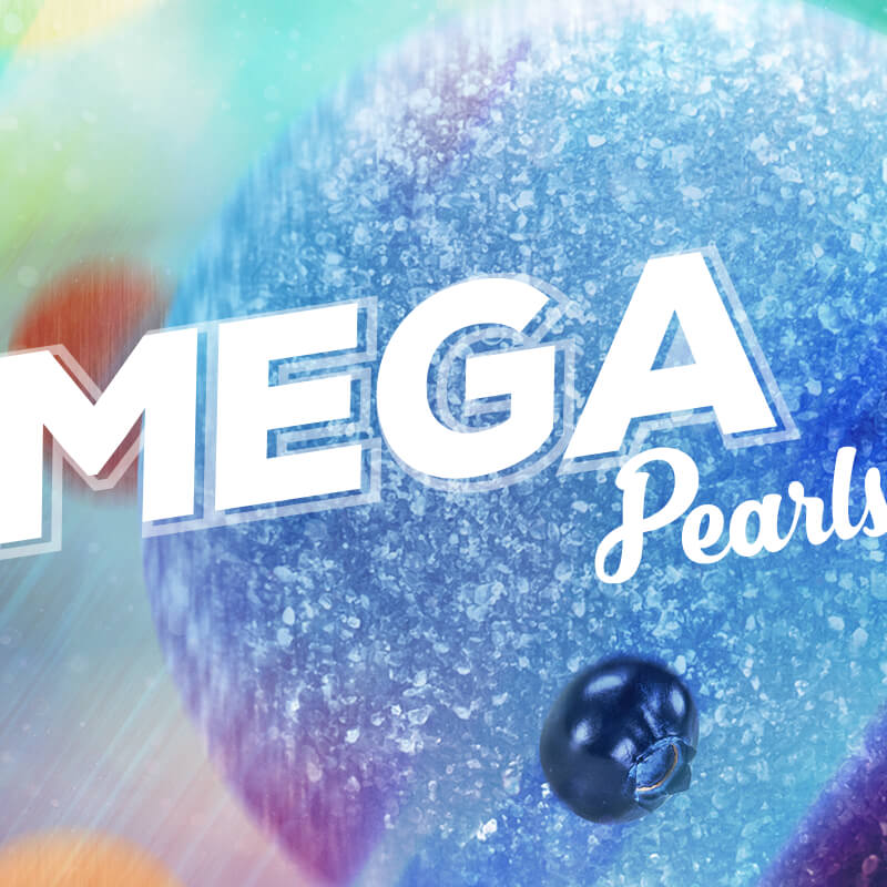
Mega by Grön
Not long after the release of Sugar-Coated Pearls, Grön Mega Pearls debuted in the THC marketplace. Their packaging is a natural extension of the Pearls brand, taking direct inspiration in texture, color, and typography from the full-size line. As with all Grön product lines, a unique (albeit much bolder) product line logo was created – with its tone implying a potentially more intense THC experience. Mega's name, uniquely, speaks directly to effect. It doesn't have a confectionary name or brand.
Also, I feel it worth mentioning that Grön CREATED the high-dose single edible market. Mega's debut is the coveted lightning in a bottle moment, and Grön saw numerous other brands pop up and attempt to take their bite of the innovation. This is one of the reasons why the world of cannabis is so exciting. It's so new, you're constantly finding new innovations and customers to market to all the time.
"Ready for the big time" embraces the bold experience of indulging in a high-dose cannabis edible. It’s a cheeky invitation to embrace the elevated state of mind and the adventures that come with it, all while playfully acknowledging that this journey can be potentially more intense than others.

Favorite Mega — best color and best tasting in my opinion.


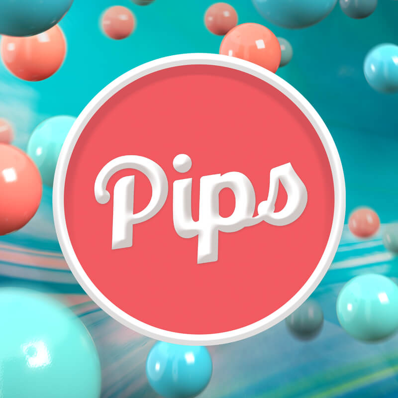
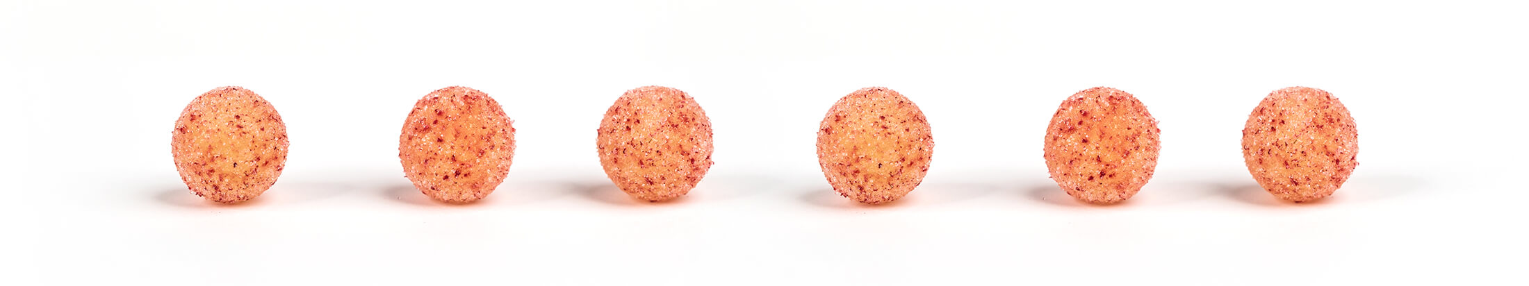
Pips by Grön:
Candy-Coated Chocolate Pieces
In early 2021, Grön released yet another cannabis first – the candy-coated chocolate product line: Pips. As with Grön's Pearls and Mega Pearls, Pips were given their own branding with the individual packages taking inspiration for color, texture, and tone from Grön's THC-infused chocolate bars.
"A little fun in each one" captures the essence of Pips—small, fun, and abundant. These microdose-friendly edibles invite you to enjoy an easygoing experience, making them ideal for both social settings and personal moments of joy.

This Pips SKU cemented the color theory for Grön, taking direct inspiration from the Chocolate Bar with the same Flavor and Taxonomy.
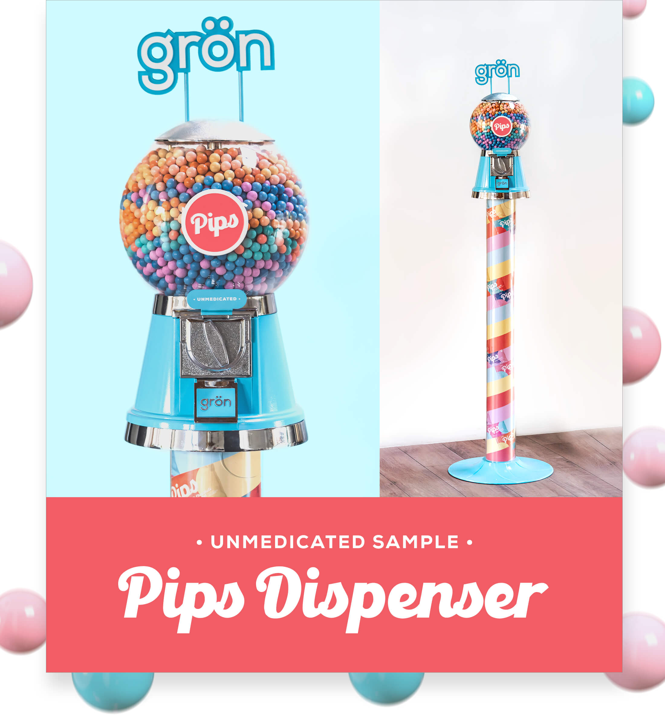
Pips played right into that Future Classic style Grön was aiming for. The shield on this Unmedicated Sample dispenser became the precedent we used to begin unifying the branding as a whole.
BAUHAUS-INSPIRED ACCENT PATTERNS
I designed these accent graphics. They would go on to play a significant role in the branding and marketing, echoing each category's unique identity while conveying a sense of unity in tone which can be paired with any product or lifestyle photography.

Crafted with exquisite combinations of simple shapes, they create beautifully balanced expressions that reflect the personalities of the individual categories. Color variations indicate flavor and time-of-day distinctions, as well as specific product SKUs, while the foundational geometric shapes are carefully layered to enhance visual interest.

I wanted these graphics to be something the designers would be empowered to explore endlessly, reflecting Grön's commitment to freedom and creativity. This led to the creation of "region-specific" patterns, such as the Bauhaus pattern for our Prickly Pear SKU launched in Arizona. These patterns were used on Shirts designs, digital banners, and more. This design creates a fun, energetic, non-cannabis aesthetic that feels mainstream while still representing a cannabis brand. Moreover, designers can continue to create an endless array of Bauhaus patterns, further strengthening the brand's presence with each applied iteration.

Prickly Pear's pattern is worth calling out not just because it's a beautiful region-specific execution, but because it came well after the final brand standards were launched internally. The full strength of Grön's brand and marketing team were able to execute a launch for a new flavor —totally on brand for digital, printing, and physical marketing channels.
MOTION GRAPHICS:
BRAND THAT MOVES
The motion graphics serve as a vibrant extension of the brand's aesthetic, bringing the Bauhaus patterns and colors to life while consistently delivering effect-based messaging. This dynamic approach makes the graphics positive, accessible, and inviting, appealing to both newcomers and seasoned cannabis users. They enhance brand continuity, as their static versions are integrated throughout Grön’s branding.
Pearls • Pearls Go With Everything
For example, the Pearls graphics utilize overlaying circles to evoke a sparkly effect reminiscent of the Pearls packaging, while remaining versatile enough to apply to specific products, like Tart Cherry, which maintains its distinct nighttime identity. Unified by the Bauhaus-inspired graphics, they remain tonally consistent no matter the flavor or recommended use.
Chocolate • Melt With Us
MEGA • Ready for the Big Time
Pips • A Little Fun in Each One
Four Brands Executed in a Unified Tone
Sometimes working on the THC child brands felt like a fictitious project you'd receive in design school – something fun and too good to be true. It was a great honor to have been granted so much creative control over something so central and definitive to the Grön brand.
I will look forward to future iterations of Grön package and product designs for the rest of my life.