


THE GRÖN MODERN PORTFOLIO
6 years in the making, explore the strategies and executions that defines the Modern Grön Brand.

THE PREAMBLE
& CHALLENGES

BRAND VOICE,
LOGOS & COLORS
CATEGORY
BRANDING

PHOTOGRAPHY
& VIDEOGRAPHY
THE FIGMA
BRAND MACHINE
EATGRON.COM
THE GRÖN MODERN PORTFOLIO
BRAND VOICE, LOGOS,
& COLORS
As a cannabis edibles brand, Grön’s category branding aimed to resonate with the diverse audiences in the cannabis market, addressing needs that ranged from pain relief and sleep aids to simply enjoying a premium cannabis high. However, the distinct voices and visual styles of each child brand had become increasingly extreme and disconnected—not only from the Grön mother brand but also from one another.
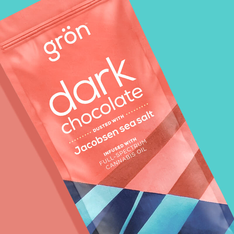
For example, some of the child branding presented its products in a whimsical outer space setting, internally dubbed the "Gröniverse," which starkly contrasted with the craft-inspired tone of the chocolate branding. In the latter, master confectioners meticulously trimmed chocolate bars with knives and lightly dusted them with sea salt — a far cry from the fantastical setting of edibles drifting in a cannabis fantasy realm.

The Gröniverse. From this point forward was now "off brand."

This wide divergence in aesthetics created a sense of confusion within Grön’s branding and for Grön as a whole; it would not be surprising for customers to be unaware that both Mega and Chocolate were produced by the same brand. This situation raised a few critical questions:
1) How could these varied brands be unified under a cohesive brand identity?
2) What was the Mother Brand's identity?
The solution involved establishing a unified vision and aesthetic for the Grön mother brand, beginning with the logo and mission statement and extending to photography, colors, accent patterns, videography, and more. This refresh would enable us to prioritize the mother brand’s presence over the child brands, and, if successfully executed, would allow the high-dose Megas and craft-like chocolates to coexist under the same standardized umbrella brand.
This new standard would become “Grön Modern" — the newly unified Grön brand and category branding.

New Mission:
For the Brand & the Company
A mission statement is a vital reflection of a company's values and goals, with every word intentionally chosen to provide context and meaning for all aspects of the brand. In this case, I feel it worth mentioning that the word "brand" is often used synonymously for the company as a whole, and as such, needed to satisfy the needs of both the branding AND the business. After weeks of collaboration and creative refinement with C-Suite, I crafted a mission that encapsulates Grön’s origins, offerings, and our aspirations within the cannabis space and beyond.
This mission statement was featured prominently in C-Suite decks, sales pitches, and internal onboarding documents at Grön. Much of the work you will see will be aimed at external deliverables (retail experiences, digital ads, packaging, etc.), but the mission was perhaps the place where I had the most impact on Grön's culture.
TO ELEVATE LIVES
Grön believes that cannabis can positively impact people’s day-to-day lives, whether it's providing relief from sleepless nights, alleviating pain, or simply offering a premium recreational experience. The focus on "elevating lives" also carries a playful double meaning—embracing the effects of cannabis.
CARINGLY CRAFTED
I wanted to emphasize that crafting confections is an art form — one that Grön excels at and was preparing to highlight in upcoming photography and videography. It requires skill, dedication, and passion to create something truly delicious. Grön's confectioners are masters and are comprised of perfectionists who pour their love and expertise into every product, ensuring that this care translates into an exceptional experience for our consumers.
EDIBLE EXPERIENCES
I often said, “We don’t sell cannabis or edibles; we sell experiences—experiences that happen to be derived from cannabis.” This philosophy clarified how we would communicate with our audience, prioritizing messaging about effects over flavor and keeping messages short and direct. I believed (and still do) that when someone walks into a dispensary, they already have plans for their cannabis experience/high. There’s no need to convince them of anything; just be forthright and clear, help them understand how your products will make them feel, ensure they look delicious and appealing, and confidently take "yes" for an answer.
The new mission: “to elevate lives with caringly crafted edible experiences” encapsulates the essence of what Grön Modern would stand for, guiding our brand standards and all forms of communication.

Defining The Grön Modern Voice
Liberating: I wanted to reinforce what Grön sells: freedom — the freedom to feel the way you want to feel. Regardless of the cannabis experience a customer seeks—be it relief from pain, freedom from insomnia, or simply the joy of a recreational high—the mission was to empower individuals to feel how they want, both mentally and physically. This concept of freedom serves as the guiding principle for Grön Modern’s direction and messaging.
Positive: I wanted Grön to stand for a supportive environment where everyone can thrive and live their best lives — aided by the power of cannabis.
Expert: Customers can rely on Grön. Additionally, Grön established ourselves as experts in the field of cannabis and confections. Grön's understandings of the science behind its edibles instills trust, encompassing everything from effects to flavors and presentation. Grön knows precisely how its edibles affect people—their taste, appearance, and overall experience. Every Grön product is expertly crafted, perfectly dosed, and guarantees a quality experience.
Playful: Grön can embrace a playful tone — after all, it's cannabis edibles brand. It celebrates the vibrant, joyful world of confections, and our products and packaging reflect this spirit, designed to evoke feelings of happiness and fun.
Conversational: Whether engaging with customers, budtenders, or partners, Grön speaks the language of the cannabis community. This familiarity allowed Grön to connect authentically with its audiences — customers, budtenders, and retailers.
Maternal: Grön’s voice is loving, trustworthy, supportive, and free of judgment. As a women-founded and led brand, this quality holds particular significance. I understood that everyone’s cannabis journey is personal, and it supports individual choices, whether someone needs a larger dose or is just starting out.
These six values—positive, expert, playful, liberating, conversational, and maternal — would serve as Grön's guiding principles whenever any external copy would be created. They ensured consistency and authenticity across all brand communications and collateral, keeping us aligned with our mission and community.
Special thanks to Jake Murray for his collaboration with the Brand and C-suite teams in crafting this vision.

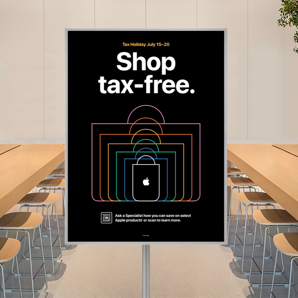
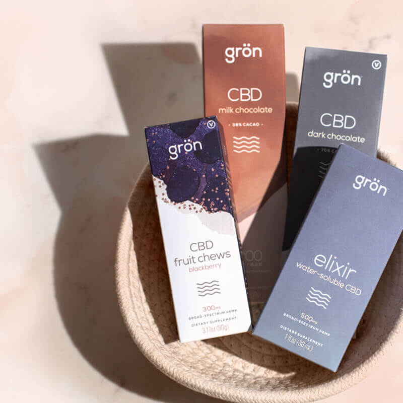
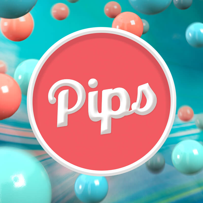
Recognizing the significance of the wordmark in our brand identity, I made a conscious decision to retain the wordmark's core design. A complete overhaul would disrupt existing packaging, which was a risk (and cost) Grön wasn't willing to take. Instead, I introduced a subtle yet impactful enhancement—a "shield treatment" that added visual weight and enhanced its presence, specifically in retail environments. By placing the logo within a circle and employing a double border treatment, the logo was infused with a sense of timelessness—a nod to the future classic aesthetic that resonates within Grön's brand ethos.
This move positioned the Grön mother brand ahead of its sub-brands, necessitating that the child brands follow suit. We introduced shields for all sub-categories creating a cohesive brand framework.


Additionally, I pushed for all of the child brands to adopt the "by Grön" lockup for all packaging design, ensuring they pointed back to the mother brand. Each of the four categories features a 9-degree tilt, adding visual interest and creating a consistent pocket for the lockup.

Updating Grön’s color was another crucial step. "Grön," is Swedish for green, which perfectly aligns with the new signature color: a vibrant teal that leans toward the green end of the spectrum. This primary color, affectionately named "Mother Green," pays homage to the nurturing quality of our brand’s tone.

The shields were also able to absorb the individual colors associated with each individual product. Again, you're feeling the visual weight of these marks even as they sit in isolation without any context. This flexibility would be invaluable as we continued to develop not just the category brands, but the individual SKUs within each category.
While placing the established wordmarks within shields and enhancing the brand's colors may seem like minor adjustments, together, these elements create visual unity, successfully uniting all five brands under a single aesthetic tone for the first time.

The Revitalized Role of Color in Grön Modern
Color plays a crucial role in branding strategy, as it is one of the most immediate visual elements that consumers notice. It helps to establish brand identity, evoke emotions, and differentiate from competitors. A well-chosen color palette can communicate a brand's values and personality, reinforcing messaging and enhancing recognition.
It was a real joy designing these colors and their intended strategies.
The previous color palette had become muted and overly neutral, creating an urgent need for revitalization. The cream was the worst offended in this regard. By injecting vibrancy into the Mother Brand, I set a precedent that the child brands needed to do so as well. These vibrant colors not only increased the energy in Grön's branding but also reflected the dynamic experiences associated with cannabis consumption, where sensations are heightened, and colors appear more vivid.

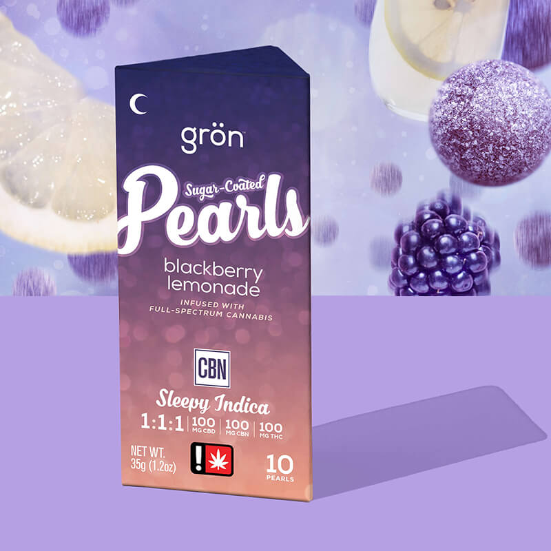
Within each branding category, Grön developed key color palettes that align with the intended effects and optimal times of day for consumption.
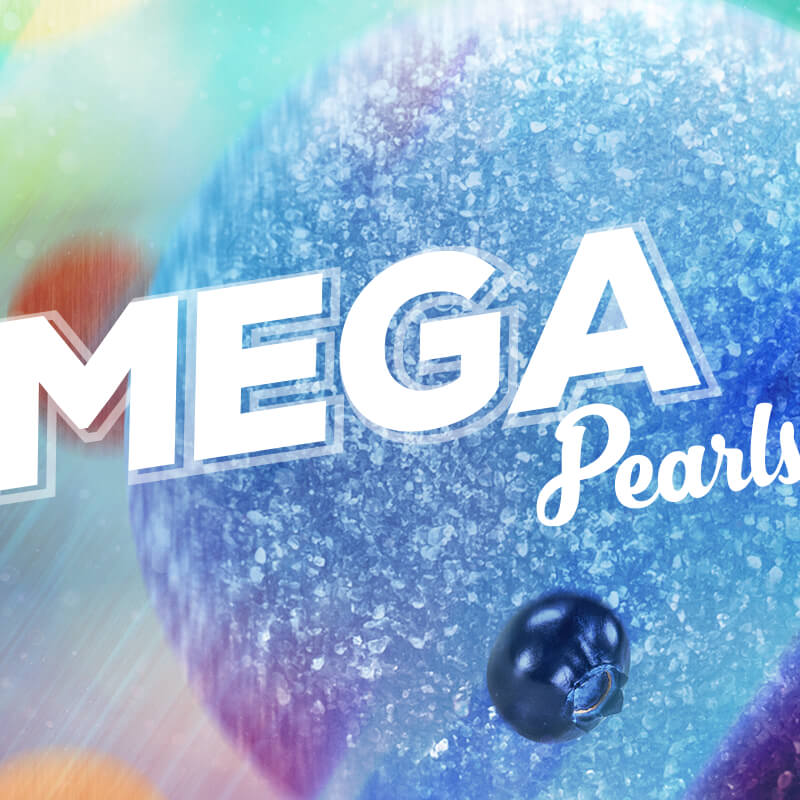
Grön's colors were inspired by and adjusted from flavors (Pearls & Mega) and packaging (Chocolate & Pips). I created special "Under Box" hues specifically designed to help accentuate packaging and make our boxes look as beautiful as possible. These colors also became the bedrock of the individual products' identities, going on to be implemented in product-specific graphics and executions.


Daytime products — unified by warm colors.

Nighttime products — unified by deeper blues and purples.
Daytime products incorporate vibrant oranges, yellows, and sky teals, while evening products feature deeper hues like purples, maroons, reds, and dark blues to indicate their nighttime suitability. These color choices carry through the four child brands products. All CBN products, for instance, all use the same hue of purple as their primary accent colors, strengthening visual unity and brand cohesion.
Remember, a person shopping for edibles already knows what effect they’re looking for.
The use of specific iconography, such as suns, moons, and waves, helped convey the ideal times for consumption. Clear visual cues can help convince those who might be hesitant to try edibles. Be direct and clear, and let the consumer make their own choices. These icons were used on packaging and further emphasized on retail displays, digital ads, and general product education.

Typography Adds to a Brand's Voice
Typography standards are crucial for a brand as they establish a consistent visual identity that enhances recognition. Consistent use of typefaces, sizes, and styles helps convey the brand’s personality and values, ensuring that all communications—from marketing materials to digital platforms—align cohesively. By adhering to typography standards, a brand not only enhances its aesthetic appeal but also improves readability and user experience, ultimately leading to stronger brand loyalty and engagement.
The Grön Modern typography had to be a curated hierarchy, with each product category featuring its own distinct typeface and set of standards.

While there are variations among these typefaces, they all complement each other, creating a cohesive family that reflects Grön's diverse range of products. Nexa served as the universal Grön Modern font, seamlessly pairing with various executions to maintain brand consistency.

Chocolate: Glamour, Pearls: Nabila, Pips: Retroking, Mega: Nexa Black Italic.
For Grön's headline typography, I mandated "Glamour," a serif font that, like Nexa, can be paired with any child-brand headline in various contexts. Additionally, Grön made intentional typography choices for the logo headlines of our primary product families to ensure clarity and impact in retail and digital ads. It was crucial to avoid mixing typefaces; for example, Retroking (used for Pips) would never be used in a Pearls campaign or for general Grön promotions. This was a common mistake made previously, again, leading to the dissonant feeling of the previous branding.
Negative Space & the Color White
The power of negative space in compositions lies in its ability to enhance clarity, focus, and overall aesthetic appeal. It helps to eliminate clutter, allowing viewers to engage more deeply with the primary message or subject. Effective use of negative space can also evoke emotions and provoke thought, often leading to a more memorable and impactful visual experience.

White emerged as a primary accent, reinforcing the brand’s freshness and modernity. It perfectly complements Grön's colors and patterns, making them feel vibrant and revitalized.
Grön's photography of edibles benefited the most from this rule, keeping things clean and minimal. The best analogy would be that of an art gallery — white walls to allow the art to come forward and be the only thing you're focused on.

Shooting against a white background does more than just make food look appetizing; it also eliminates distractions. Without competing elements in the frame, the viewer’s focus is solely on the edible in front of them. This design rule would ripple out in future executions which you'll see throughout this series of articles.

Beyond aesthetics, a white backdrop conveys freshness and cleanliness, which are vital qualities Grön wanted to stand for in the world of edibles. The crispness of a white background enhances the perception of quality, making the edibles look even more appealing to potential customers.
Additionally, consistency is always key in branding, and a pure white background helps achieve that. By maintaining a uniform look across all images, we could create a recognizable visual identity that resonates with our audiences and execute it effectively.
Harmony through Mission, Logo, Color, & Typography
When logos, colors, and typography work in harmony, they create a cohesive brand identity that is easy to recognize and emotionally engaging. This alignment simplifies the consumer’s experience, allowing them to connect with the brand quickly and on a deeper level. For cannabis businesses aiming to establish a strong market presence, investing time in developing these elements is essential for building a memorable and impactful brand.

Harmony via Color, Logo, and Beautifully Cropped Photography on White.
The synergy of these elements—logos, color, and typography—creates a streamlined process for executing designs that not only look good but also effectively communicate the brand's values.
With the first step of Grön Modern fundamentals in place, the team could focus on expanding the child brands even further, pushing them into a unified experience they had never achieved before while still honoring the mother brand that created them.