


THE GRÖN MODERN PORTFOLIO
6 years in the making, explore the strategies and executions that defines the Modern Grön Brand.

THE PREAMBLE
& CHALLENGES

BRAND VOICE,
LOGOS & COLORS
CATEGORY
BRANDING

PHOTOGRAPHY
& VIDEOGRAPHY
THE FIGMA
BRAND MACHINE
EATGRON.COM
THE GRÖN PORTFOLIO
EATGRON.COM
The Importance of a Strong Website in Branding
In my opinion, websites in general exemplify the sum of any brand’s current status — encompassing the full breath of a brand’s aesthetic, messaging, and tone. In cannabis this is especially true as a website is the only instance where a brand can break free of the shackles of state regulations – presenting whatever messages, colors, or imagery they feel best represented who they are and what they stand for.
One of the first rules of brand design is this: EVERYTHING COMMUNICATES. A lesson learned from my rigorous creative masters at The Felt Hat.
After visiting Grön's site, learning the story, feeling its tone, you would (if the site is well designed) know the brand (the abstract concept) and ideally, feel how the brand wanted you to feel. This is the power of effective web design, and our new photography, videography, patterns, colors, and messaging, were razor-sharp and clearly communicated what I wanted Grön to be.

With the brand standards complete, and the Figma brand machine established, the brand could finally tackle this crucially important deliverable. The massive goal would be to overhaul the site in its entirety — from user journey and navigation, to aesthetics and color, to optimizing for mobile, and of course optimizing its ad funnel user journey to effectively convert more sales.
The Journey of a
Complete Website Redesign
I had the privilege of working at Nike Digital Brand from 2014 - 2016. During that time, Nike was overhauling their entire dotcom experience. I witnessed and learned more about UX from designers far more talented than myself and learned the art of beautiful ad funnel design. I was determined to bring all the knowledge and learning from that experience to eatgron.com, because after all, in my opinion, if the website were perfectly polished, it would serve as the grand reveal of Grön Modern to the world. The team was tasked with redesigning the entire website not gradually, but all at once.

Indulgent Experience of the Site's Design
An indulgent web design creates a sensory-rich experience that captivates visitors and draws them into the brand's world. By using vibrant colors, appealing graphics, and high-quality imagery, Grön strove to evoke emotions and create a welcoming atmosphere that enhances the shopping experience. Grön incoorperated the full extent of Grön Modern elements — videos, engaging animations, and interactive features, helping to contribute to a more immersive experience — making users feel like they are part of something special. This indulgent design reinforced Grön's brand identity, creating a memorable impression that encourages repeat visits. The overall aesthetic aligned with the brand's values, ensuring that the design resonates with consumers and reflects the quality of the products being offered.
Featured Spotlight Product
Integrating a spotlight product section on the home page would significantly boost visibility for new or popular items(Tart Cherry or Limited Time Offer Products, etc.). By drawing attention to these products, Grön could create immediate interest, leading to increased sales and engagement. This strategic placement serves to guide customers toward high-margin or promotional items, making it easier for them to discover what Grön knew was trending or highly rated. Additionally, spotlighting seasonal or limited-edition products can create a sense of urgency and excitement, encouraging customers to make quicker purchasing decisions.

The simplest navigation possible. Debuting the new logo, the standard hamburger menu (ideal for mobile), and a search bar. Incorporating a search bar with autocomplete suggestions further simplifiesd the process, making it even easier for customers to locate specific products or information.

A well-organized navigation system not only enhances user satisfaction, but also guides them toward making informed purchasing decisions. User-friendly navigation is essential in any web design. Clear categories and intuitive menus allow customers to find what they are looking for quickly and efficiently. When users can easily navigate through various product sections — they are less likely to feel frustrated or overwhelmed, which encourages exploration and reduces bounce rates.
Easy Category Brand Shopping
One of the primary advantages of an ad funnel design is the ease of category brand shopping. Customers can effortlessly navigate through various product categories, allowing them to quickly find what they’re looking for without feeling overwhelmed. This streamlined experience not only minimizes friction but also encourages users to explore more products, increasing the likelihood of additional purchases.

Every brand has a story.
Watch with Sound Please.
An origin story intro should emotionally connect customers to the brand. By sharing the journey behind a brand's creation, including its values, mission, and the challenges overcome, companies can build trust and loyalty among consumers. This narrative element enriches the shopping experience, making it more than just a transaction. Customers who resonate with a brand’s story are more likely to feel a personal connection, which can lead to repeat purchases and brand advocacy.
This is the Crown Jewel of the brand. This video encapsulates who Grön is — what I wanted it to stand for, the abstract concept I wanted to present to the world. It showcases a quality aligned with our brand standards, emphasizing craft and the artisans behind our confectionery products, the CEO's origin, minimal focus on packaging or graphics, and incorporates our new logo. It became a permanent feature on the homepage, serving as worthy introduction to our brand for our visitors.
Grön sells Edible Experiences
Lead with what people are shopping for: The Edible Experience. The addition of a Find Your Effect page provides detailed descriptions of the effects and products offered by Grön — empowering its customers to select the products that best met their needs. This transparency not only educates customers but also builds trust, as they feel more confident in selecting products that align with their needs and desires.

Once a customer experiences a product whose descriptions match the effect, they trust the brand forever. This engaging approach encourages long-term loyalty as customers feel more confident and informed about their choices. It might even encourage them to try other ratios of effect-based products.

Education. By incorporating educational content about minor cannabinoids on Grön's website, Grön positioned itself as a trusted source of information —we're experts after all (one of Grön's brand voices). This not only enhances the shopping experience but also builds consumer confidence, helping to demystify the science behind cannabinoids, making it easier for customers to understand how cannabis interact with their bodies.

Effect first, flavor second. Each type of effect had multiple products with the same minor cannabinoid ratio – allowing users to comfortably now shop by flavor.
Leveraging State-Specific Landing Pages for Brand Consistency
Tailored Content for Compliance and Relevance
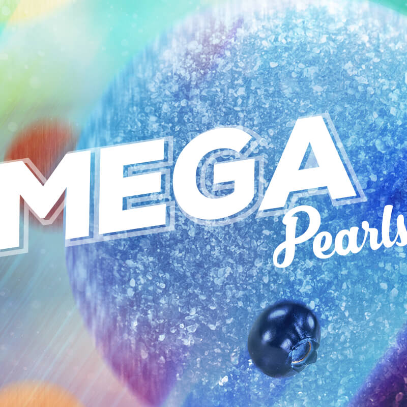
Cannabis laws vary significantly from state to state, affecting everything from product availability to marketing regulations. State-specific landing pages allowed Grön to provide tailored content that complies with local laws while addressing the unique needs of each market. Take our Mega gummies, for example; in Missouri, they are designed as “pumpkin molds” with scored segments to indicate appropriate dosing. In New Jersey, they must be presented as two-piece disks with notches. While the flavors remain consistent, the appearances and formats vary by market.
Enhanced User Experience
State-specific landing pages streamline the shopping experience by displaying only the products and information relevant to the visitor's location. This personalization reduces confusion and enhances user satisfaction, making it more likely that visitors will convert into customers.

Improved SEO and Online Visibility Search engine optimization was/is key to driving traffic to a website, and state-specific landing pages enhanced Grön's online visibility. By incorporating location-based keywords and content, we improved the chances of ranking higher in search engine results for users searching for cannabis edibles in their state. This localized approach not only attracts organic traffic but also positions Grön as an authority within that specific market. If these pages are well-optimized there's lower bounce rates and longer site visits, further boosting overall SEO performance.
Targeted Marketing and Promotions
State-specific landing pages also provide an excellent opportunity for targeted marketing campaigns! Grön could tailor promotions, discounts, and special offers based on regional trends and consumer preferences. By incorporating localized content, like our Arizona exclusive Prickely Pear Products, we were able to actively engage with customers in their area.

These landing pages also served as a single point of truth for anyone within the company. If someone needs to know which products were available, they can simply refer to the website. I always found it incredibly satisfying to direct inquiries to the website, knowing that everyone had access to the most accurate and up-to-date information.
Creating Engaging Silo Pages
for Product Categories
Easy Category Brand Shopping
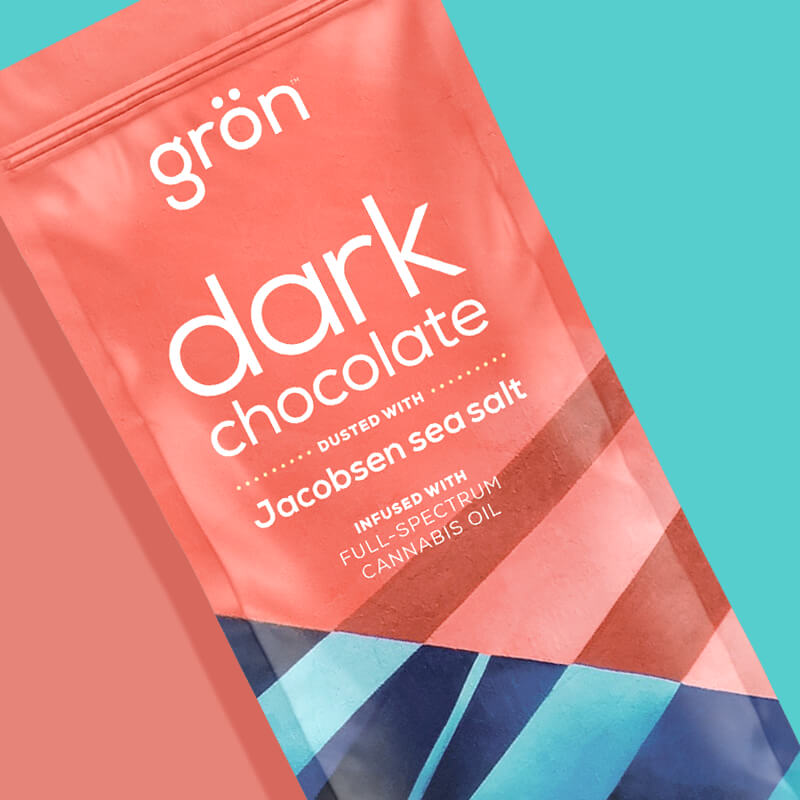
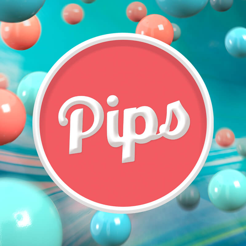
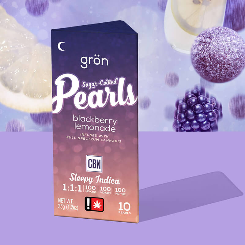
By categorizing products effectively—such as by type (Chocolate, Pips, Pearls, and Mega) Grön could tailor the shopping experience to meet individual customer preferences, ultimately boosting satisfaction and retention. These pages maintain a consistent rhythm and indulgent user experience, especially on mobile devices.
To my great delight, I learned that our Vimeo videos were typically played through their entire duration – meaning people were actively watching/responding to the imagey of craft Grön Modern was realigning under.

The key to an effective silo page is ensuring that when a user clicks on "chocolate," they receive an indulgent experience with comprehensive information about that category. We wanted to provide clear answers about our chocolate effects, ingredients, Fair Trade Certification and showcasing high-quality photos, behind the scenes craft-focused videography, and, of course, a shoppable curated grid wall of all our chocolate products.
By the end of the experience, visitors should feel as if they’ve wandered through a premium Grön cannabis adult-use candy shop, have learned everything they could ever want about the category, and hopefully feel confident enough to make a purchase with a product that fits the high they're searching for.

Indulgent Product Detail Pages (PDP)
Product detail pages (PDP) are arguably the most crucial aspect of any retail website. If a visitor navigates (or has been guided) to a PDP, they are actively considering a purchase, and Grön's goal was to drive them towards the call to action (CTA) that leads to third-party systems responsible for completing the order. Importantly, these pages were state-localized, so if someone clicked from Arizona, they would see the Arizona-specific edible they were interested in.

Grön aimed to make these pages engaging and fun, ensuring that customers felt a connection with the product — and of course, elegantly shoppable. Grön's visitors spent an average of one and a half minutes engaging with the PDPs, indicating they are actively exploring our photography/videography and reading product details.

Chocolate & Pips PDPs. Note the tonal unity in all 4 categories from this 30,000ft view — achieved through functional photography, layout design, colors and pacing.

Meag & Pearls PDPs. Take these PDPs and multiply it by the amount of Markets Grön is currenlty in and you'll get a rough sense as to the amount products Grön actually offers.
A New Era for Grön,
the Debut of Grön Modern
The launch of Grön's revitalized website serves as a dynamic platform for promoting ongoing marketing events, new product releases, and category expansions. As the brand continues to evolve and grow, so too will the website, continuing to attract new users.
This connection underscores an essential truth: the effort put into building the website directly impacts Grön, as its appearance and functionality will continue to influence user perception and engagement.
Once the website launched, I felt a waive of relief and accomplishment — taking my first vacation since returning to the company.
The revitalized brand, Grön Modern, had officially launched.