


THE GRÖN MODERN PORTFOLIO
6 years in the making, explore the strategies and executions that defines the Modern Grön Brand.

THE PREAMBLE
& CHALLENGES

BRAND VOICE,
LOGOS & COLORS
CATEGORY
BRANDING

PHOTOGRAPHY
& VIDEOGRAPHY
THE FIGMA
BRAND MACHINE
EATGRON.COM
THE GRÖN MODERN PORTFOLIO
THE PREAMBLE & CHALLENGES
I’m a designer first and an artist second. The designer in me seeks dispassionate, objective truths, even if those truths might reveal unpleasant realities. Doing so is the only way to identify goals that will genuinely make a difference in branding—anything else is art. The artist in me relies on my gut intuition, instincts, and previous experience.
I’ve always defined a brand as an abstract concept, a story that is told consistently and often, ideally one that resonates with everyone.
To refresh the brand and its story (the abstract concept) I had to address 5 KEY PROBLEMS:
- Grön is a non-English Word in an English speaking market.
- The Grön identity was lost in its packaging.
- The Child Brands had Taken Over.
- The Mother Brand Lacked Identity.
- Embrace Cannabis Marketing
Problem 1: Grön is a non-English Word in an English Speaking Market.
If you already know Grön, you probably know it’s correctly pronounced “Grewn.” If not, you may have been reading or saying “Grawn.” This essentially means that the brand is in a position of having to “correct” your speech or interpretation, which is not ideal as nobody likes to be corrected. Grön means "green" in Swedish, giving the word a lovely significance in the cannabis world. However, if you can’t pronounce or read it correctly, you have no chance of understanding its double meaning.
Solution: Prioritized Pronunciation Education
To address this issue, it became essential to prioritize pronunciation education across all touchpoints. This meant incorporating clear instructional copy in retail merchandising, digital marketing, and educational materials to teach customers and cannabis workers the correct pronunciation.

Problem 2: Lost in the packaging
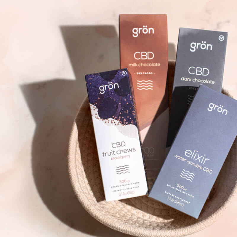
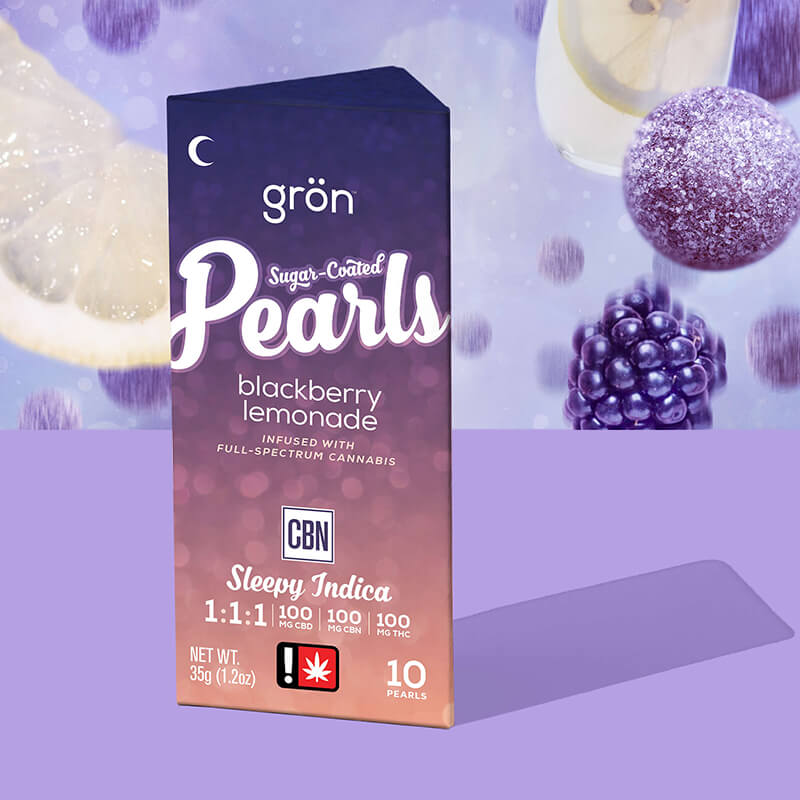
In the world of cannabis, packaging is king. 100 percent of customers interact with our box — from viewing at a distance to final purchase. The Grön logo is on every SKU, but if someone is unable to pronounce "Grön," they are likely to overlook it and associate the product with its primary child brand—Pearls, Mega, or Pips.
Solution: The “By Grön” Lockup
To address this issue, I decided to incorporate a "By Grön" lockup (a simple yet timeless branding approach) into all of our child brands and packaging. Our Canadian partners pioneered this treatment for Pearls, providing us with a solid precedent to pivot to. Even if consumers still cannot pronounce "Grön," they will at least recognize that a primary brand is behind the creation of the product.

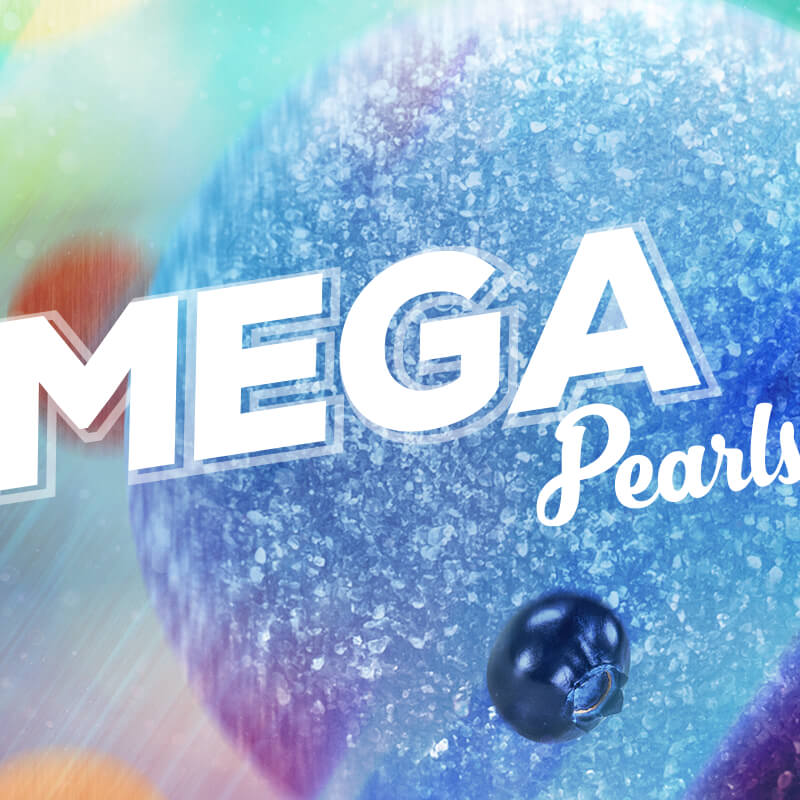
Problem 3: The Children had Taken Over
The child brands (Pearls, Mega, Chocolate, and Pips) had developed their own distinct tones, voices, and personalities, which were reflected in both digital and print collateral. However, they had drifted too far from the core essence of Grön. While their individual packaging aesthetics were effective, the overall brand cohesion suffered. The supporting tonal elements—such as colors, photography, writing, and graphics—needed realignment to strengthen the connection to the mother brand.

The Gröniverse from this point forward would be considered "off brand."
Solution: Establish Unified Brand Standards
To address this issue, it became essential to unite the child brands under a definitive set of standards established by Grön. This involved adjusting the supporting elements to ensure consistency across all platforms. By refining the colors, harmonizing the photography style, and creating a cohesive voice in the messaging, we aimed to reinforce the identity of Grön while still allowing the child brands to maintain their unique appeal.
Problem 4: Defining the Mother Brand
Without a clear sense of identity, it became challenging for the child brands to understand what to respect and align with. Christine Apple’s origin story and Christine herself served (and always will) as a key pillar of the brand's narrative, but unless her face appeared on an ad or collateral next to a box, the brand would require a unified tone and toolkit beyond just a compelling origin story and charming founder. This realization was crucial and perhaps the hardest to confront—especially for Christine, who, to her credit, understood that she wasn’t and could not be the brand (the abstract concept). Without a solid aesthetic and tonal foundation, the brand risked losing its coherence and potential connections with consumers.

Solution: Redefine the Grön Brand, from Mission to Mark
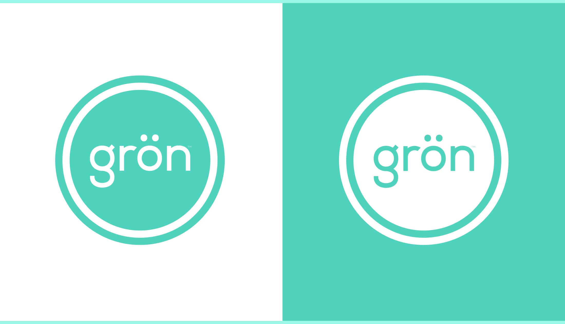
To tackle this challenge, I recognized the necessity of creating a new internal and external mission statement that would not only clarify Grön’s identity and origin, but also help define the brand’s voice and vision. Additionally, I adjusted Grön’s wordmark to give it more visual weight and refined its teal color to lean more towards a vibrant green—a choice that was somewhat obvious given its meaning. This new color, dubbed "Mother Green," was also more vibrant than the original bluish teal. This single change meant that all colors in Grön’s brand would need to become more vibrant, reflecting a truer expression of the experiences one could expect from consuming cannabis edibles.

Original Legacy Wordmark on its blue-side teal.
Future Classic. A word mark in a shield, but the ability to have a shape to play with will improve the capabilities of the branding in future executions.
Problem 5: Embrace Cannabis Marketing
Grön will always be an innovative brand, but it couldn’t rely solely on a brand team any longer. State expansions were a regular part of its business model, and it needed to launch in new states operating at 100% efficiency. A proper internal marketing team was necessary—a branch with strategies and campaigns tailored specifically to the uniquely regulated cannabis markets for each state Grön operated or would operate in.
Solution: Expand the Team
A simple answer with a lot behind it. We needed to become a more balanced brand and marketing team for the perpetual content we’d be creating. Finding hardworking key players to leverage the upcoming refresh would be paramount for the brand’s success.
EXECUTION IS EVERYTHING:
For the first time in years, the mother brand was strategically poised to be ahead of its child brands. These seemingly “simple” adjustments would ripple throughout the entire Grön brand ecosystem, allowing us to confidently make edits and additions as the company grew and expanded. While it’s true that I set the strategy, the executions are ultimately what matter, and I couldn’t execute them alone. As Grön (the company) continued to expand, we would bring on key teammates to assist with the new expansions in other vital areas such as marketing, motion graphics, email design, and more.
The work you’re about to see is the result of the thousands of hours devoted by the hardest working (and most talented) team I’ve ever had the pleasure of working with.