


Working with Apple was an incredible honor, a chance to operate at the highest level of craft and creativity.
Along the way, absorbed everything I could, every process and decision, learning how excellence is not an accident but a discipline. The work you’re about to see is a tribute to the people I collaborated with — I was one part of a remarkable team, surrounded by some of the most talented minds in design, writing, and systems thinking.
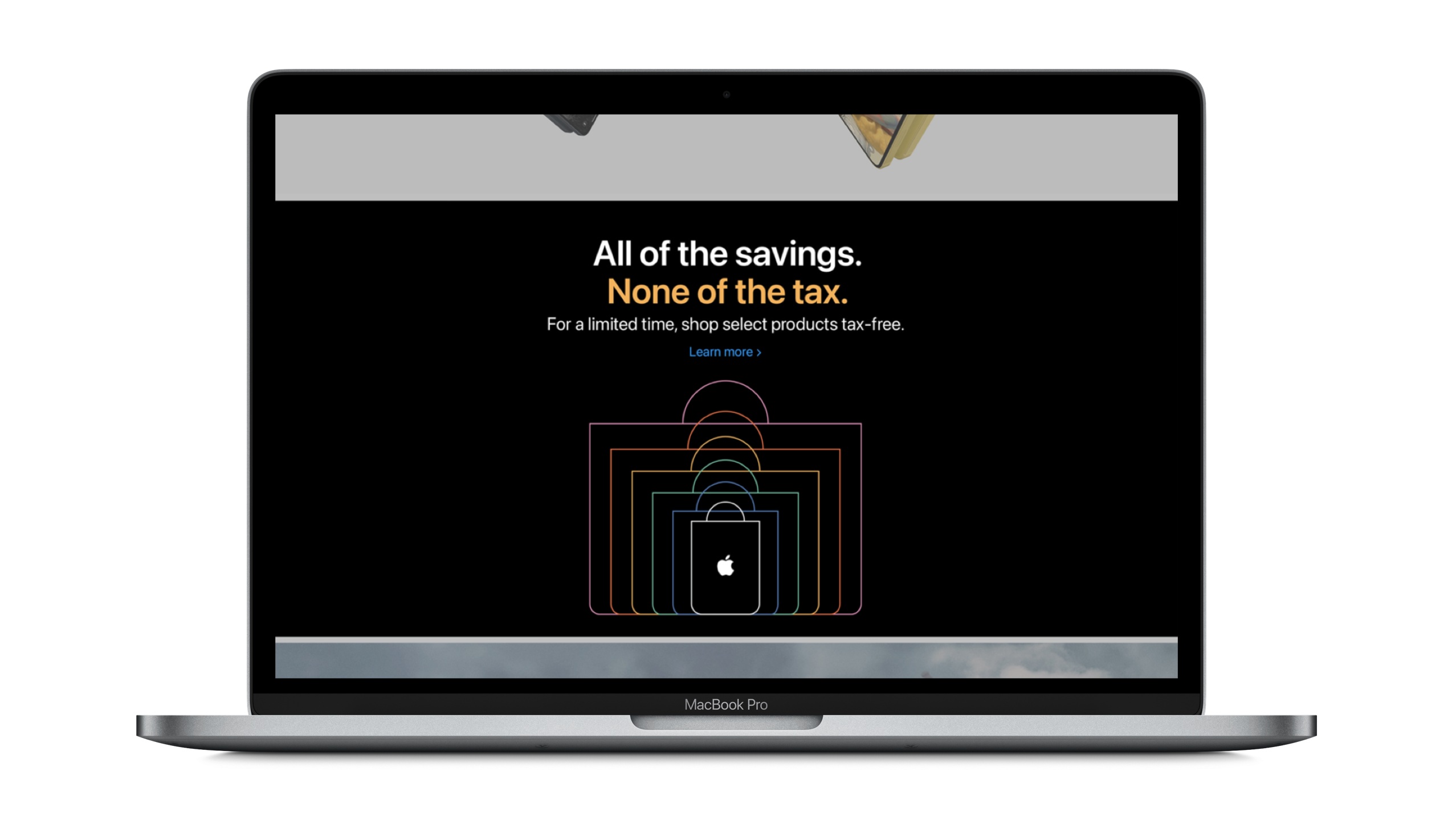
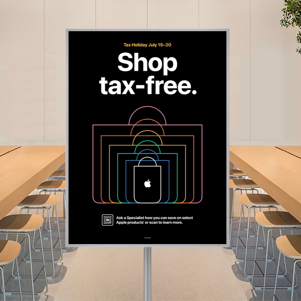
Tax Holiday campaign focused on creating a refined Key Visual and clear, clever messaging that could scale across every deliverable. With a perfectly implemented visual system and strong copy foundation, the team was free to focus on state-specific details, cross-selling opportunities, and seamless execution.

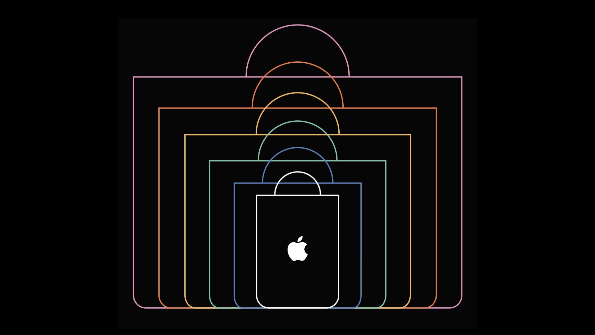
Tax Holiday Key Visual
It was a rewarding challenge to create something both minimal and full of energy, perfectly aligned with the brand’s aesthetic. One of the few pieces I had the opportunity to design from scratch, this escalating series of Apple shopping bags became a vibrant expression of the campaign’s spirit. Each outline was crafted with pixel-perfect precision to capture the sense of growth, excitement, and momentum that defines the Apple shopping experience.
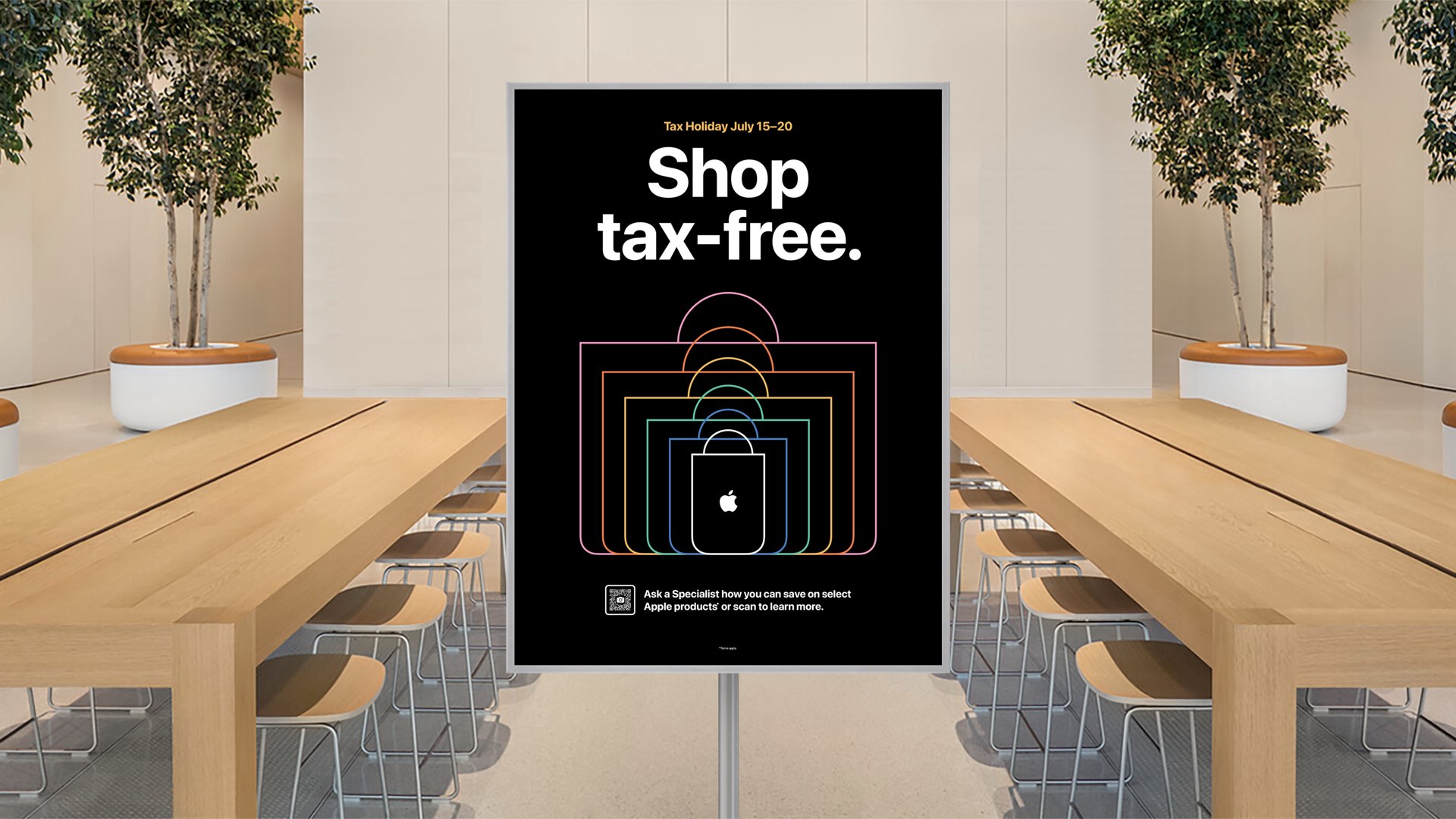
IN-STORE EASEL — Once the Key Visual and Messaging were finalized, files were handed off to the Easel team, who applied final design edits and state-specific adjustments, primarily updating the sale dates.
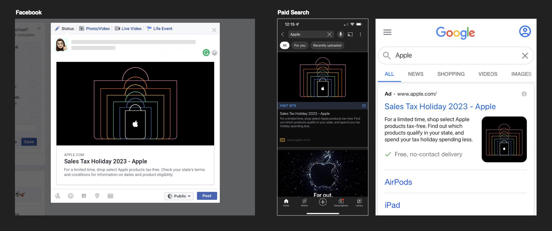
BANNERS & DIGITAL ASSETS — The Key Visual and gold messaging scaled easily across all formats, though a smaller version of the bag graphic was created to preserve line weight and visual impact in compact applications.
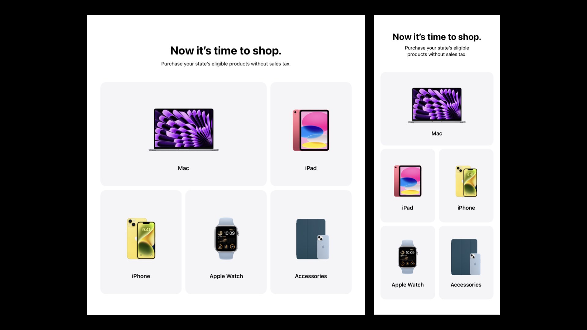
LINES OF BUSINESS CTAS — Instead of product tiles, Tax Holiday uses simple CTA grids that mirror the same look, allowing quick image updates without structural changes.
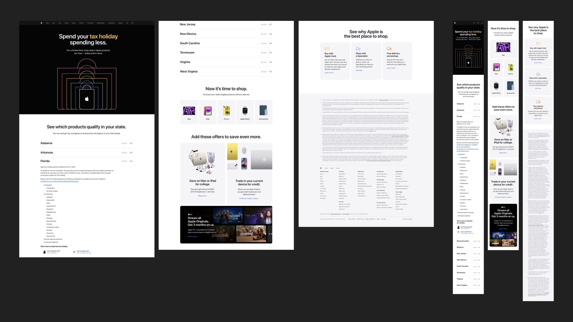
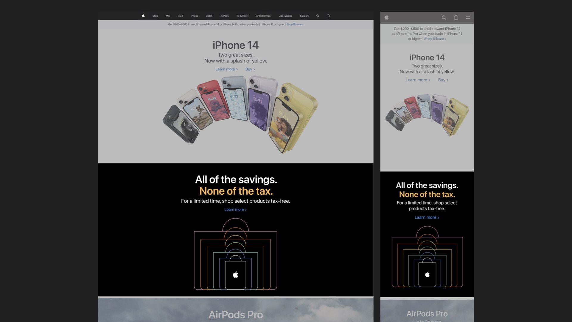
LANDING PAGE — Built for clarity and speed, the layouts applied the Key Visual and messaging consistently.
APPLIED SUPPORT BANNERS AND DRIVERS
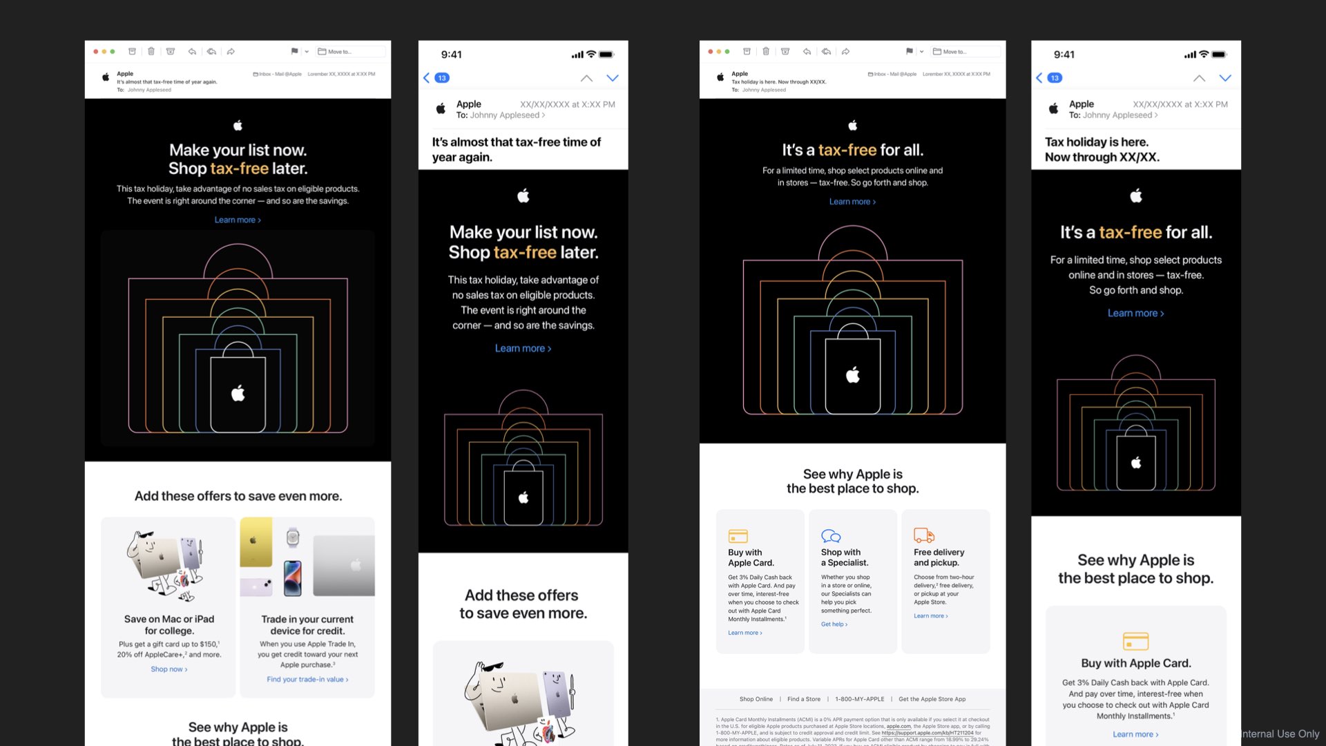
TAX HOLIDAY DIRECT MARKETING EMAILS
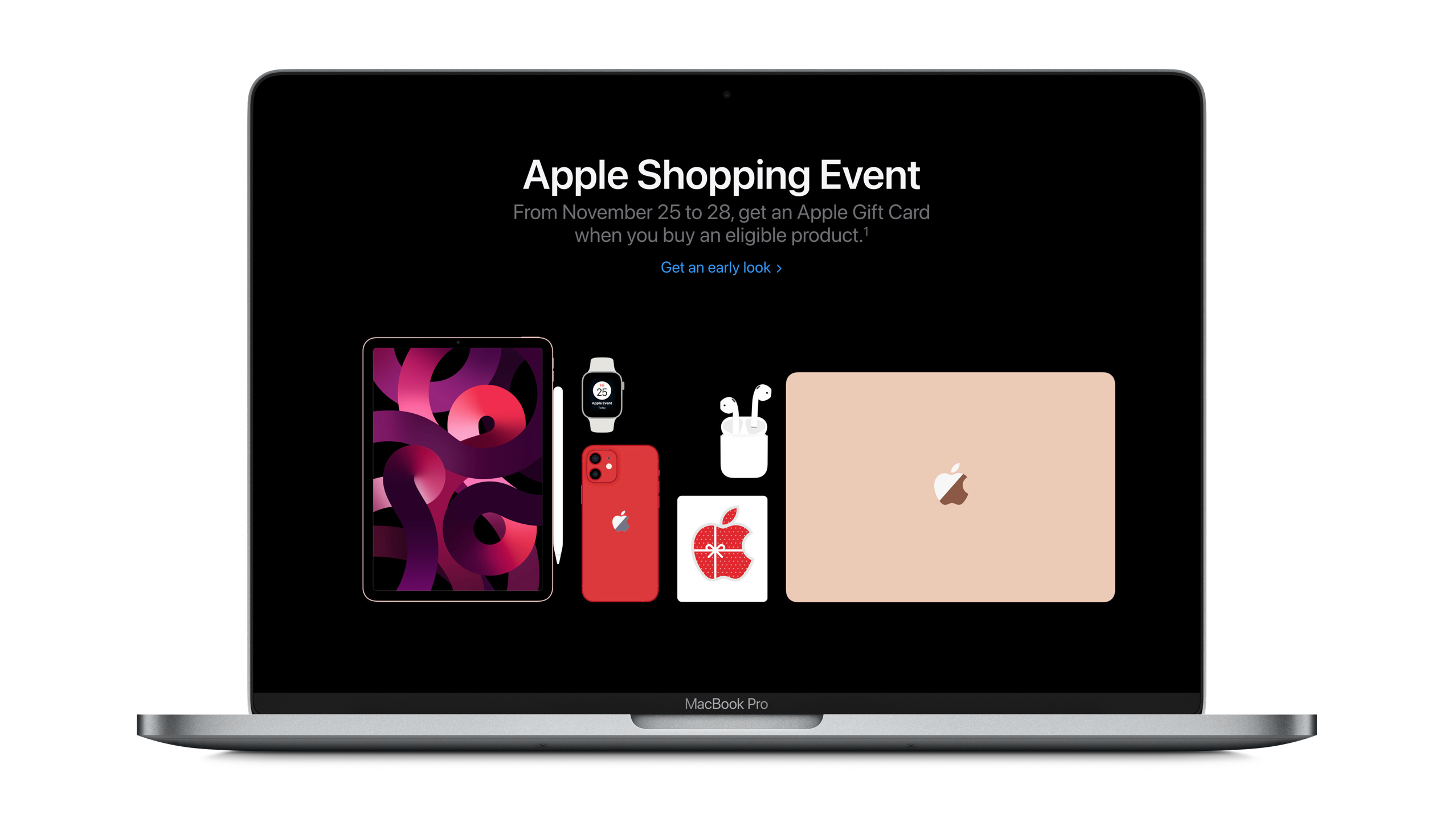
APPLE SHOPPING EVENT (BLACK FRIDAY)
By defining a clear Key Visual with carefully designed geo-specific alternates, we ensured ASE could be deployed seamlessly across every digital channel. From Apple.com to the Apple Store landing pages, emails, and affiliate banners, each execution reflected the same visual precision and standard of excellence — delivering a unified, pixel-perfect experience worthy of Apple’s brand.
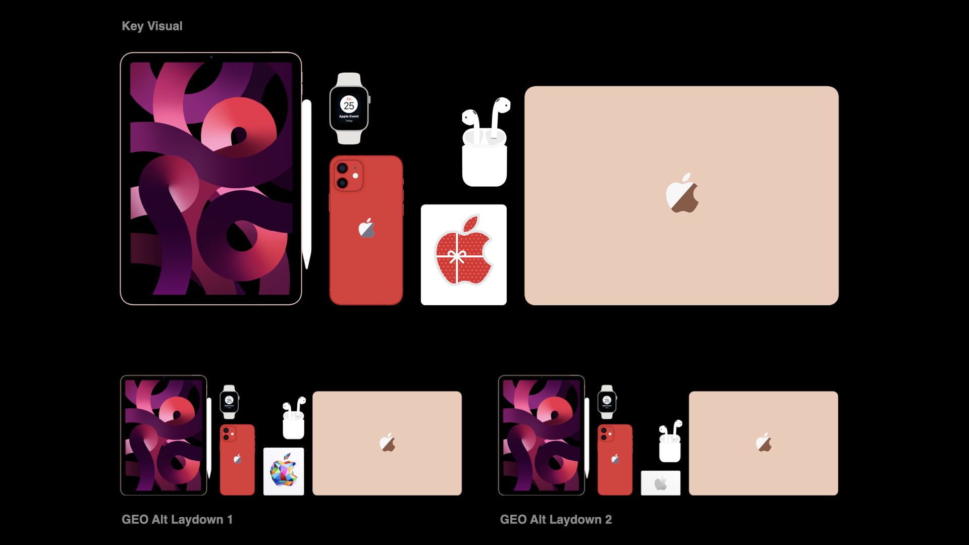
KEY VISUAL — A flat vector laydown of featured Apple products became the core graphic for ASE22,
offering flexibility for messaging, easy GEO swaps, and reusable assets across campaign sections.
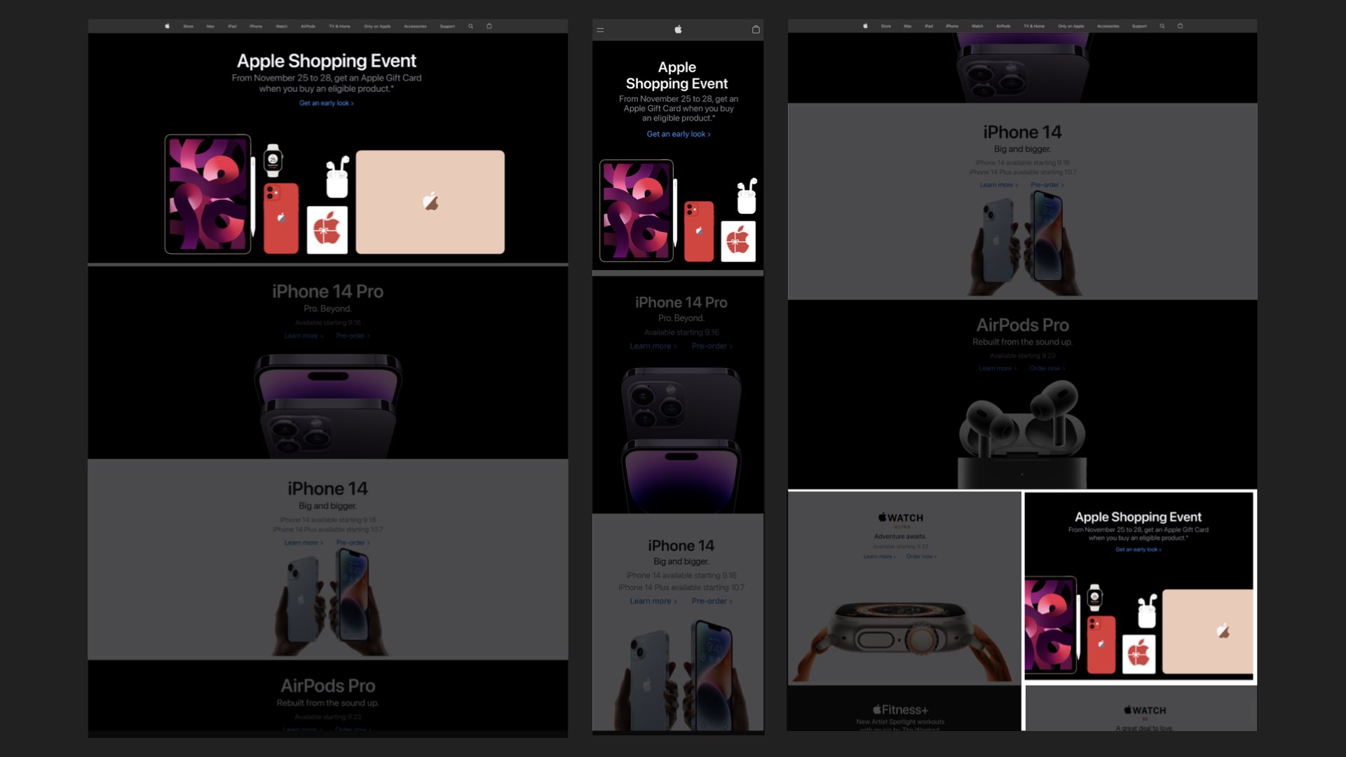
HOMEPAGE BANNERS — Consistency across all banner sizes was maintained by keeping the laydown’s
spacing fixed and using strategic cropping to adapt the layout for each format.
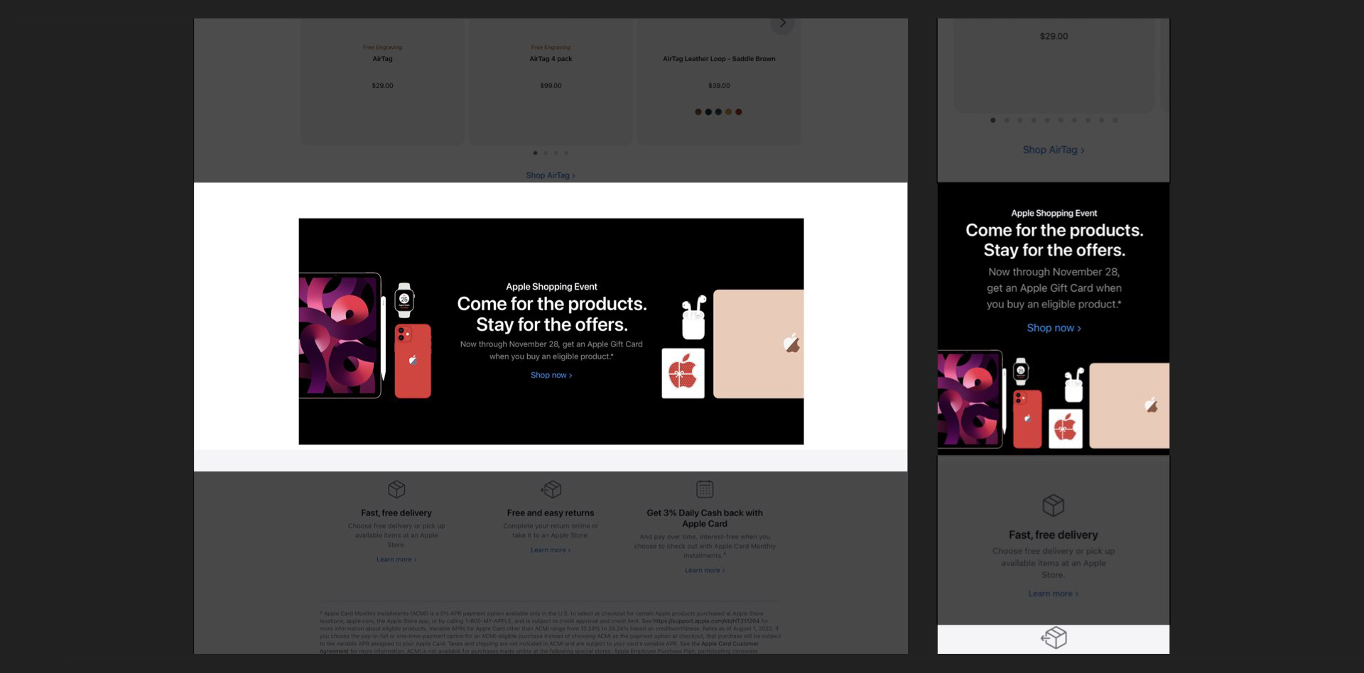
ALTERNATE HOMEPAGE BANNERS — Key Visual split for adaptable copy.
BANNERS & AD DRIVERS — All instances used the same laydown with adjusted crops.
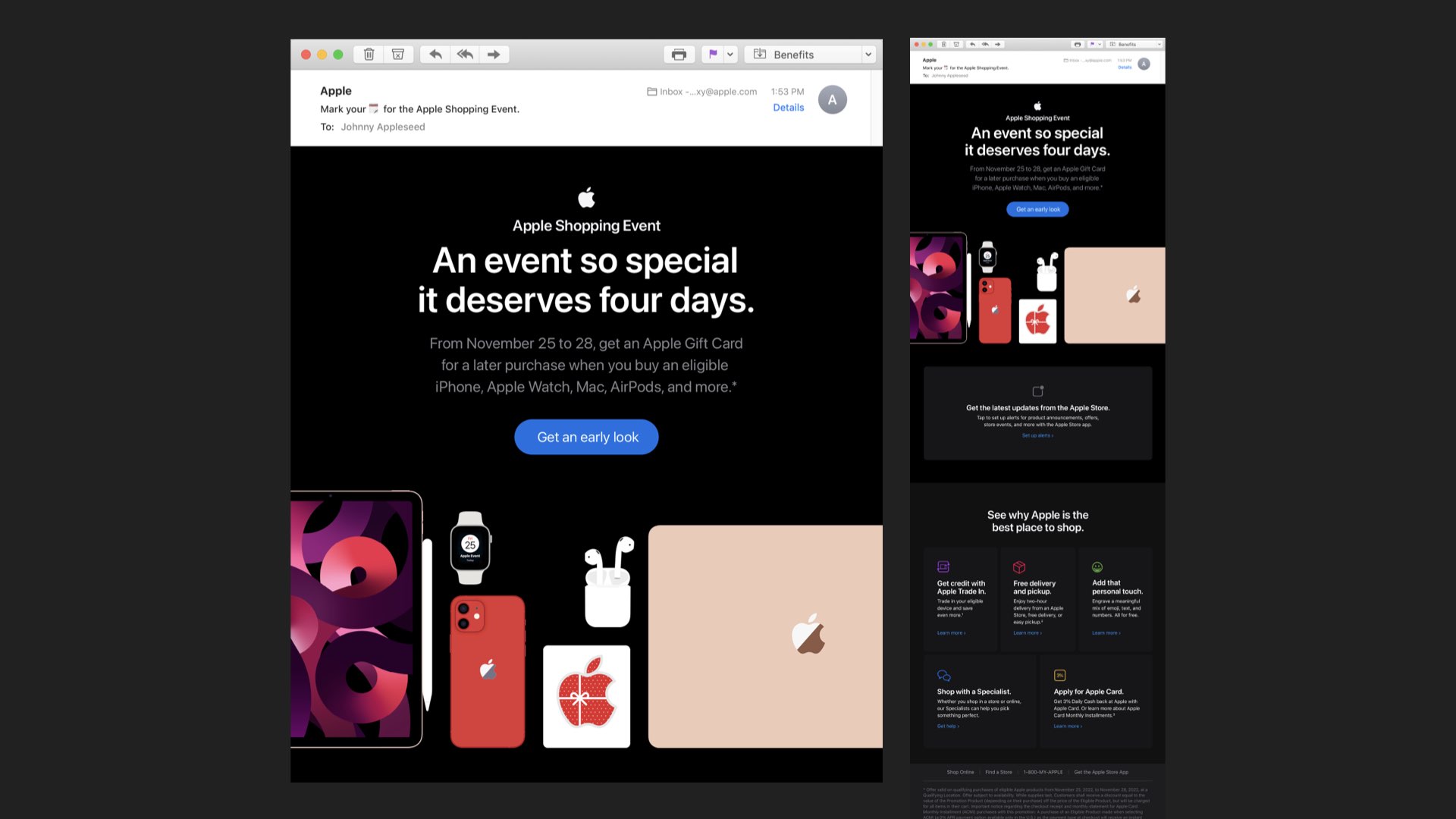
DIRECT MARKETING EMAILS — Three versions were created (Announce, Offer, and Follow-Up) with only the Announce DM using the full laydown.
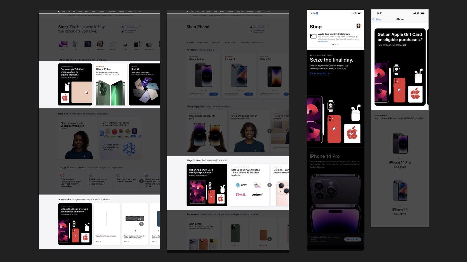
APPLICATIONS — The laydown Key Visuals were used across both section previews and product tile intros, appearing in rounded corner boxes or negative space layouts with corresponding messaging, CTAs, and product tiles, including a dedicated version at the top of every page to indicate the promotion days.
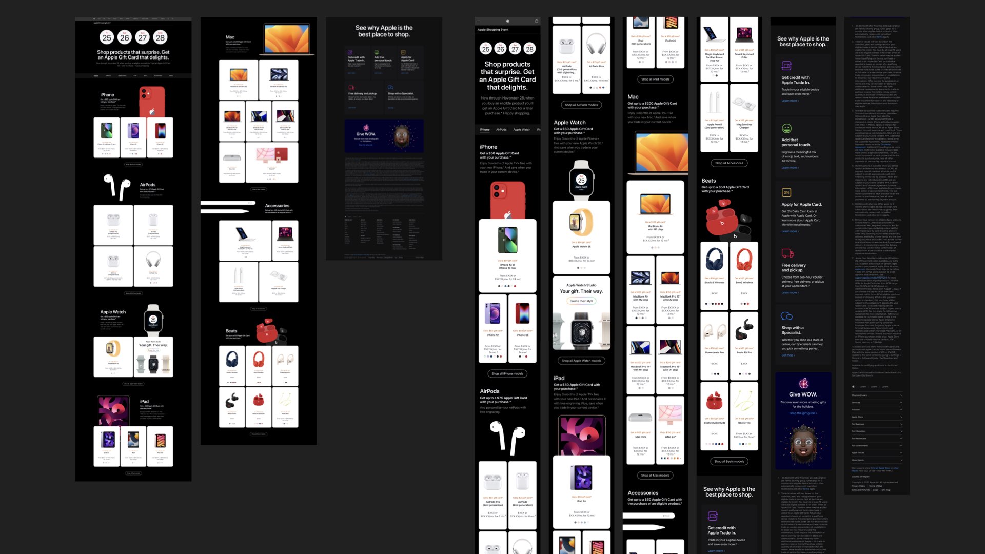
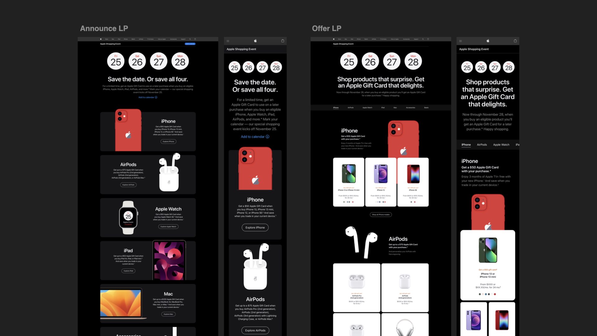
FULL OFFER LANDING PAGE
Working with Apple was one of the Mount Everest moments of my career, a rare opportunity to contribute to a brand I’ve admired since college and long considered the gold standard of design and innovation. Collaborating with teams that uphold such a precise and thoughtful approach to every detail was both inspiring and transformative. Experiencing how creativity, discipline, and intention converge within Apple’s process reshaped how I approach my own craft. It was more than a collaboration, it was an experience I’ll be grateful for for the rest of my life.
Cheers.