


THE GRÖN MODERN PORTFOLIO
6 years in the making, explore the strategies and executions that defines the Modern Grön Brand.

THE PREAMBLE
& CHALLENGES

BRAND VOICE,
LOGOS & COLORS
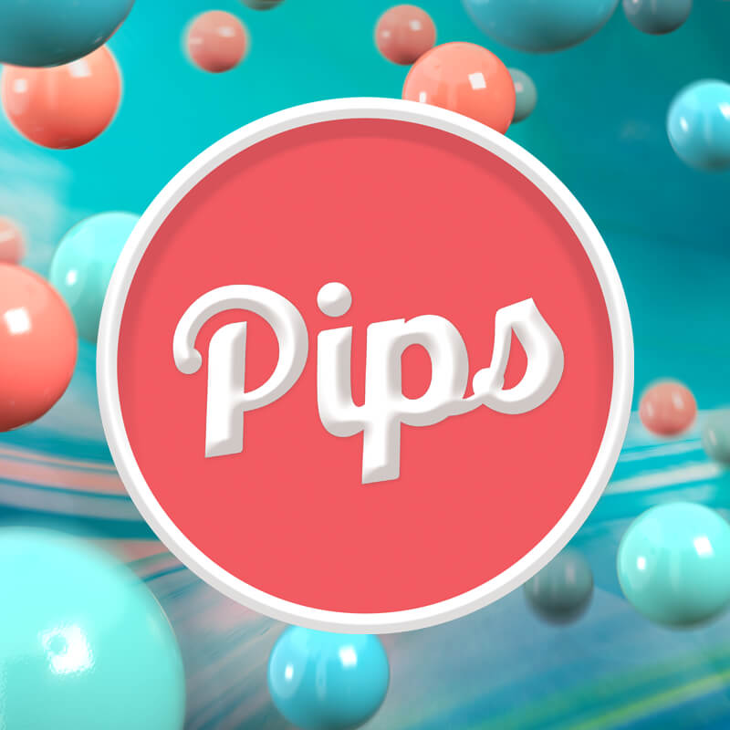
CATEGORY
BRANDING

PHOTOGRAPHY
& VIDEOGRAPHY
THE FIGMA
BRAND MACHINE
EATGRON.COM
THE GRÖN MODERN PORTFOLIO
THE FIGMA
BRAND MACHINE
The brand standards would serve as the crucial reference for all things brand related: from informing artwork aesthetics to shaping the brand’s messaging and tone. However, to truly maximize its potential, and make the refreshed elements practical, we needed a functional program to harness all these elements and implement them into an effective “brand machine.” I define a brand machine as: the suite of programs and tools that facilitate the execution of brand deliverables (digital banners, posters, online articles, marketing collateral, etc.).
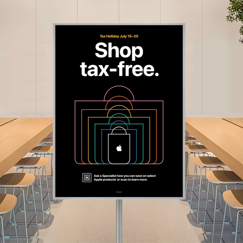
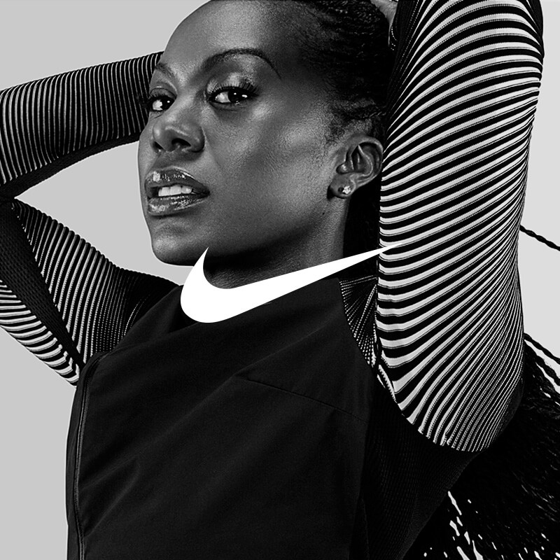
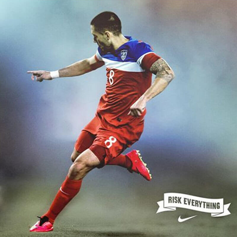
My time working with brands like Nike, Apple, and Coca-Cola had one commonality: all of these brands strive to create perfectly branded, consistent assets that could be utilized for rapid brand executions.
Upon returning to Grön as the SVP of Brand, I leveraged the insights gained from Apple’s digital ecosystem to develop a similar system for Grön from scratch. If successful, I knew it would enable my team to execute the Grön Modern branding faster than ever, in perpetuity — a must have for our ever expanding edibles empire.
There was only one program up to the task: Figma.
I’m going to get reasonably granular for the rest of the article, so let me be clear: if you’re not using Figma as your primary design and branding tool, you’re behind. Period.
Right alongside AI, Figma is the single most powerful design tool to emerge in the last 20 years.
In a landscape where many professionals are overwhelmed by the bloat of programs and tools, Figma stands out as a game-changing solution. To put it another way, during my negotiations for my return to Grön, the addition of Figma to the brand team was the only non-negotiable element. Without it, I knew we would have no chance of executing the full brand refresh the CEO was asking for.
A Brand Machine:
Perfectly Consistent,
Endlessly Playful
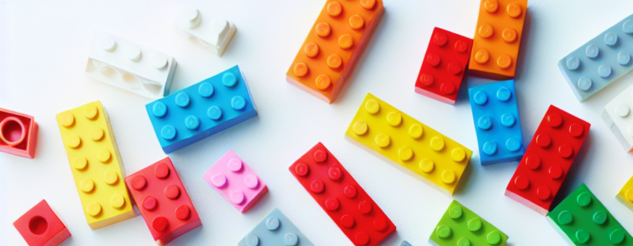
The best analogy for creating and designing a brand machine is to compare it to the creation, in all of its totality, of a Lego set — the blocks, colors, instructions, everything. In this analogy, a brand’s elements (colors, logos, typography, photography, etc. ) represent the individual Lego blocks. The brand standards serve as the instructions for the Lego set, providing a guide on what the final result should look like and outlining the steps to achieve a perfect outcome.
The beauty of Legos, of course, is that the blocks can be used to build any sculpture one can imagine. For example, if you’ve purchased a Lego set of a pirate ship, you can either follow the instructions to build that specific ship or use the pieces to create something entirely different. Regardless of the custom sculpture you choose to create, it will still evoke the essence of a pirate ship because it has been constructed using the pirate ship pieces.
There are limits to this analogy, as even the best-designed brand "blocks" can lead to something chaotic or off-brand if not guided properly. Generally speaking however, approaching the creation of a brand machine from this perspective allows for a consistently branded, user-friendly set of blocks that are easy and enjoyable to create with. After all, creation is inherently a playful act, and nothing is more playful than dumping a bucket of Lego blocks on the floor and assembling whatever comes to mind.
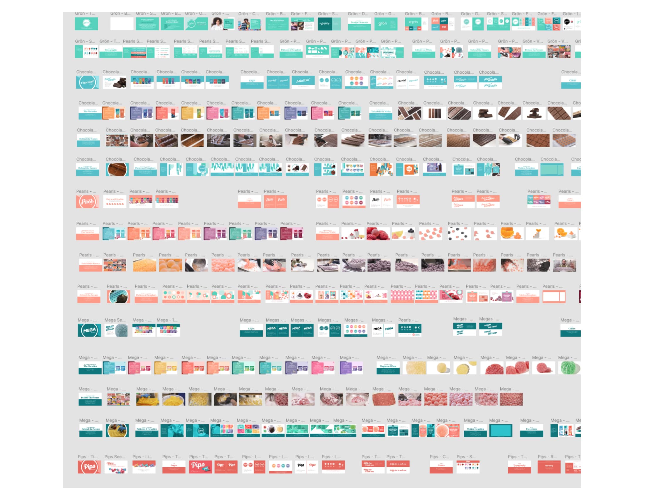
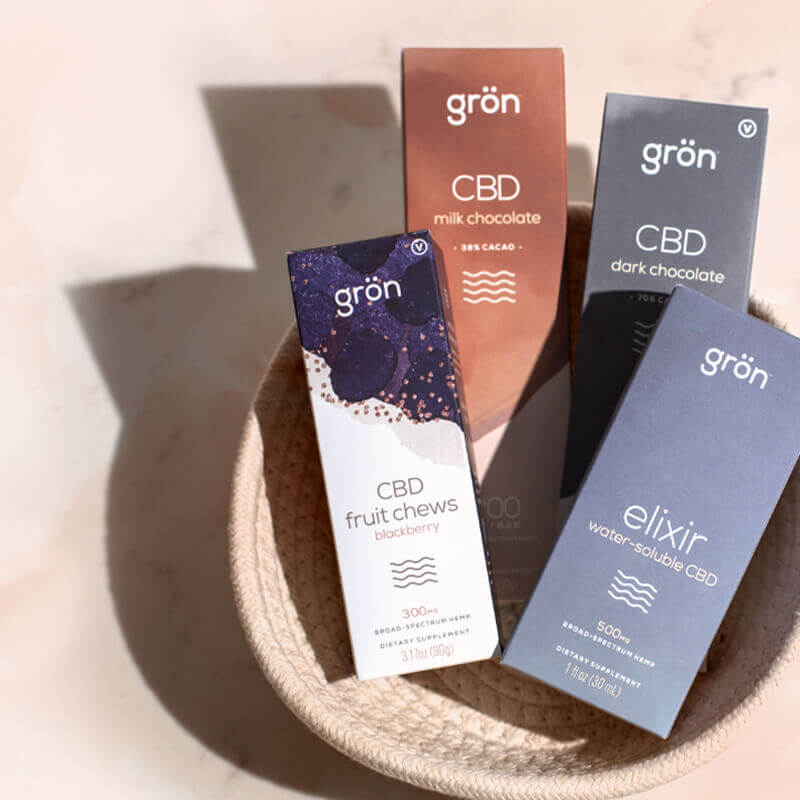
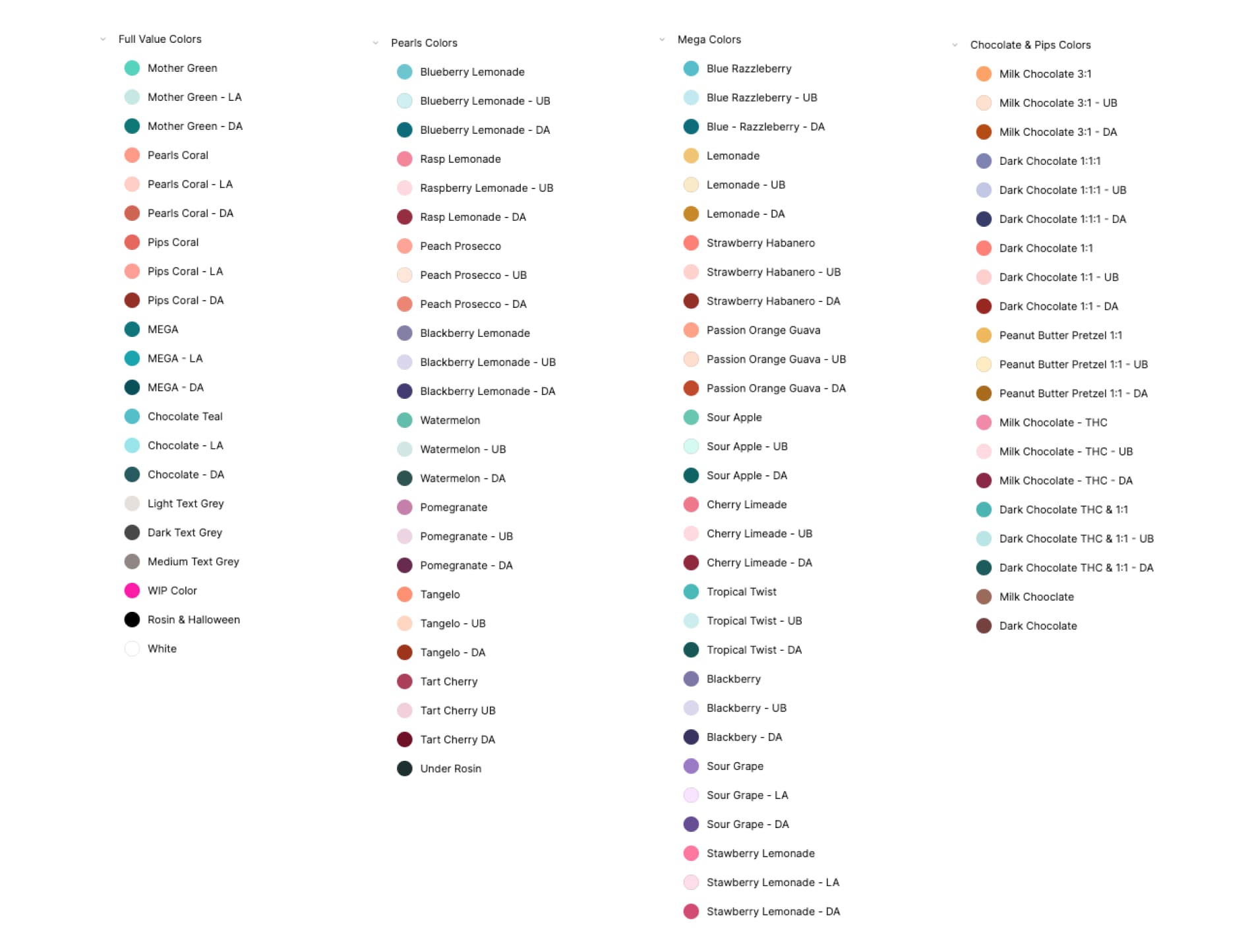
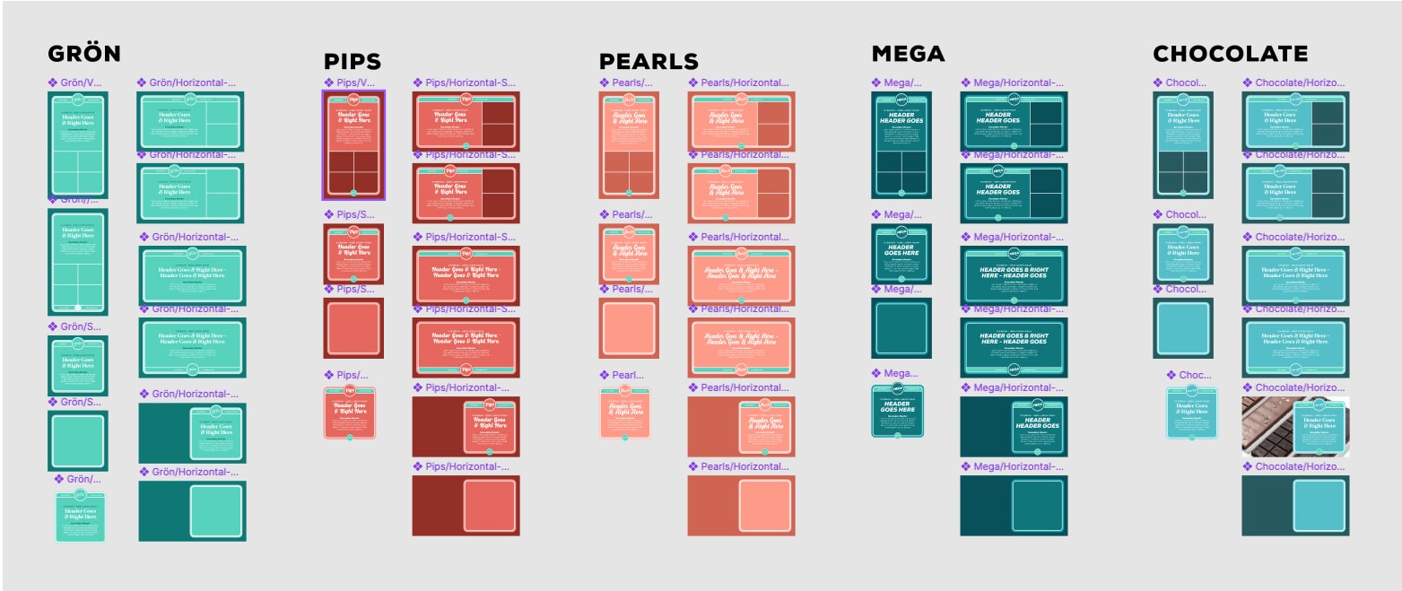
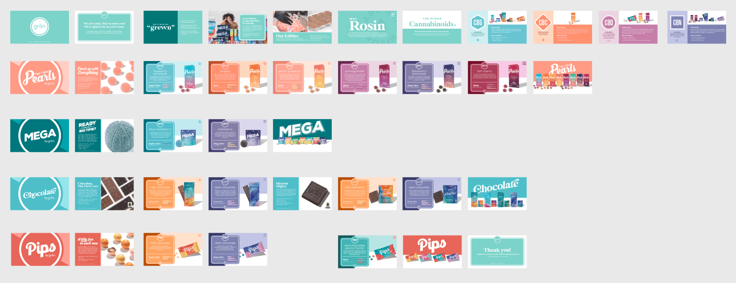
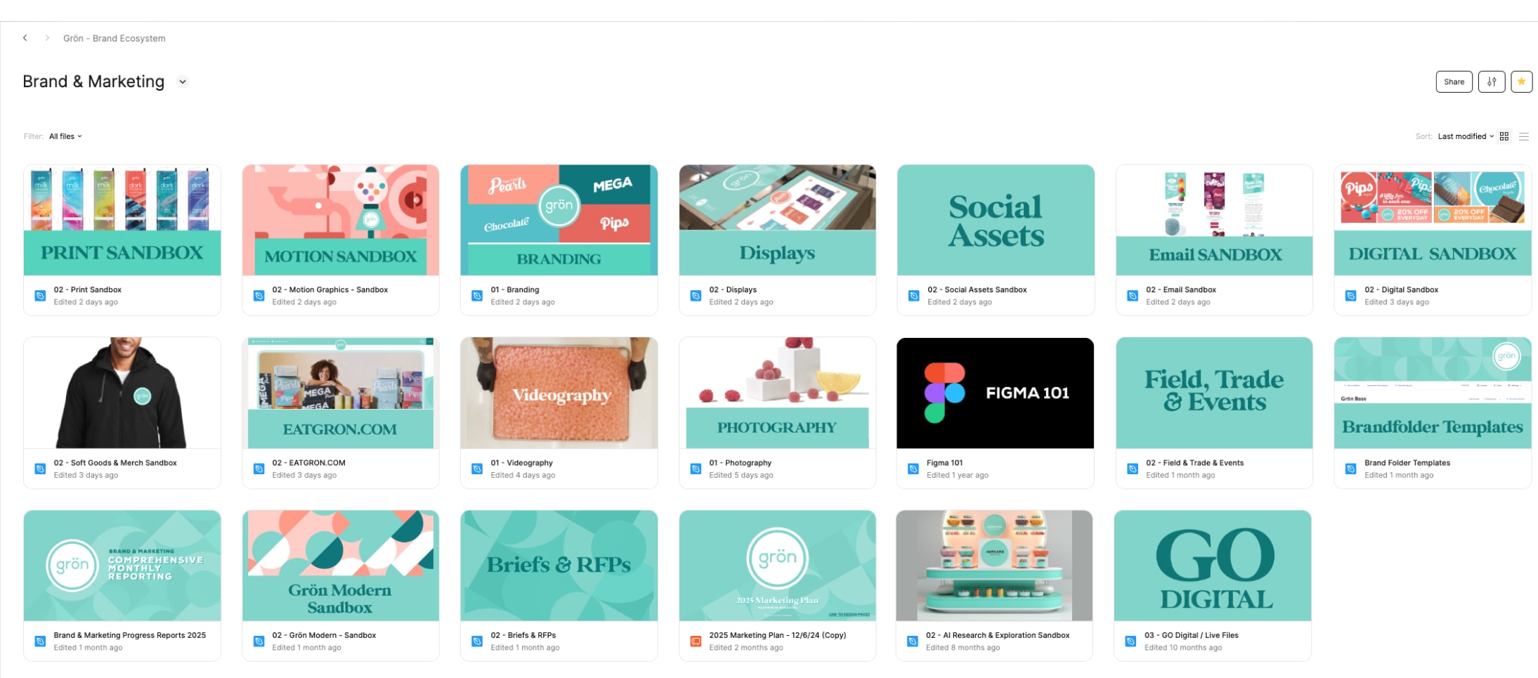
The finalization of Grön’s brand standards (the 400 page deck) had essentially created thousands of brand “blocks”, which in Figma are called components. Grön's Figma ecosystem leveraged not only the rules outlined in the brand standards, but also the literal slides themselves, as they were all built from the on brand elements (Figma components). These components were imported directly from the Grön Figma libraries, which were easy to update, manage, and share with not just the brand team, but the whole company. We built libraries of everything, from colors and logos, to photographs and bauhaus patterns, and most importantly renderings of packaging.
These were accessible to not just anyone on the design team, but anyone at Grön. There were numerous benefits to using cloud-based libraries as the system for all employess at Grön to interact with the branding.
Consistency Across Platforms: With a centralized cloud-based library, all employees have access to the same branding materials, ensuring that every piece of marketing collateral, from social media posts to printed brochures, reflects the same visual identity.
Increased Efficiency: Cloud-based libraries reduced the time spent searching for the right brand assets or templates. Anyone at Grön could easily find and utilize logos, color palettes, and images, allowing them to focus on creating content rather than hunting down resources. This efficiency not only saved time but also boosts productivity.
Endless Scalability: As Grön's brand would continue to grow, so too would its branding needs. Often times, it felt like we could never ge ahead, as soon as we standardized something, a new market would launch (this is a good thing), adding even more to the workload. Whether Grön was launching a new product or entering a new market, having a robust library of branding materials ensured that the company's identity remains strong and consitent — bringing the same messaging and tone to that area. Our color swatches, bauhaus patterns, and product photography would always be the same with only the messaging adjusting to meet the standards of a state's specific regulations.
You’re Only as Fast as Your Slowest Piece
Beyond brand cohesion, the primary goal of Grön’s brand machine was to streamline the branding process and to maximize speed of production. If your brand elements (blocks) cannot be assembled into functional layouts quickly, your entire system is at best ineffective and at worst useless. The cannabis industry exemplifies the need for brands to be agile and responsive in an environment defined by constant rapid change. I often compared the world of cannabis to standing on quicksand — something that’s unsettling, constantly changing, and had the potential to swallow you whole. Regulations can/did shift overnight and varied greatly from one state to another, requiring us to remain vigilant and adaptable to avoid penalties and preserve the identities of Grön and its child brands.
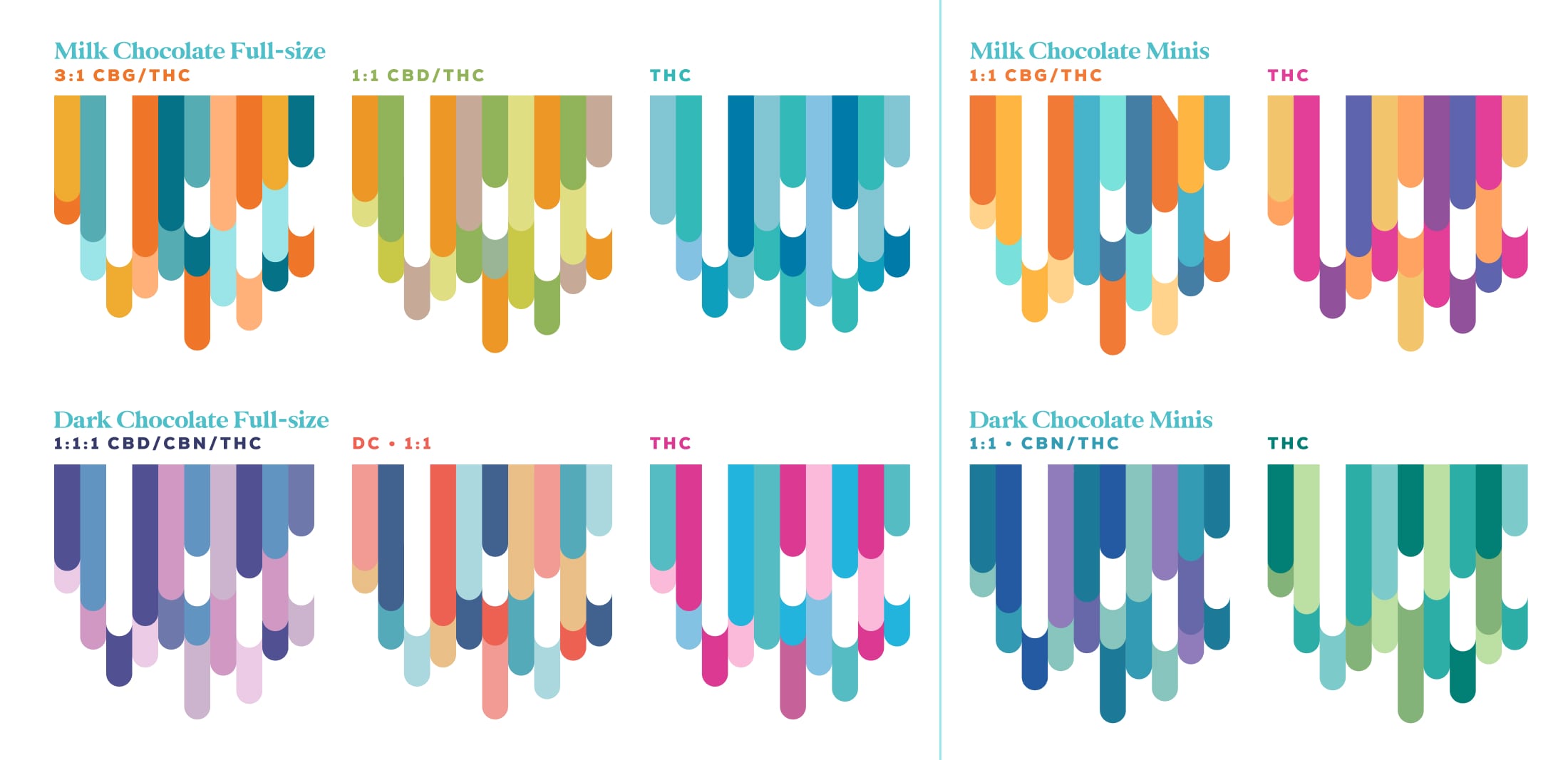
Maintaining Branding Consistency
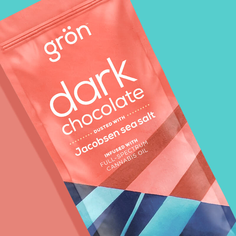
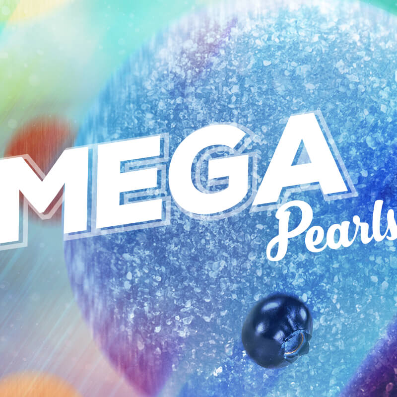
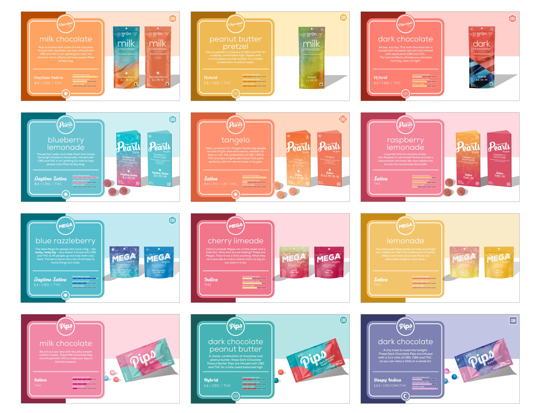
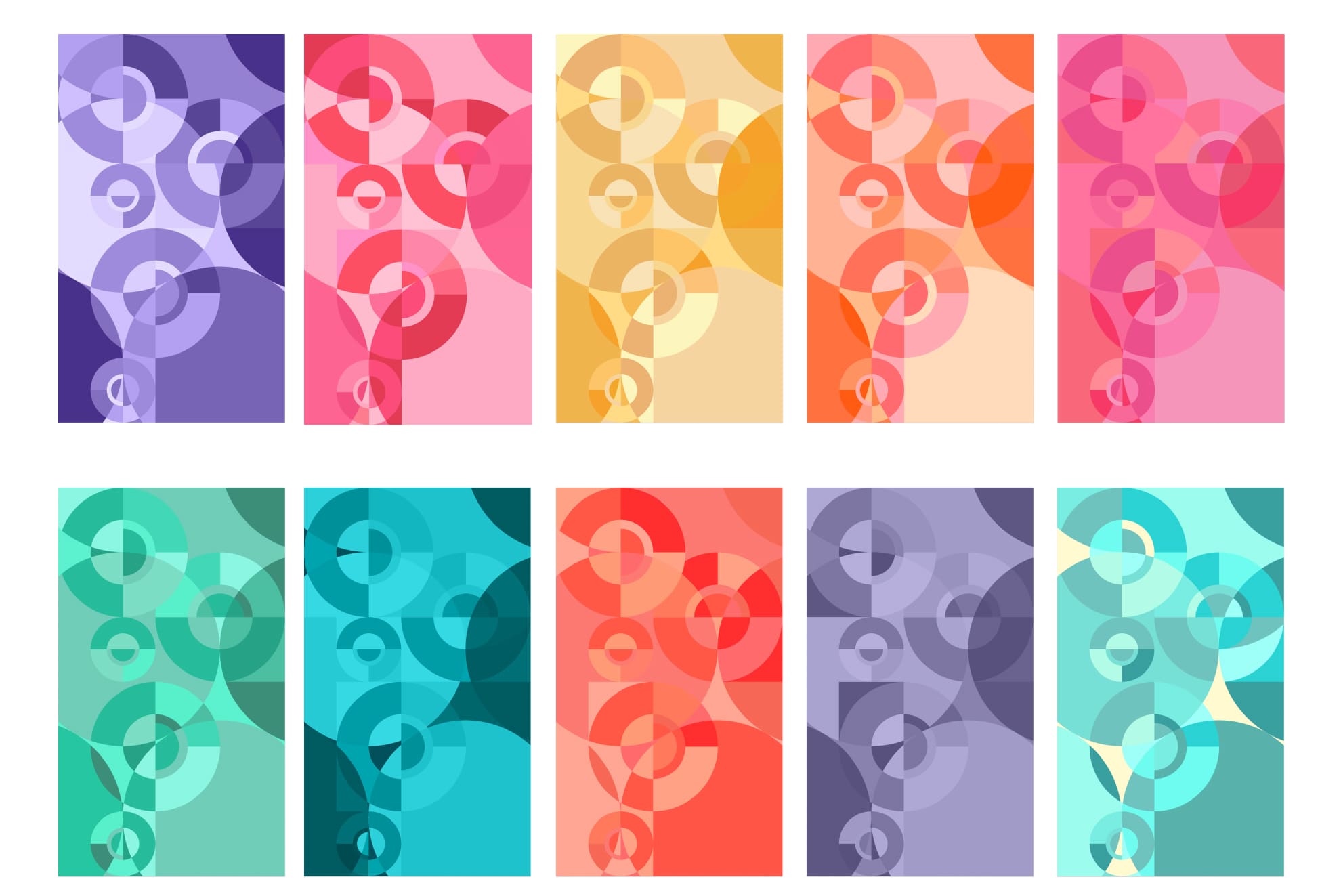
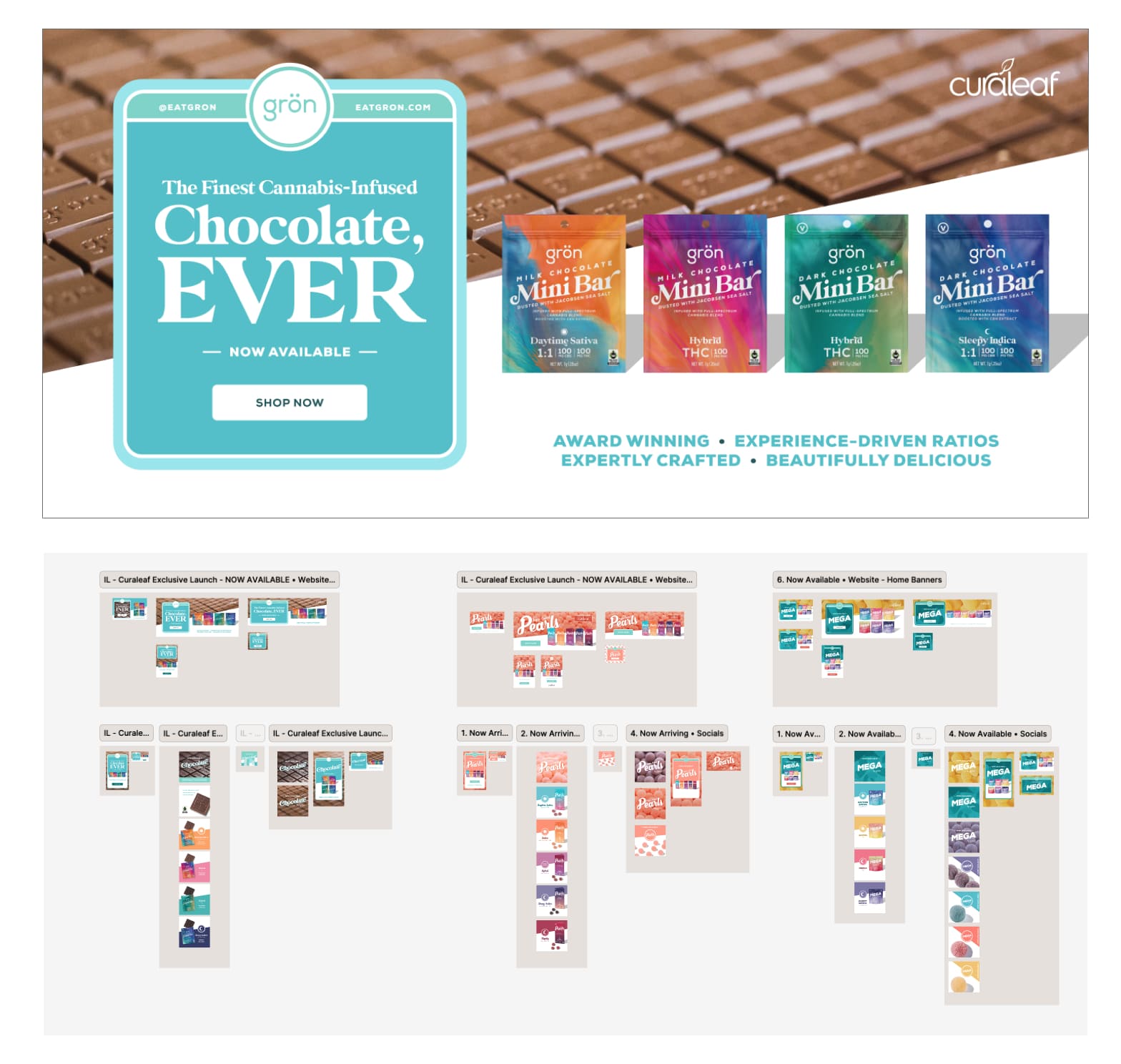
Using product-specific background graphics helped Grön maintain a consistent brand image across it's categories, reinforcing brand recognition through the use of brand colors, logos, and themes.
The Mega pattens (above) were designed to be product-specific enhancing the overall aesthetic of marketing materials – making them more visually appealing and effectively highlighting features and benefits. Additionally, the ability to crop, scale, and modify these graphics allows for flexibility across various mediums, ensuring that the brand looks polished and professional, whether it’s a large banner at an event or a small thumbnail on a website.
The Power of Interwoven Components
As I've mentioned, the regulations for cannabis were constantly shifting and nine times out of ten, those regulations directly impacted the box. In many ways, this is a worst case scenario, as all instances of collateral featuring the box would now be obsolete and in need of updating — let alone the actual packaging itself. A single product (component) could have dozens upon dozens of instances scattered throughout Grön’s entire brand ecosystem.
However, since all the new collateral was built in Figma, and since the designs were built with components linked to brand libraries, we simply needed to update the library component, push the update live, and then update components in the layouts. All of this could be done in seconds, where as if we were using individual files saved on dropbox, with other industry standard programs like Illustrator or Indesign, a designer would likely spend hours or even days tracking down all the applicable "linked" changes.
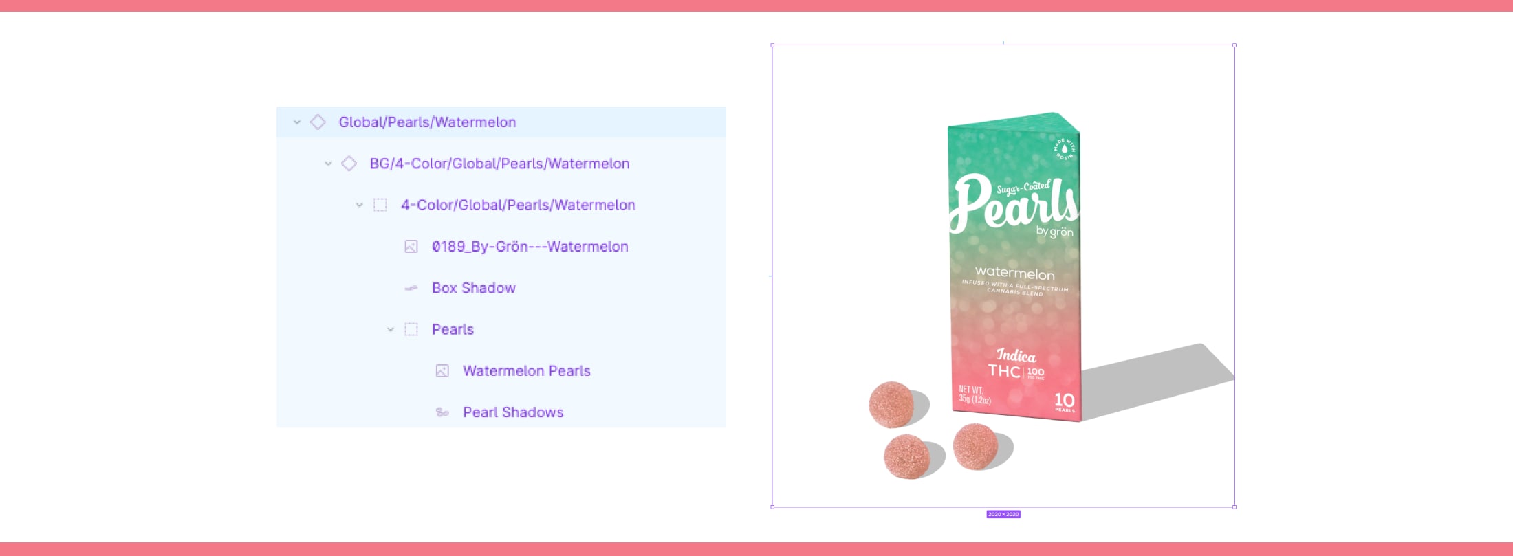
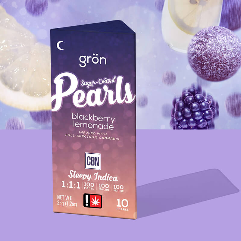
One Component — Multiple Uses. The construction of an individual component matters. In this case, a box of Watermelon Pearls is organized into layers, including the box itself, shadows, and the pearls. These layers can be independently toggled on and off without damaging the overall compnent. This allows someone at Grön to place this single component into any functional layout and then choose which version they need: a complete box with pearls, a box without pearls, or just the three pearls themselves. Grön's component libraries are filled with such efficiencies, collectively creating a system that is fast, lightweight, and flexible.
Figma’s primary use was for digital layout creation and app design, but its library and component system was so powerful, and the ability to make global changes were so fast, that we adopted all of our print collateral to its platform as well.
Doing so easily saved us hundreds of hours in combined production time over the course of the year.
Template Design in Figma:
Streamlining Brand Consistency
One of the most effective strategies for ensuring brand consistency while prioritizing speed is the use of templates, and Figma has proved an invaluable tool in this regard, serving as yet another extension of the Grön Modern refresh. On-brand templates helped maintain a uniform look and feel in all Grön marketing materials by establishing specific fonts, colors, logos, and layouts, ensuring that branding remains consistent regardless of who is creating the content. Additionally, creating layouts from scratch can be time-consuming; on-brand templates streamline the design process by providing a ready-made framework for production.
When multiple team members were involved in content creation, on-brand templates provide a common reference point that enhances collaboration by ensuring alignment with branding guidelines, reducing miscommunication and inconsistencies.
By creating templates in Figma, linked to our on-brand components, we established a direct and efficient method for maintaining brand consistency across all materials. This approach extended to digital banners, printed posters, sales sheets, catalog designs, and more. Whenever possible, we sought to templatize anything we created, allowing for future reuse. These templates not only maximized speed but also ensured brand consistency, which was vital for our primary strategy of bringing the Grön Modern to all of Grön's executions.
Collaboration & Improved Art Direction
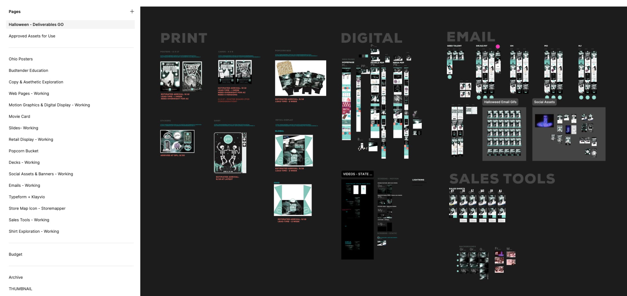
Figma revolutionized Grön's design process by providing a unified space for collaboration — and by extension, a single place to provide feedback. For instance, during our Halloween campaign, digital designers worked seamlessly alongside print designers who were creating 4x6 cards and 8.5x11 sale sheets. This integrated approach was invaluable for maintaining brand cohesion, as it allows both teams to collaborate closely, share design elements, and borrow layouts that enhance the overall effectiveness of the campaign. The ability to see each other's work in real-time fosters a collaborative environment where creativity thrives and the best layout wins.
Providing feedback and art direction became much simpler in this environment as designers create and iterated within the same floating art board space, art directors can easily reference their work, providing timely feedback to ensure alignment with brand standards. The ability to view all deliverables in one place streamlines the supervision process, allowing for quick adjustments and maintaining high-quality artwork throughout the project.
The cloud-based nature of Figma enhanced the collaborative experience as this system eliminated the headaches associated with traditional design tools like Photoshop or InDesign, which often require navigating, saving, and managing multiple files. With Figma, all deliverables were easily accessible in one location, making it simple to manage any project or campaign. My designers could iterate quickly by duplicating art boards, making adjustments, and comparing variations side by side. This ease of access and organization was a game changer, enabling teams to work more efficiently and effectively.
Figma's capabilities significantly improved Grön’s workflow and project management. By creating digital and print “sandboxes,” I tried to foster a creative environment where designers could collaborate and innovate freely, ensuring that everyone had access to the resources they needed. This not only increased production speed but also empowered designers to produce cohesive and impactful designs.

You only get one chance to make a first impression, and EVERYTHING COMMUNICATES.
While at Grön, I had the privilege of designing numerous C-suite decks. Taking on these projects was always exciting for me, as they represented the pinnacle of our design efforts, showcasing our brand standards in the most compelling way possible and putting my skills of information design to the test.
C-Suite deck deadlines in particular always seemed to drop on us with little warning.
Just like our standard marketing deliverables, we developed templates for various decks, as they had become an essential (and regular) part of our standard deliverables. Deck templates were especially utilized by the C-suite for the ongoing presentations and by the CEO for her continual speaking engagements. Additionally, our marketing team relied on these templates to communicate with our retail partners, effectively showcasing what our brand could offer.
Figma proved invaluable for producing high-quality, professional presentations and collateral that truly represented the best version of our brand. By integrating live artwork from our website and ongoing campaigns, we ensured that each iteration of the C-suite decks became increasingly polished and relevant. I wanted to give these presentations the respect they deserved, as they encapsulated our brand’s story, aesthetic, and achievements.
The System is More Valuable
than Any Single Execution
Figma was instrumental in defining our success at Grön. By streamlining our organization and workflow, it enabled us to manage branding assets with unprecedented efficiency, consistency, and speed. The contrast to previous legacy systems, such as Adobe and Dropbox, is striking. The satisfaction of my team soared as they became more comfortable with the program, contributing to a smoother and more productive team as a whole.
Figma was also crucial in the creation of our updated brand standards. It allowed us to complete the project within a tight timeframe. Had we been forced to rely on archaic programs like InDesign or Illustrator, or God Forbid Powerpoint or Keynote, I have no doubt we would have faced significant delays, bogged down by the clunkiness of those tools. In contrast, Figma empowered us to build and iterate rapidly, helping us develop the strategy for who we wanted to become.
It was easy to use, and for me, simple to teach. I could guide my colleagues through the process of deck creation and swiftly introduce them to the fundamentals of artboards and color palettes. The user-friendly interface allowed not just me but also other leaders within the C-suite to create their own decks, fostering a collaborative environment. As more team members became adept at designing presentations, I witnessed a surge in creativity that benefited the entire organization. Ultimately, Figma revolutionized our design approach at Grön, enabling us to produce top-notch presentations and marketing executions that truly represented both Grön the business and Grön the brand.
Believe the Hype
With our updated branded components finalized, templates developed, and all elements in place, we were finally prepared to tackle our most comprehensive deliverable incorporating the totality of Grön’s branding, from color and typography to packaging, photography, videography, and messaging—eatgron.com.